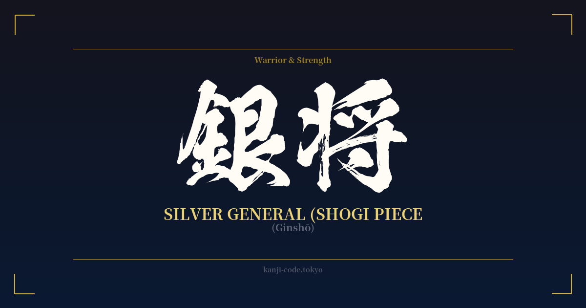
✍️ 銀将 (Ginshō) — Cultural Context
銀将 (Ginshō), the Silver General, is one of the most interesting and versatile pieces in 将棋 (Shōgi), the traditional Japanese strategy board game often called Japanese Chess. While not the most powerful piece on the board, the Silver General is a cornerstone of both defense and tactical offense, embodying a uniquely Japanese approach to strategy.
Unlike Western chess, shogi is a game of attrition and redeployment. Captured pieces can be 'dropped' back onto the board to serve their new master. This dynamic makes the game incredibly complex, with tides that can turn in an instant. In this fluid battlefield, the Ginshō shines.
The Silver General's movement is unique: it can move one step forward, or one step diagonally in any direction except straight backward. This makes it a fantastic defensive piece, crucial for building the protective 'castles' (囲い, kakoi) that shield the king. Famous formations like the Yagura castle are built around the coordinated placement of Silver and Gold Generals.
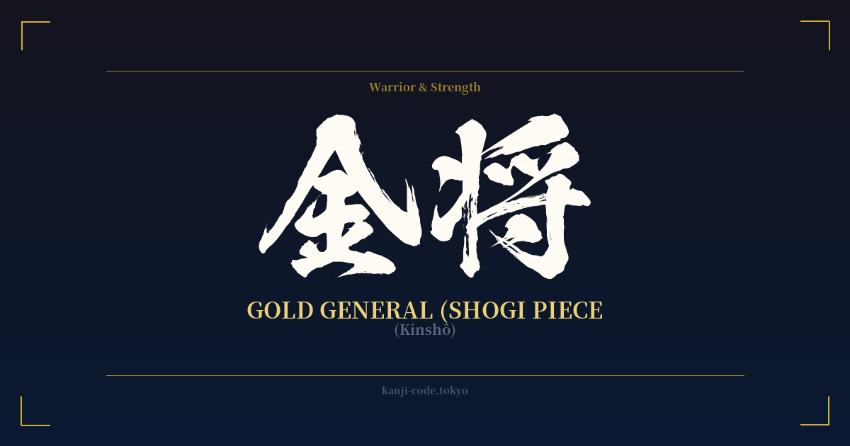
However, its ability to retreat diagonally also makes it a surprisingly effective attacker. While the Gold General (金将, Kinshō) is a stronger pure defender, it cannot retreat backward, making it a liability if pushed too far forward. The Ginshō, by contrast, can probe enemy lines and still have an escape route. This represents a core strategic concept: flexibility over brute force. The Silver General isn't about overwhelming power, but about finding the right angle, controlling space, and creating opportunities.
Culturally, the Ginshō symbolizes the skilled subordinate or the clever strategist. It is not the king (王将, Ōshō) or the powerhouse Rook (飛車, Hisha), but the dependable, adaptable warrior who executes the plan with precision. It represents the value of being multifaceted—a defender who can attack, a supporter who can lead a charge. For this reason, the Silver General is a symbol for those who appreciate tactical thinking, adaptability, and the quiet strength of a well-played supporting role.
🖌️ Font Styles for 銀将
The same kanji can look dramatically different depending on the calligraphy style. Choose a font that matches the mood you want for your tattoo or design.
🎨 Tattoo Suitability
📐 Tattoo Design Guide
For a 銀将 tattoo, the vertical arrangement is classic and aesthetically pleasing, making it ideal for the forearm, calf, or along the bicep. The two characters are well-balanced and create a strong visual column.
– Font Style: A crisp, clear Kaisho (block) script emphasizes the strategic, board-game nature of the word. For a more fluid look that represents the piece's flexible movement, a Gyōsho (semi-cursive) style works wonderfully. Avoid overly complex or stylized scripts that could make the kanji illegible.
– Visual Elements: Consider pairing the kanji with an abstract design of a shogi piece (koma), which has a distinctive five-sided shape. You could also incorporate a subtle grid pattern in the background to evoke the shogi board (shōgiban). A minimalist design focusing solely on the two characters, however, carries a quiet confidence.
Comments