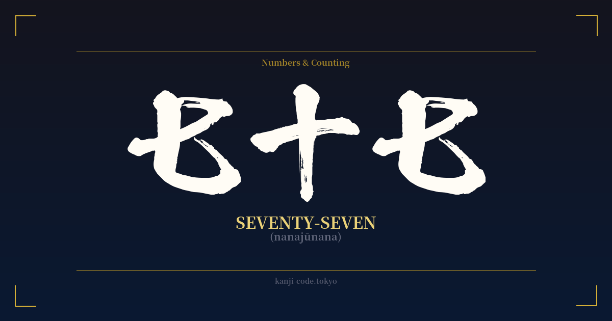
✍️ 七十七 (nanajūnana) — Cultural Context
In Japanese, the number seventy-seven is written as 七十七 (nanajūnana). The construction is straightforward and logical, following the standard system for writing numbers in kanji. It breaks down into 七 (nana – seven), 十 (jū – ten), and again 七 (nana – seven), literally translating to 'seven-tens-seven.' While simple on the surface, this number holds a special, heartwarming place in Japanese culture, primarily linked to a significant life milestone.
The most profound meaning of seventy-seven is its connection to the celebration of the 77th birthday, known as 喜寿 (Kiju). This is one of Japan's traditional longevity celebrations (年祝い, toshiiwai), which mark specific ages with unique names and customs. Kiju is particularly cherished due to a clever and beautiful bit of wordplay rooted in calligraphy.
The character for 'joy' or 'rejoicing' is 喜 (ki). When this character is written in a cursive, stylized script (草書, sōsho), it can look like the three characters for seventy-seven (七十七) stacked together. The top part resembles a 'seven' (七), the middle section with the 'mouth' radical (口) can be stylized into a 'ten' (十), and the bottom part is another 'seven' (七). Because of this visual pun, the 77th birthday was named 'The Joyful Age.'
Celebrating Kiju is a happy occasion for families to honor their elders. The person celebrating often wears or is gifted items in the color purple (紫, murasaki), a color historically associated with nobility, elegance, and longevity. This tradition is shared with the 70th birthday celebration, Koki (古希).
Beyond the Kiju celebration, the number 77 doesn't have the same deep-seated mythological or spiritual significance as some other numbers. However, the influence of Western culture has introduced the concept of 'lucky number seven,' so a double seven (七十七) can be seen as doubly fortunate by some, though this is a modern and imported association. Primarily, its identity is tied to that joyful milestone, a testament to a long and happy life.
🖌️ Font Styles for 七十七
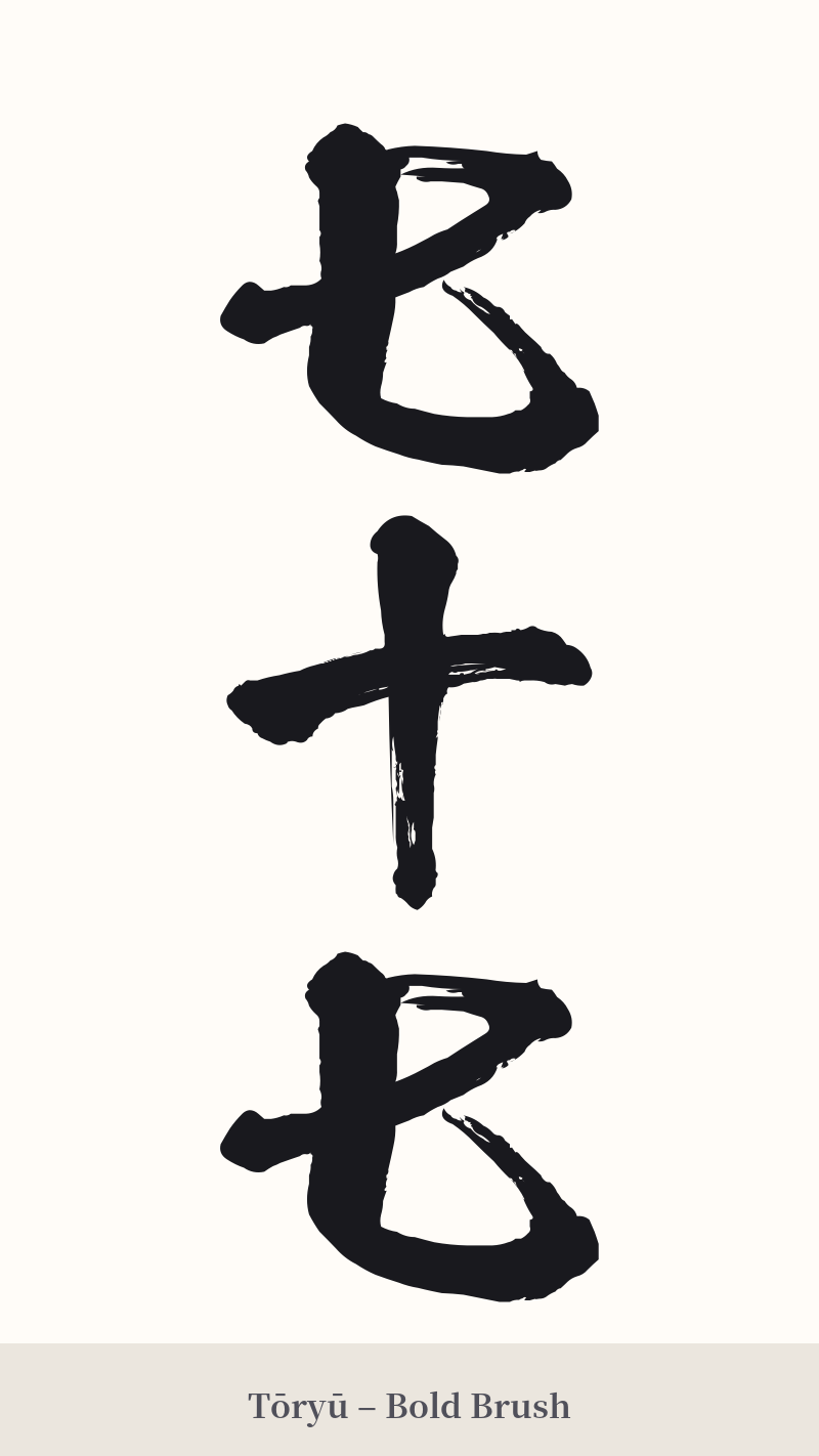
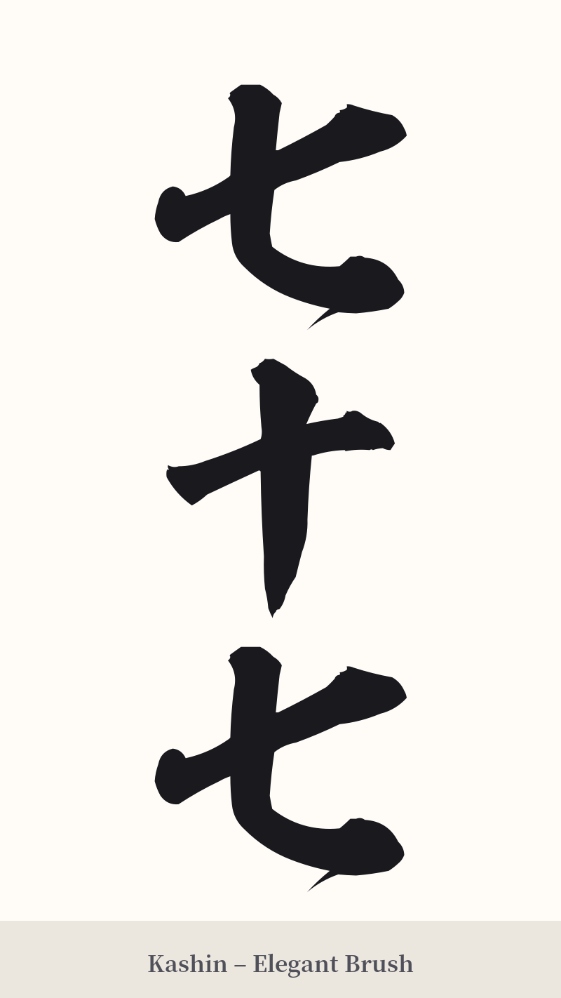
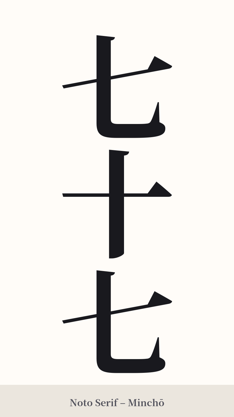
The same kanji can look dramatically different depending on the calligraphy style. Choose a font that matches the mood you want for your tattoo or design.
🎨 Tattoo Suitability
📐 Tattoo Design Guide
Given the simplicity of the characters, the font style and placement are crucial for a successful 七十七 tattoo.
– Placement: Because the design is inherently simple and linear, it works well in smaller, more discreet locations. Consider a vertical design on the inner wrist, along the forearm, behind the ear, or on the ankle. For a larger piece, it would need to be integrated into a bigger, more meaningful composition.
– Font Style: The characters themselves are not visually complex, so the style can add personality. A bold, blocky Mincho or Gothic font can give it a modern, graphic look. Conversely, a flowing cursive (Sōsho) or semi-cursive (Gyōsho) script can add elegance and subtly hint at the calligraphic connection to the character 喜 (joy).
– Visual Tips: A vertical orientation is the most traditional and aesthetically pleasing way to write Japanese. You could also consider having the characters designed by a calligrapher to create a unique, artistic piece that transcends the simple strokes. If the tattoo is to celebrate Kiju, incorporating the color purple could be a meaningful touch.
Comments