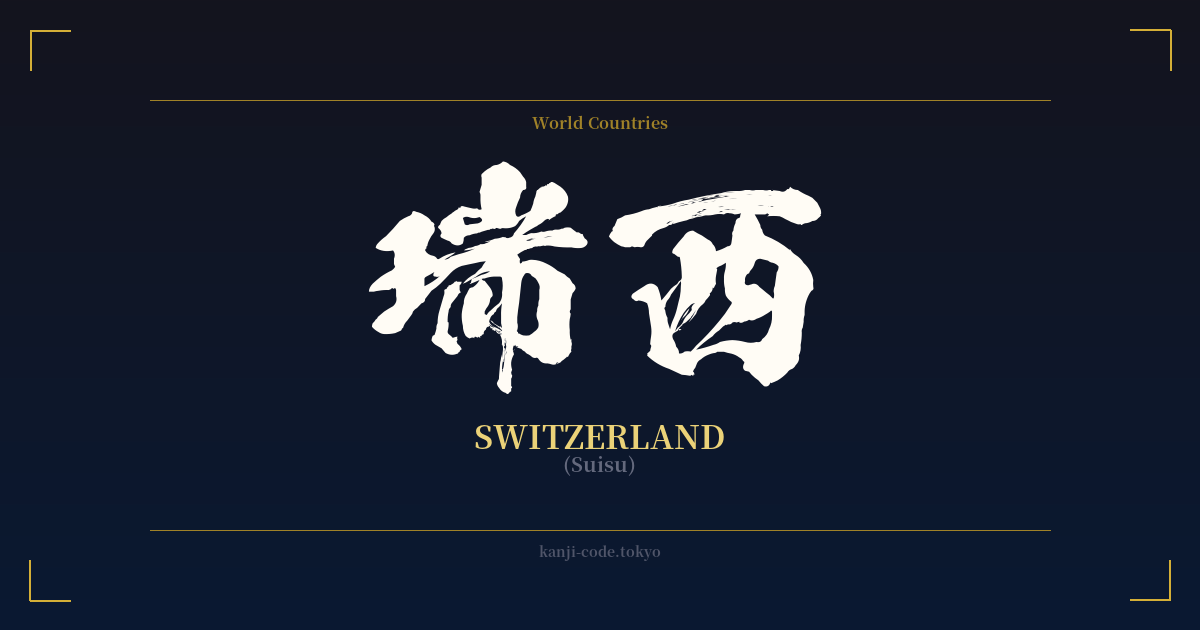
✍️ 瑞西 (Suisu) — Cultural Context
The kanji 瑞西 (Suisu) is a fascinating example of how Japan linguistically absorbed the outside world during the Meiji Restoration in the late 19th century. This practice, known as 'ateji' (当て字), involves assigning kanji to foreign words based on their phonetic sounds, rather than their literal meanings. In this case, 瑞西 was created to represent the name 'Switzerland'.
The characters were chosen for their pronunciation. The first kanji, 瑞, has an 'on'yomi' (Sino-Japanese reading) of 'zui' or 'sui'. The second, 西, has readings of 'sei' or 'sai'. Together, they create a sound that approximates 'Suisu', the Japanese pronunciation of Switzerland. The individual meanings of the characters—瑞 for 'auspicious' or 'congratulations' and 西 for 'west'—are purely coincidental. The term does not carry a symbolic meaning of an 'auspicious western country'; it is simply a phonetic transliteration.
This method was common for many country names, such as 米国 (Beikoku) for the USA and 英国 (Eikoku) for the UK. However, while some of these ateji remain in common use, 瑞西 has largely been replaced in modern, everyday Japanese. Today, the katakana script スイス (Suisu) is the standard way to write Switzerland. You are far more likely to see katakana on maps, in news articles, and in general conversation.
So, where might you still encounter 瑞西? It is preserved in more formal, official, or historical contexts. For example, it appears in the names of bilateral organizations like the 日瑞協会 (Nichi-Zui Kyōkai), the Japan-Switzerland Society. Its usage lends a sense of tradition and formality, harkening back to the era when these international relationships were first being codified. Choosing 瑞西 over スイス is a stylistic decision, one that evokes a sense of history and linguistic curiosity rather than modern utility. It stands as a relic of a unique period in Japanese history, a testament to a time of rapid internationalization and cultural exchange.
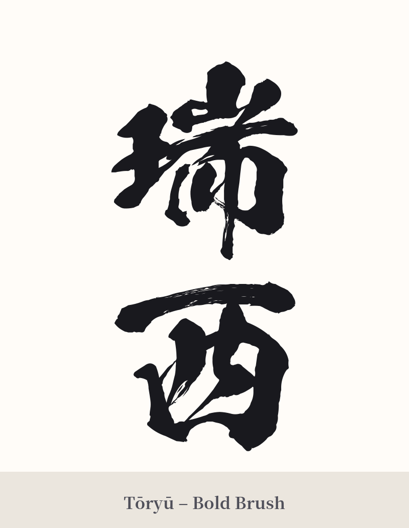
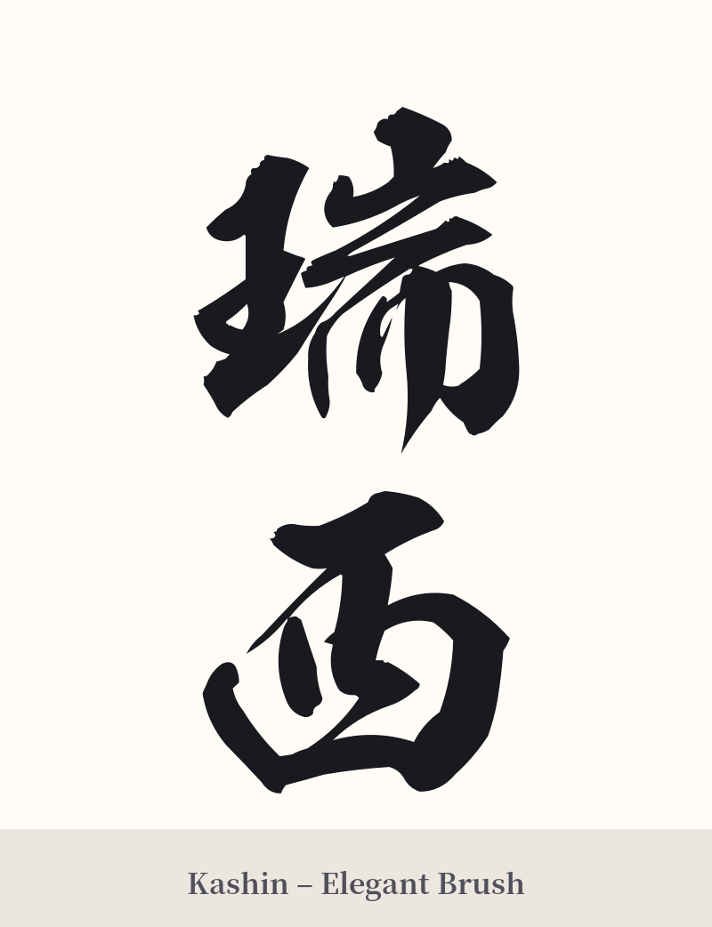
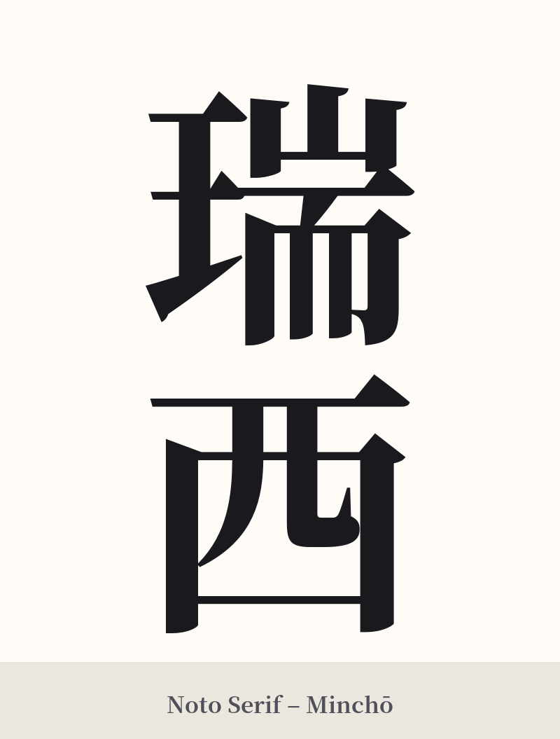
🖌️ Font Styles for 瑞西
The same kanji can look dramatically different depending on the calligraphy style. Choose a font that matches the mood you want for your tattoo or design.
🎨 Tattoo Suitability
📐 Tattoo Design Guide
For a tattoo of 瑞西, the design should honor its historical and formal nature. A traditional script is often the best choice to reflect its origins as a Meiji-era transliteration.
– Placement: This two-character compound works beautifully in a vertical orientation. Consider placing it along the forearm, the calf, or beside the spine. A horizontal placement on the chest or back is also a strong option.
– Font Style: Avoid modern or overly stylized fonts. Classic calligraphy styles like Kaisho (regular block script) will give it a dignified and clear appearance. For a slightly more fluid and artistic look, Gyosho (semi-cursive script) is an excellent choice that maintains legibility.
– Visual Tips: The first character, 瑞, has 13 strokes and is relatively complex. It is crucial to work with a tattoo artist skilled in kanji to ensure the strokes do not blur together, especially if the tattoo is small. Give it enough space to breathe. The contrast between the complex 瑞 and the simpler 西 creates a nice visual balance.
Comments