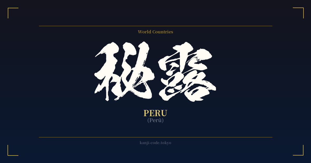
✍️ 秘露 (Perū) — Cultural Context
The word 秘露 (Perū) is a fascinating example of a system called 'Ateji' (当て字), where kanji characters are used for their phonetic values rather than their meanings. This practice was common during the Meiji Restoration (1868-1912) when Japan rapidly modernized and absorbed a flood of foreign words and concepts. Before the katakana script became the standard for foreign loanwords, scholars and officials would select kanji that approximated the sounds of a foreign name.
In this case, 秘 (hi, bi) and 露 (ro, ru) were chosen to phonetically represent 'Pe-ru.' The phonetic fit isn't perfect, which is common in Ateji. The individual meanings of the characters—秘 for 'secret' and 露 for 'dew' or 'expose'—are completely irrelevant to the country of Peru. The combination does not mean 'secret dew'; it is simply a sound-based representation.
This method created visually rich and sometimes poetic-sounding names for countries, such as 亜米利加 for America and 濠太剌利 for Australia. However, it was also cumbersome and often led to confusion, as people might mistakenly try to interpret the literal meanings of the characters. Over time, the simpler and more direct katakana script (ペルー) became the standard for writing foreign names, rendering kanji versions like 秘露 largely obsolete.
Today, 秘露 is considered archaic and is rarely seen outside of historical documents or specialized contexts. Its use evokes a sense of a bygone era, a time of cultural collision and creative adaptation. Interestingly, the Meiji period, when this Ateji was coined, also marks the beginning of significant Japanese immigration to Peru, starting in 1899. This adds a layer of historical resonance, connecting the kanji to the very people who built a bridge between the two nations. While beautiful in its own way, it exists as a linguistic artifact rather than a practical term.
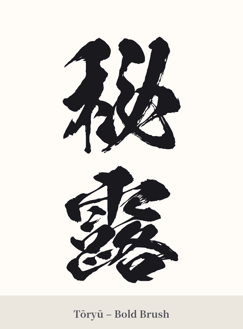
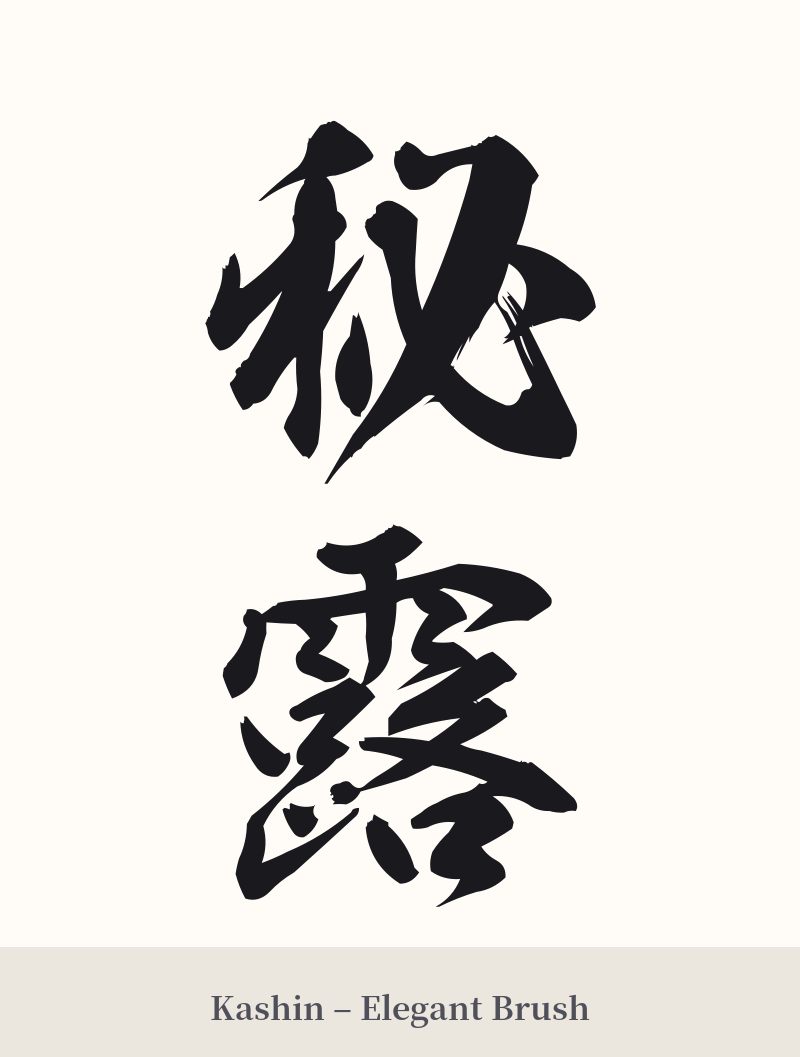
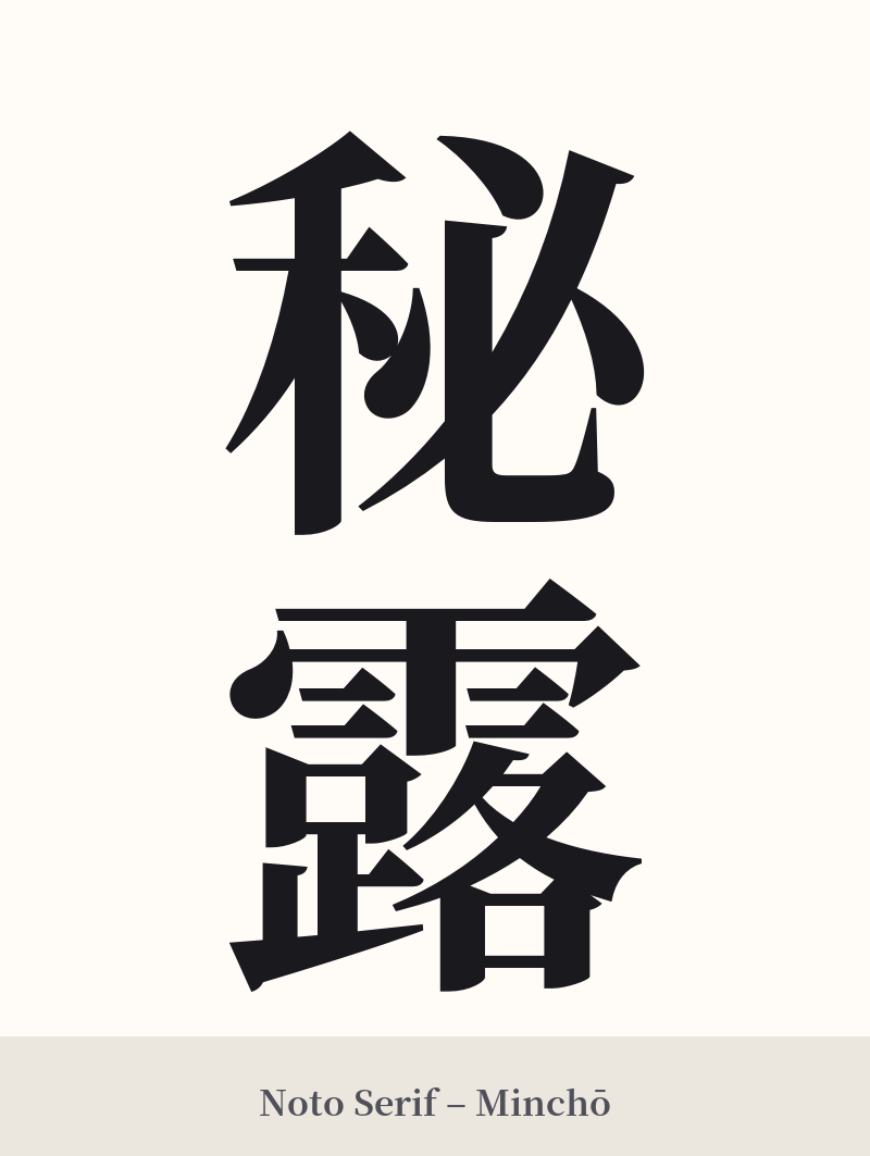
🖌️ Font Styles for 秘露
The same kanji can look dramatically different depending on the calligraphy style. Choose a font that matches the mood you want for your tattoo or design.
🎨 Tattoo Suitability
📐 Tattoo Design Guide
Due to the complexity of this kanji pair, especially the second character, careful consideration of design and placement is crucial.
– Placement: Choose a larger, flatter area of the body to ensure the design remains legible. The back, chest, or thigh are excellent choices. Avoid smaller areas like the wrist, ankle, or fingers, as the dense strokes of 露 (21 strokes) will blur together over time.
– Font Style: A clean, precise font is non-negotiable. A traditional Kaisho (block) style or a crisp Mincho (serif) style will help maintain the integrity of each stroke. Avoid highly cursive or stylized scripts like Gyosho or Sosho, as they will render the characters illegible.
– Orientation: Vertical orientation is classic for kanji and works well with this two-character compound. It allows each character to be clearly defined.
– Sizing: Do not go too small. The intricate details within 露 require a certain scale to be executed properly by a tattoo artist and to age well on the skin.
Comments