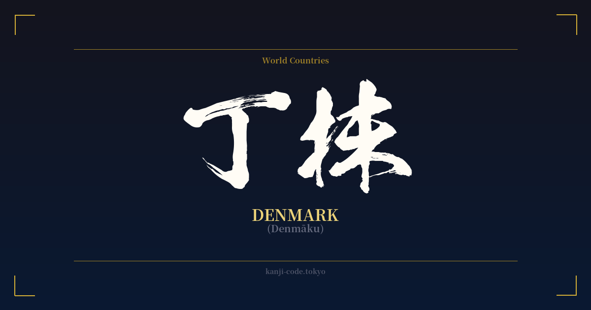
✍️ 丁抹 (Denmāku) — Contexto cultural
La palabra 丁抹 (Denmāku) ofrece una fascinante perspectiva de un período específico de la historia japonesa. Es un ejemplo de 'ateji' (当て字), una práctica que utiliza caracteres kanji por su valor fonético para representar palabras extranjeras, ignorando por completo su significado original. Este método era común durante la Restauración Meiji (finales del siglo XIX), cuando Japón se abrió rápidamente a Occidente y necesitaba formas de escribir los nombres de países, personas y conceptos desconocidos.
En este caso, se eligieron los caracteres '丁' (chō/tei) y '抹' (matsu/ma) para aproximar fonéticamente el sonido de 'Dinamarca'. El significado real de estos caracteres —'丁' se refiere a una calle o un mostrador, y '抹' significa frotar o borrar— no guarda ninguna relación con el país en sí. Este uso puramente fonético es una característica clave de los ateji para nombres extranjeros.
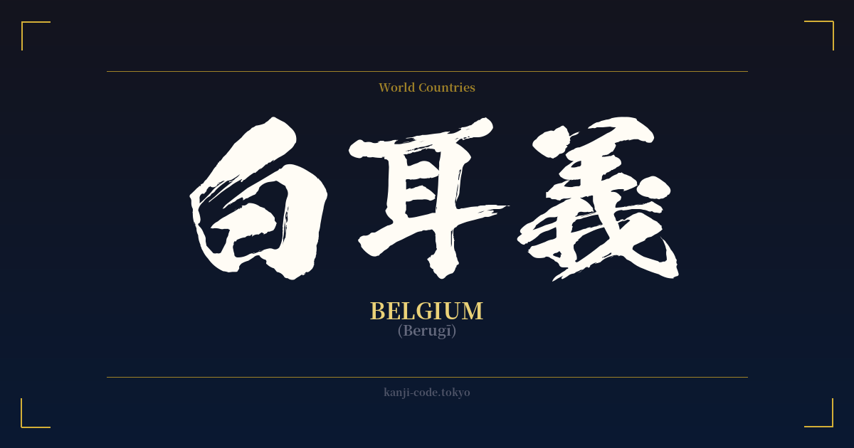
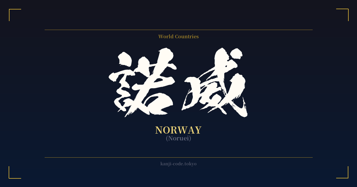
Muchos otros países adoptaron grafías kanji similares durante esta época. Por ejemplo, Estados Unidos se convirtió en '亜米利加' (Amerika), Francia en '仏蘭西' (Furansu) e Inglaterra en '英吉利' (Igirisu). Estos nombres fueron estándar en su momento, pero desde entonces han sido prácticamente reemplazados en el lenguaje cotidiano.
Hoy en día, los nombres extranjeros en japonés se escriben con katakana, un sistema de escritura silábica diseñado específicamente para ello. La forma moderna de escribir Dinamarca es デンマーク (Denmāku). Por consiguiente, el kanji 丁抹 se considera arcaico y rara vez se encuentra fuera de textos históricos o contextos especializados. Un japonés moderno probablemente no reconocería 丁抹 como Dinamarca y le resultaría confuso su significado.
A pesar de su relativa oscuridad, el 丁抹 narra una historia de intercambio cultural y adaptación lingüística. Representa el esfuerzo de Japón por catalogar y comprender el mundo exterior utilizando su sistema de escritura existente antes de la adopción generalizada del katakana para los préstamos lingüísticos. Se erige como un artefacto histórico, un testimonio de la flexibilidad y la evolución del idioma japonés.
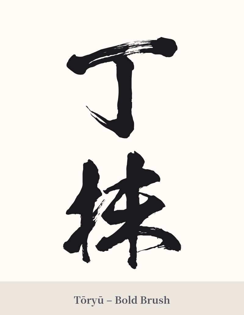
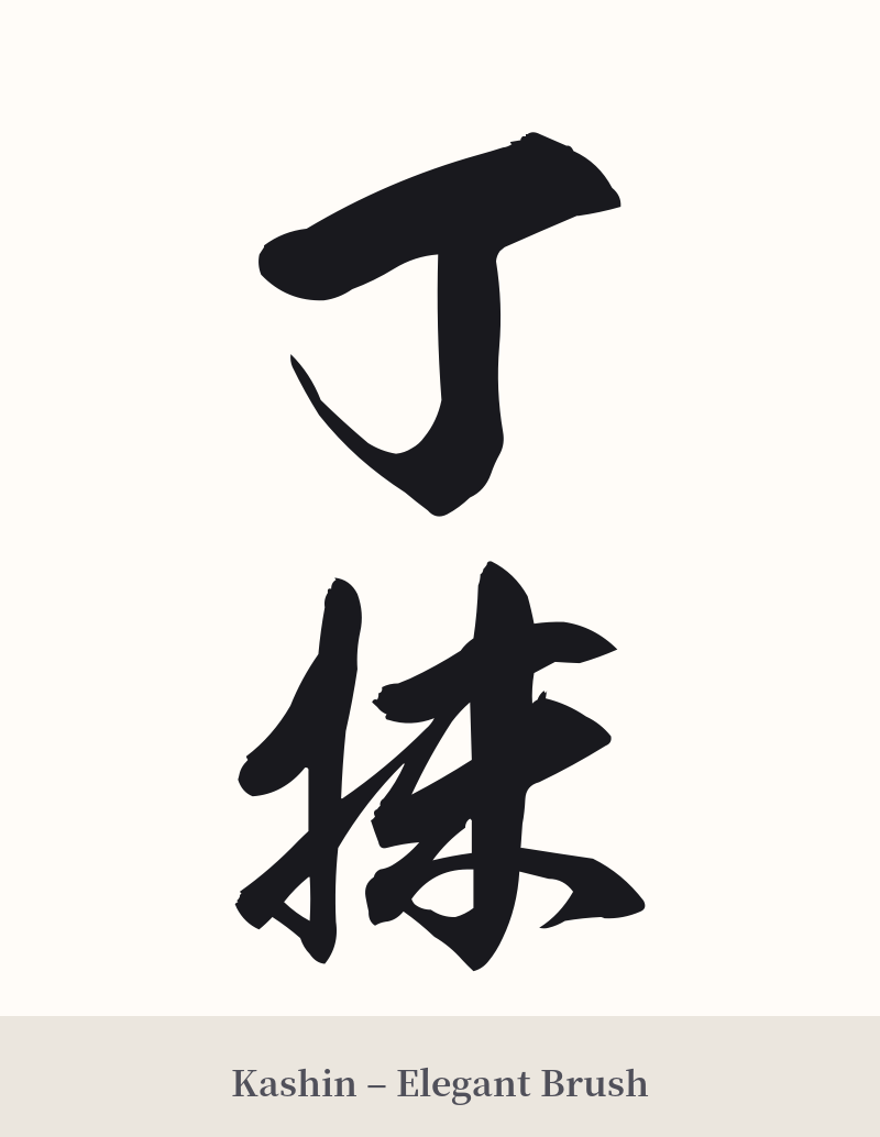
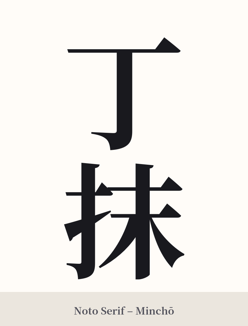
🖌️ Estilos de fuente para 丁抹
Los mismos caracteres kanji pueden verse muy diferentes según el estilo de caligrafía. Elige una fuente que se ajuste al ambiente que deseas para tu tatuaje o diseño.
🎨 Idoneidad para tatuajes
📐 Guía de diseño de tatuajes
Si decides tatuarte el símbolo de la cruz (丁抹), es fundamental comprender su carácter histórico y enigmático. El diseño debe reflejar su esencia arcaica en lugar de intentar modernizarlo.
– Ubicación: Una disposición horizontal funciona bien en el antebrazo, sobre la clavícula o a lo largo de las costillas. Para una estética más tradicional, una colocación vertical en el brazo, la pierna o la columna vertebral puede ser muy efectiva.
Estilo de fuente: Evite las fuentes modernas, geométricas o góticas. En su lugar, opte por estilos de caligrafía japonesa clásica. Una fuente formal 'Kaisho' (de imprenta) luciría elegante y distinguida, mientras que una 'Gyosho' semicursiva podría añadir un toque de elegancia histórica. Una fuente tradicional 'Mincho' también complementa su estilo clásico.
Consejos visuales: Dado que se trata de una palabra fonética, añadir imágenes basadas en el significado literal de los kanji (como una señal de tráfico o una goma de borrar) resultaría confuso. En su lugar, considérelo como una pieza independiente. Su atractivo reside en su sutileza y en la historia que encierra, lo que la convierte en un excelente tema de conversación para quienes conocen su origen.
Comentarios