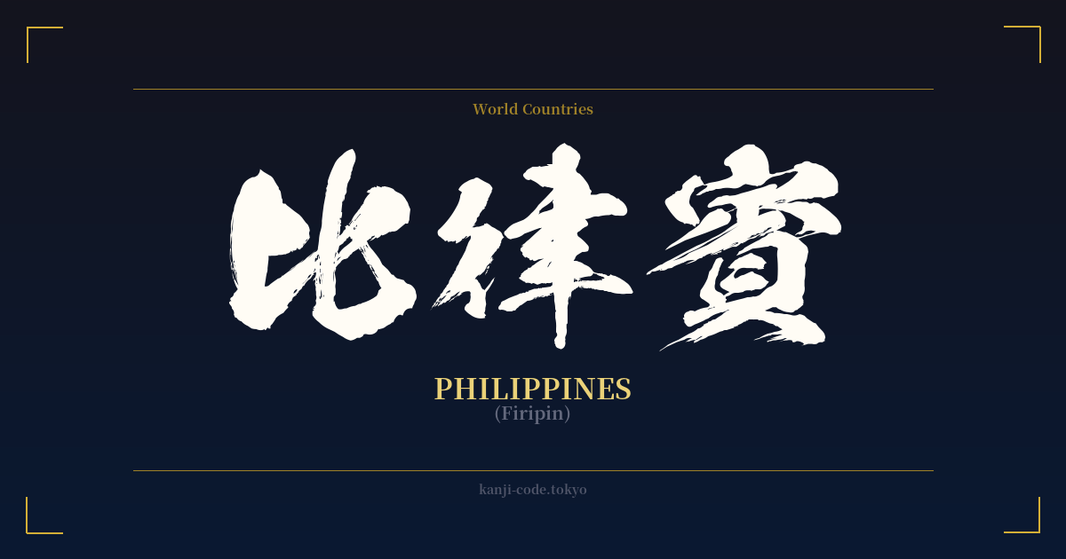
✍️ 比律賓 (Firipin) — Contexto cultural
El término 比律賓 (Firipin) ofrece una perspectiva fascinante sobre cómo Japón absorbió y representó históricamente conceptos extranjeros antes de la adopción generalizada del alfabeto Katakana para los préstamos lingüísticos. Esta práctica, conocida como ateji (当て字), consiste en asignar caracteres kanji a palabras extranjeras basándose en sus sonidos fonéticos, a menudo ignorando por completo su significado original.
En este caso, se eligieron los caracteres 比 (hi/bi), 律 (ritsu/ri) y 賓 (hin/pin) para aproximar fonéticamente el sonido de "Filipinas". Los significados individuales —"comparar", "ley/ritmo" e "invitado/VIP"— no tienen ninguna conexión semántica con la nación en sí. Se trata de una correspondencia puramente fonética, una solución lingüística creativa propia de una época en la que los kanji eran la herramienta principal para todas las formas de escritura.
Durante la era Meiji (1868-1912), cuando Japón se abrió al mundo, surgió la necesidad de transcribir los nombres de países, personas y objetos extranjeros. El sistema ateji se convirtió en el método estándar. Esto se puede observar en otros nombres de países arcaicos como 亜米利加 (Amerika) para Estados Unidos y 濠太剌利 (Ōsutoraria) para Australia. Estos nombres con kanji de varios caracteres les conferían cierto peso y dignidad, integrándolos en el sistema logográfico existente.
Sin embargo, a medida que avanzaba el siglo XX, el silabario Katakana se estandarizó como el sistema de escritura designado para los préstamos lingüísticos extranjeros. Era más sencillo, más directo y evitaba la posible confusión que suponía el uso de kanji con significados no relacionados. En consecuencia, el 比律賓 fue reemplazado gradualmente por su equivalente moderno en Katakana, el フィリピン (Firipin), que se utiliza exclusivamente en el Japón contemporáneo.
Hoy en día, es raro ver 比律賓. Puede aparecer en textos históricos, en mapas antiguos o en contextos que buscan un tono deliberadamente retro o formal. Para cualquier persona de ascendencia filipina o con alguna conexión con el país, este nombre en kanji representa una curiosidad histórica: un vestigio de una era lingüística anterior, que refleja la larga historia de intercambio cultural entre Japón y Filipinas.
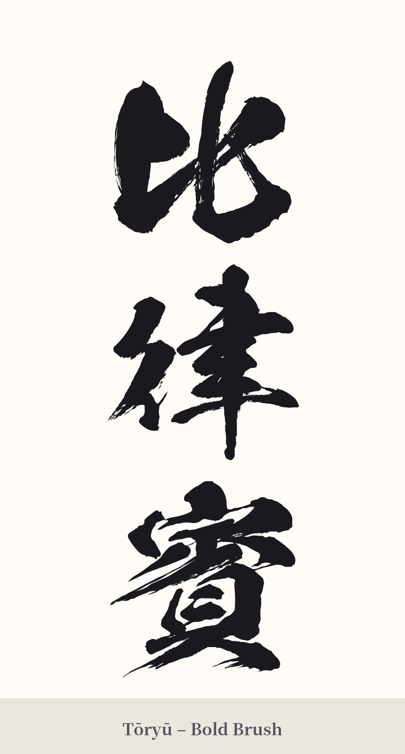
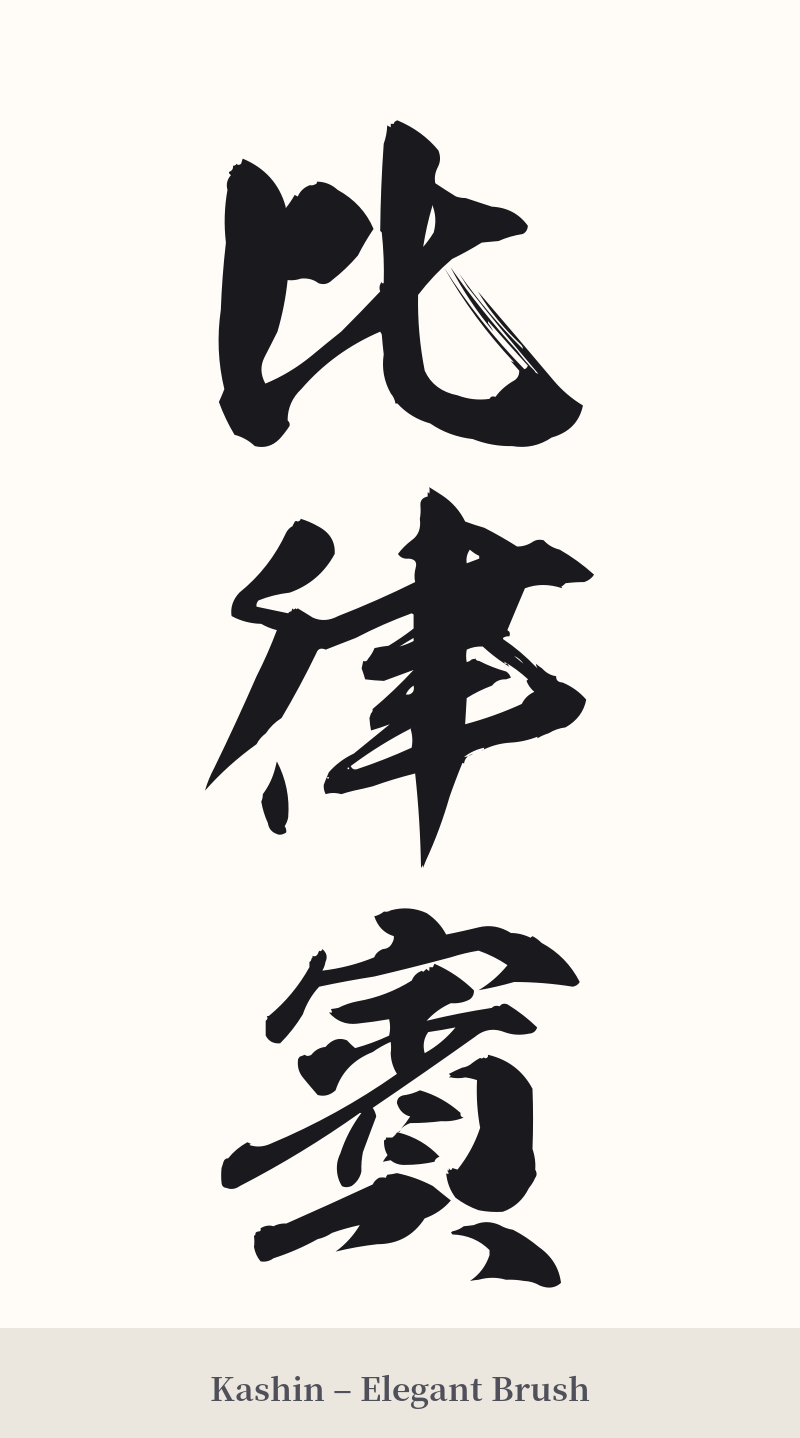
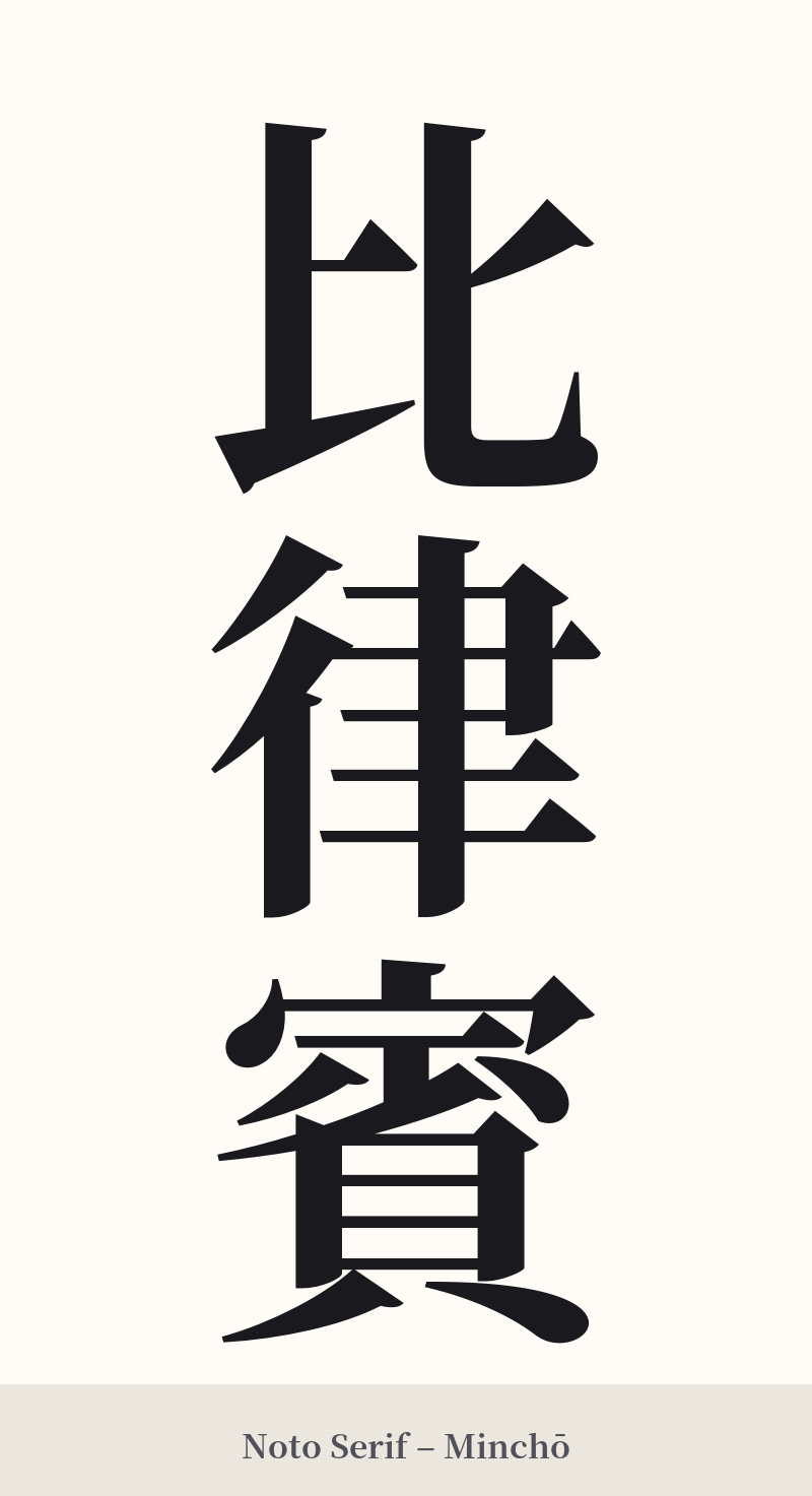
🖌️ Estilos de fuente para 比律賓
Los mismos caracteres kanji pueden verse muy diferentes según el estilo de caligrafía. Elige una fuente que se ajuste al ambiente que deseas para tu tatuaje o diseño.
🎨 Idoneidad para tatuajes
📐 Guía de diseño de tatuajes
Dado que 比律賓 es una palabra de tres caracteres, requiere una cuidadosa consideración en el diseño de un tatuaje para garantizar el equilibrio y la legibilidad.
– Ubicación: Esta composición funciona mejor en posición vertical. Las ubicaciones ideales incluyen el antebrazo, el costado de la pantorrilla o a lo largo de la columna vertebral. También es posible una colocación horizontal sobre el pecho o la parte superior de la espalda.
Estilo: Un estilo de caligrafía tradicional (shodō) honraría el carácter histórico de este término. Una escritura Gyosho semicursiva podría aportar fluidez y elegancia. Para una apariencia más sólida e impactante, una fuente Mincho o Kaisho, audaz y de líneas gruesas, enfatizaría la estructura de cada carácter, especialmente el complejo carácter final, 賓.
– Elementos visuales: Dado que los caracteres kanji son puramente fonéticos, considere combinarlos con imágenes que representen a Filipinas para darle un significado contextual al diseño. Esto podría incluir la flor de sampaguita, el sol y las estrellas de la bandera nacional o un mapa estilizado del archipiélago.
Comentarios