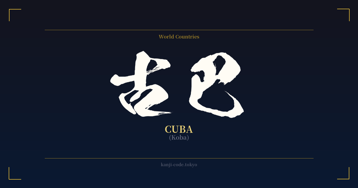
✍️ 古巴 (Koba) — Contexto cultural
La palabra japonesa 古巴 (Koba) es un ejemplo fascinante de una práctica conocida como 'ateji' (当て字), donde los caracteres kanji se utilizan para representar palabras extranjeras basándose en sus sonidos fonéticos, en lugar de sus significados.
En este caso, se eligieron 古 (ko) y 巴 (ba) para aproximar fonéticamente el nombre 'Cuba'. Este método era común durante la era Meiji (1868-1912), cuando Japón importaba rápidamente conceptos y nombres extranjeros. Países como Estados Unidos se convirtieron en 米国 (Beikoku) e Inglaterra en 英国 (Eikoku), y algunos de estos nombres ateji se conservaron en contextos formales o literarios.
Sin embargo, en la mayoría de los países, esta práctica ha sido completamente reemplazada por el uso del katakana, el alfabeto diseñado específicamente para palabras extranjeras. Hoy en día, Cuba se escribe y se reconoce universalmente en Japón como キューバ (Kyūba). La forma kanji 古巴 se considera arcaica y casi nunca se ve en la imprenta, los medios de comunicación ni las conversaciones modernas. Su aparición se limita principalmente a documentos históricos o entradas de diccionario que registran su uso pasado.
Es fundamental comprender que el significado literal de los caracteres —古, que significa 'viejo', y 巴, que representa un 'tomoe' o espiral similar a una coma— es completamente irrelevante para Cuba. Son meros marcadores fonéticos. Este es un punto común de confusión para quienes buscan una palabra japonesa para un tatuaje; el significado no es una representación poética de la nación, sino una simple transcripción fonética.
El carácter 巴 (tomo) tiene profundas raíces culturales en Japón, representando un patrón tradicional de coma o espiral. Este símbolo 'tomoe' se ve con frecuencia en los tambores taiko, como escudo de armas de las familias samurái y en la iconografía de los santuarios sintoístas. Si bien esto añade una capa interesante al carácter en sí, esta rica historia no tiene absolutamente ninguna relación con su uso en la palabra 古巴.
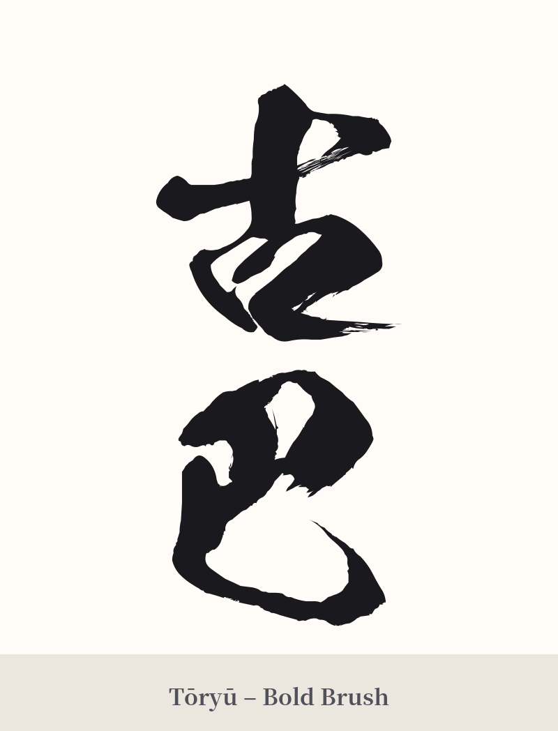
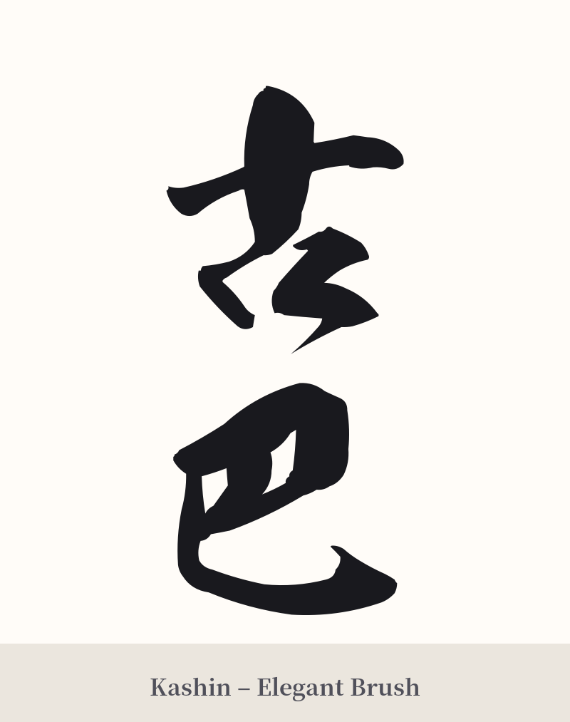
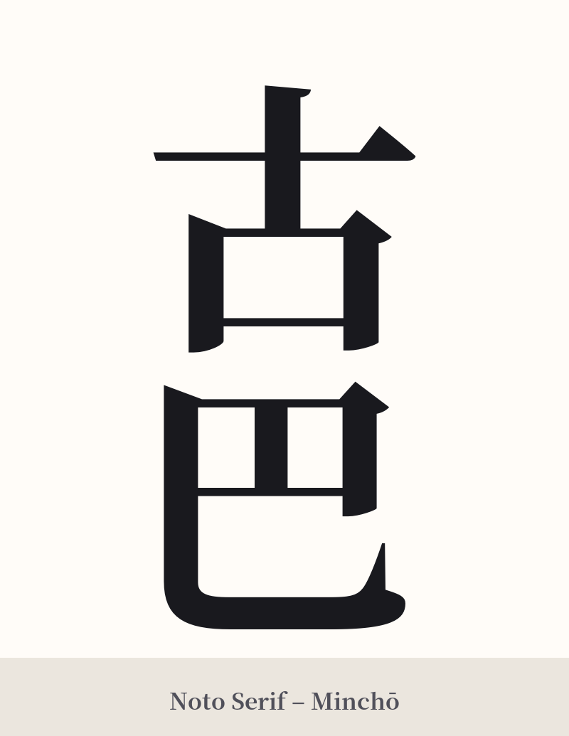
🖌️ Estilos de fuente para 古巴
Los mismos caracteres kanji pueden verse muy diferentes según el estilo de caligrafía. Elige una fuente que se ajuste al ambiente que deseas para tu tatuaje o diseño.
🎨 Idoneidad para tatuajes
📐 Guía de diseño de tatuajes
Aunque no se recomienda tatuarse la palabra 古巴 debido a su falta de conexión significativa con Cuba y su carácter arcaico, si está decidido a optar por este diseño en particular, aquí hay algunas consideraciones.
– Colocación: Una colocación horizontal en el antebrazo, el bíceps o a través de los omóplatos sería lo estándar para un compuesto de dos caracteres.
– Estilo de fuente: Debido a la simplicidad visual de los caracteres (5 y 4 trazos), una fuente débil o demasiado cursiva podría hacer que parezcan poco robustos. Opta por un estilo audaz y claro, como el estilo Kaisho (escritura en bloque) o el estilo Mincho, para darles mayor presencia.
– Elementos contextuales: Dado que los kanji por sí solos no evocan a Cuba, considere incorporar otras imágenes para contextualizar. Esto podría ser una sutil integración de los colores de la bandera cubana, la silueta de un coche clásico o un cigarro estilizado. Esto ayuda a conectar los caracteres japoneses con el tema en cuestión.
Comentarios