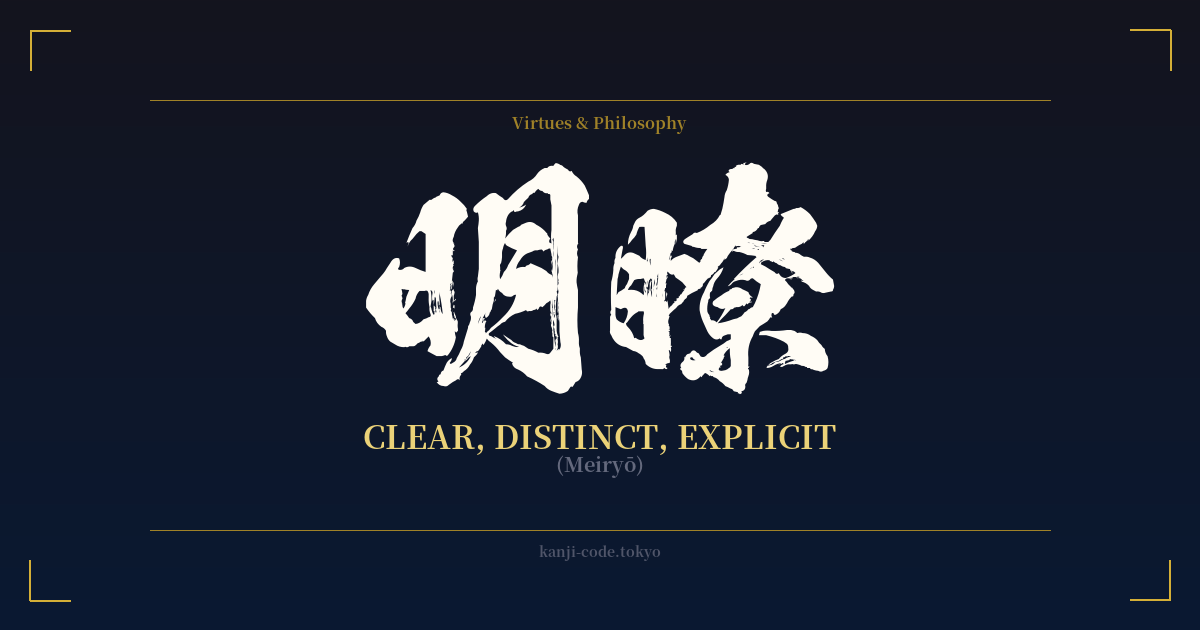
✍️ 明瞭 (Meiryō) — Cultural Context
明瞭 (Meiryō) is a Japanese word that encapsulates the essence of clarity, distinctness, and explicitness. It’s a term that feels both intellectual and perceptual, describing something that is not just clear in a factual sense, but is also easy to see, understand, and perceive without any ambiguity.
In Japanese culture, the value of clarity permeates many disciplines. In communication, while indirectness is often prized, there are times when 明瞭 is paramount, especially in legal, technical, or academic contexts. A contract must have 明瞭な条件 (meiryō na jōken – clear conditions), and a scientific paper must present its findings with 明瞭な説明 (meiryō na setsumei – a clear explanation). This makes 明瞭 a word associated with precision, intelligence, and undeniable truth.
The philosophical roots of clarity are also deep. In Zen Buddhism, achieving a state of mental clarity—a mind free from the 'clouds' of worldly desire and distraction—is a central goal. While other words like 悟り (satori) refer to enlightenment itself, 明瞭 can describe the quality of a mind that is on that path: lucid, perceptive, and unburdened by confusion. It represents the ability to see things as they truly are.
The characters themselves tell a beautiful story. 明 is a combination of 日 (sun) and 月 (moon), the two primary sources of light for the ancient world. Together, they create a powerful symbol of brightness and illumination. The second character, 瞭, features the radical for 'eye' (目) on its left side, directly linking the concept of clarity to the act of seeing. Thus, 明瞭 literally suggests a 'bright and clear view.'
Compared to its more common cousin, 明確 (meikaku), which also means 'clear,' 明瞭 carries a slightly different nuance. While 明確 often refers to something being definite or unambiguous (like a rule), 明瞭 often describes the quality of the communication or perception itself. A voice can be 明瞭 (clear and easy to hear), and a line of reasoning can be 明瞭 (clear and easy to follow). It is the quality of being free from obscurity.
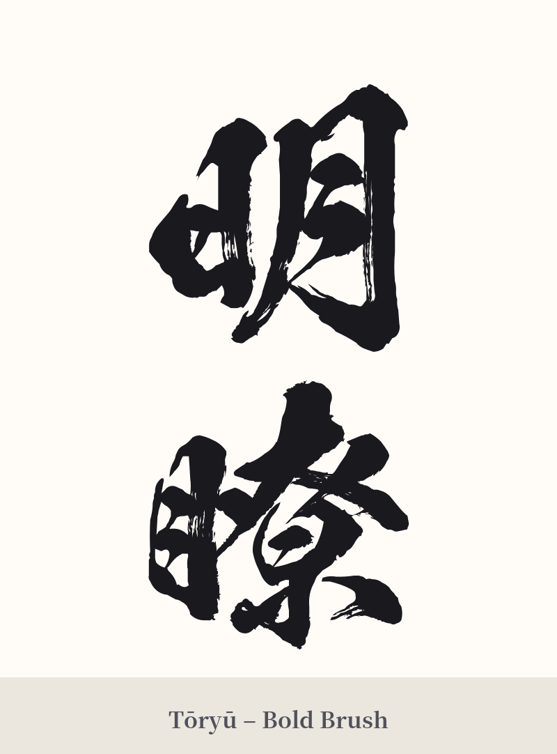
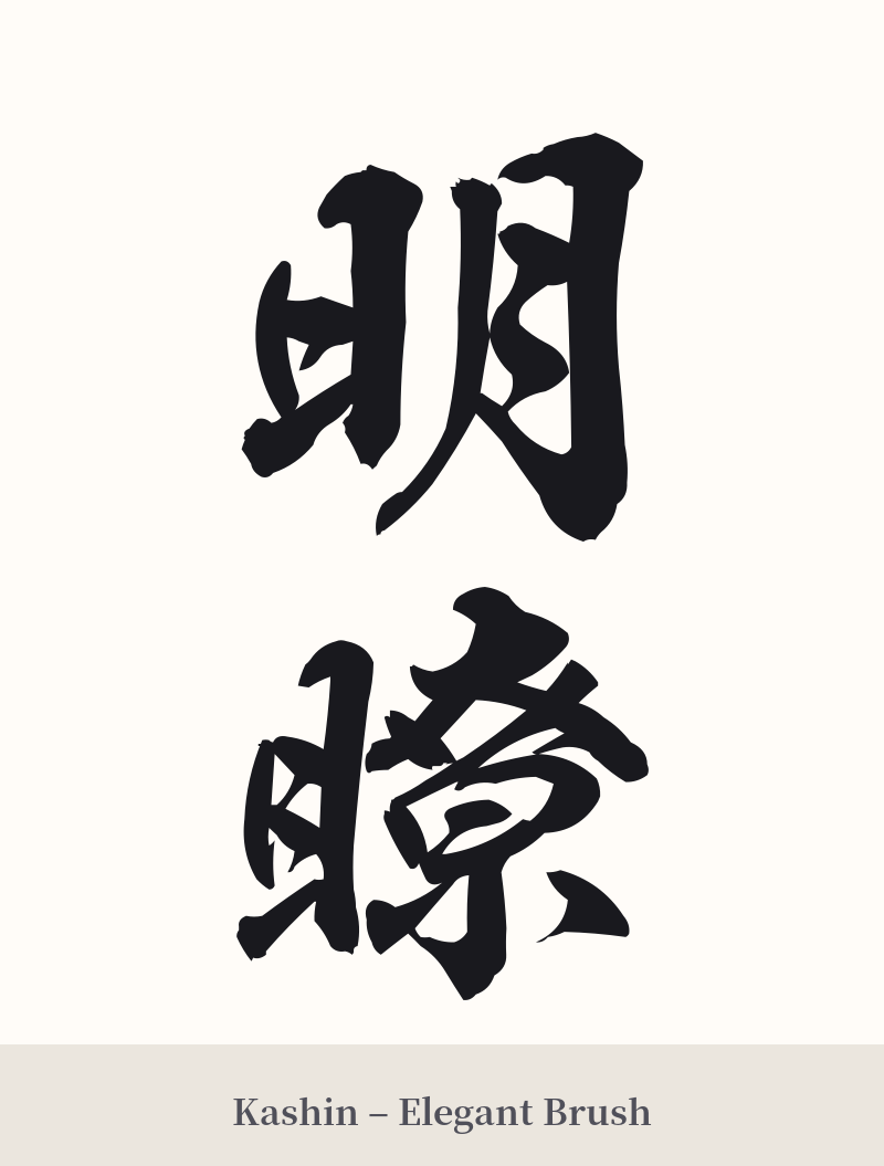
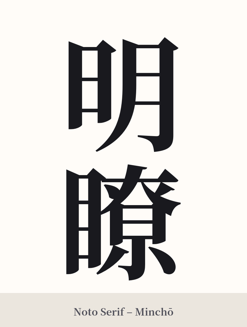
🖌️ Font Styles for 明瞭
The same kanji can look dramatically different depending on the calligraphy style. Choose a font that matches the mood you want for your tattoo or design.
🎨 Tattoo Suitability
📐 Tattoo Design Guide
For a tattoo of 明瞭, the primary consideration is legibility, especially for the second character, 瞭. Its 17 strokes demand space and precision.
– Placement: Choose a flat, larger surface area. The forearm, calf, upper back, or chest are ideal. Avoid small or highly curved areas like the wrist or ankle, as this will compromise the detail.
– Orientation: Vertical text is the traditional and most aesthetically pleasing orientation for multi-character kanji. It allows the characters to flow into one another naturally.
– Font Style: To honor the meaning of 'clarity,' a clean, crisp font is highly recommended. A standard Mincho (serif) style or a modern, sharp Kaisho (block) style would work beautifully. While a dynamic Gyosho (cursive) script can be beautiful, it might make the complex 瞭 character difficult to decipher, undermining the tattoo's core meaning.
Comments