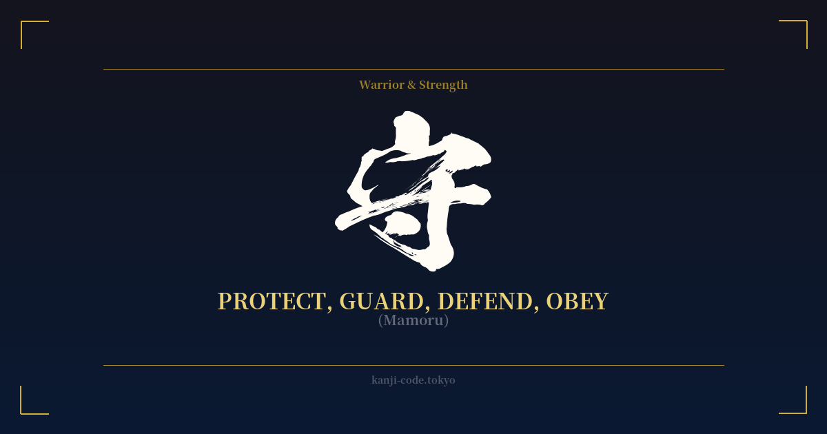
✍️ 守 (Mamoru) — Cultural Context
The kanji 守 (mamoru) is a character steeped in the concepts of duty, loyalty, and guardianship, making it one of the most resonant symbols in Japanese culture. Its meaning goes far beyond simple physical defense; it embodies the act of shielding what is precious, whether it be a person, a principle, an ideal, or a promise.
The character's origin provides a clue to its foundational meaning. It is a pictograph combining the radical 宀 (ukannuri), representing a roof or shelter, with 寸 (sun), which originally depicted a hand or measurement. Together, they create the image of a hand providing protection under a roof, symbolizing the act of guarding something within a safe space. This conveys a sense of steadfast, watchful care.
In the context of Japanese history, 守 is intrinsically linked to the samurai and their code of Bushido. A warrior's ultimate duty was to protect their lord, their family, and their domain. This protection was not merely a job but a sacred obligation tied to honor. To fail in this duty was to lose one's purpose and standing. The kanji, therefore, evokes a powerful sense of unwavering loyalty and commitment to a higher cause.
This idea of protection is deeply embedded in Japanese spirituality, most famously through お守り (omamori). These are protective amulets or charms sold at Shinto shrines and Buddhist temples. Each omamori is dedicated to a specific purpose—such as traffic safety, success in exams, or good health—and is believed to contain the spiritual essence or power of a deity to guard its owner. The very name uses this kanji, highlighting its role as a vessel of divine protection in everyday life.
In modern language, 守 remains a versatile and common character. It's used in words like 守護 (shugo, safeguard/protection), 留守 (rusu, being away from home, literally 'staying to guard'), and 子守唄 (komoriuta, lullaby, literally 'child-protecting song'). It speaks to a quiet, constant strength—the resolve to stand firm and shield others from harm, to uphold one's word, and to preserve what matters most.
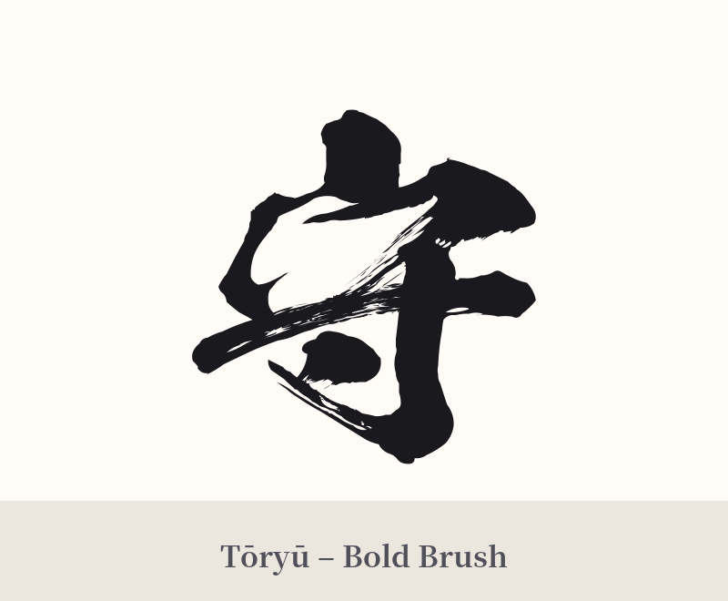
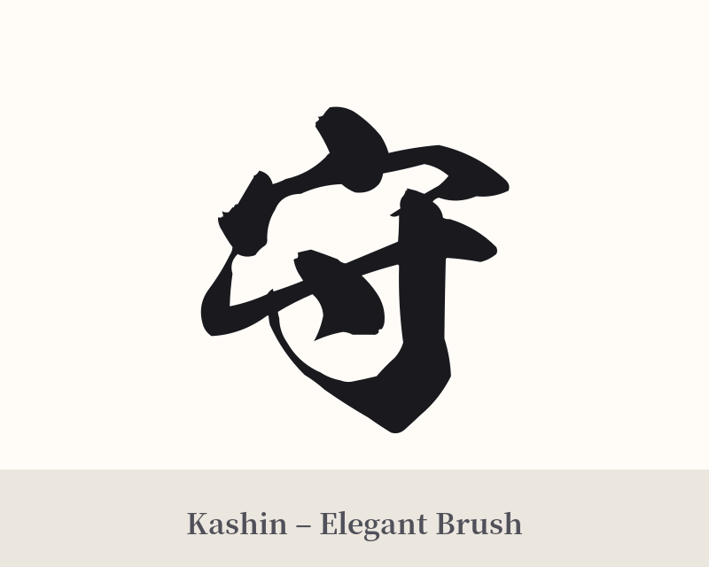
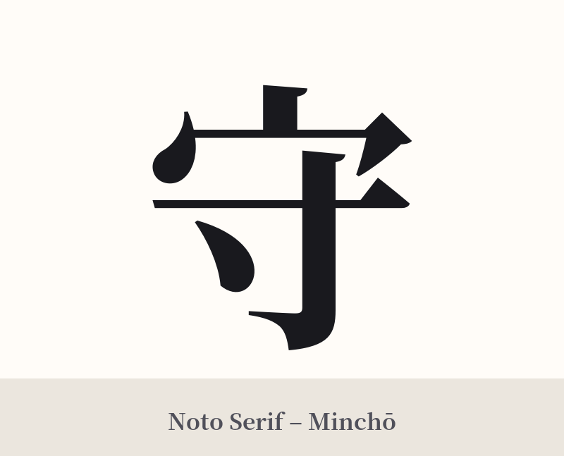
🖌️ Font Styles for 守
The same kanji can look dramatically different depending on the calligraphy style. Choose a font that matches the mood you want for your tattoo or design.
🎨 Tattoo Suitability
📐 Tattoo Design Guide
The kanji 守 offers a blend of simplicity and profound meaning, making it a versatile choice for a tattoo design.
– Placement: For a personal and symbolic statement, placing it over the heart on the chest is very powerful. The inner forearm, bicep, or the back of the neck are also excellent spots where the character's clean lines can be appreciated. The shoulder blade is another classic location, suggesting a guardian's presence.
– Style: A bold, strong Kaisho (block script) font emphasizes the kanji's stability and steadfastness, perfect for conveying unwavering protection. For a more dynamic and personal feel, a semi-cursive Gyosho script can add a sense of fluid, active guardianship. A heavily stylized Sosho (cursive) can appear almost like a sigil of protection.
– Pairings: While strong on its own, 守 can be paired with other elements to add context. Consider incorporating it into a design with a dragon (a powerful guardian in East Asian folklore), a lotus flower (symbolizing purity worth protecting), or a family crest (kamon) to signify the protection of one's lineage.
Comments