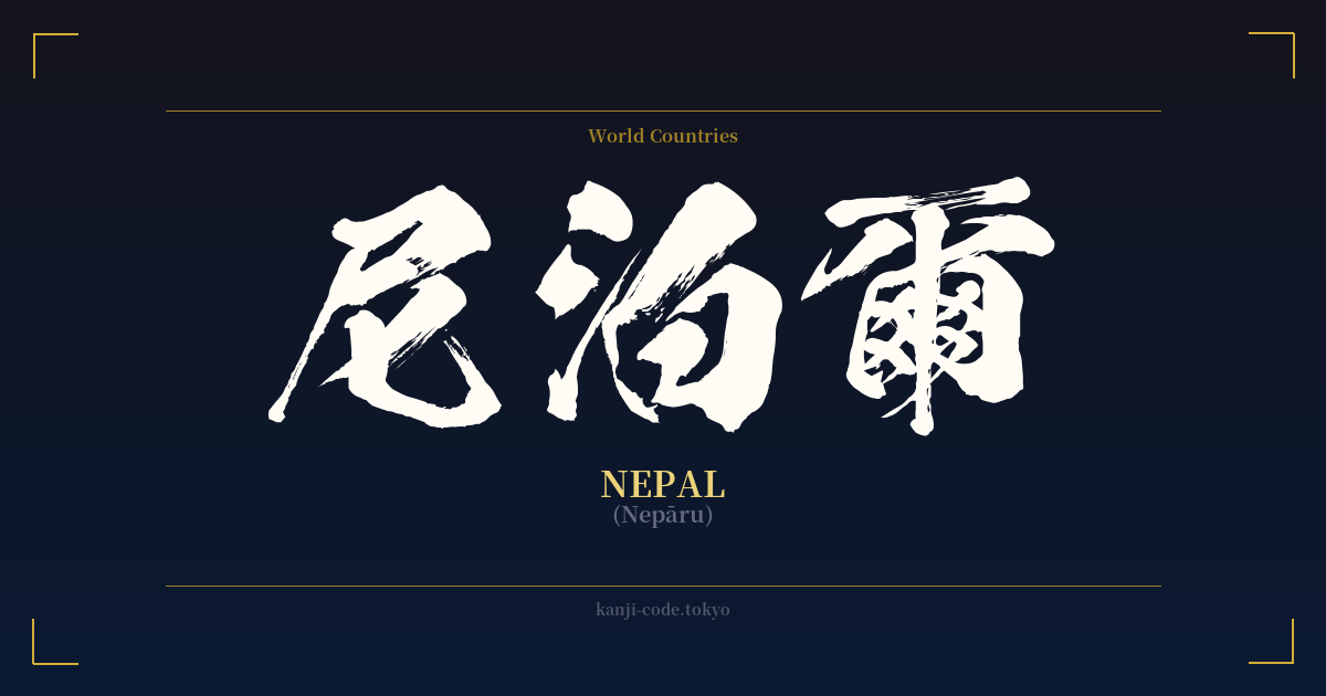
✍️ 尼泊爾 (Nepāru) — Cultural Context
The word 尼泊爾 (Nepāru) is a fascinating example of a Japanese linguistic practice known as 'ateji' (当て字), where kanji characters are used for their phonetic values rather than their literal meanings. This method was widely employed, especially during the Meiji Restoration and earlier periods, to transliterate foreign names and concepts before the Katakana script became the standard for such words.
In this case, the characters 尼 (ne), 泊 (pā), and 爾 (ru) were selected to approximate the sound of "Nepal." Individually, these kanji have completely unrelated meanings: 尼 means "nun," 泊 means "to stay overnight," and 爾 is an archaic term for "you." The combination is purely a sound-based puzzle, a testament to the ingenuity of scholars and translators creating a written form for a foreign place name using the tools they had.
Today, the use of 尼泊爾 is considered archaic and has been almost entirely replaced by the Katakana script: ネパール (Nepāru). You might still encounter 尼泊爾 in highly formal documents, historical texts, or in contexts that intentionally evoke a classic, old-world feel. However, in everyday conversation, news media, and modern writing, Katakana is the exclusive choice.
Despite the semantic randomness of the kanji, there's a beautiful, albeit coincidental, cultural resonance. Nepal is the birthplace of Siddhartha Gautama, the Buddha, and is a country deeply steeped in Buddhist and Hindu traditions. The character 尼 for "nun" inadvertently touches upon this monastic and spiritual heritage. This connection, while not intended by the word's creators, adds a layer of serendipitous depth for those who appreciate the shared spiritual history between Japan and Nepal. This link is further strengthened by a mutual reverence for nature, from Japan's sacred forests and mountains to Nepal's towering Himalayas, which have captivated Japanese mountaineers for decades.
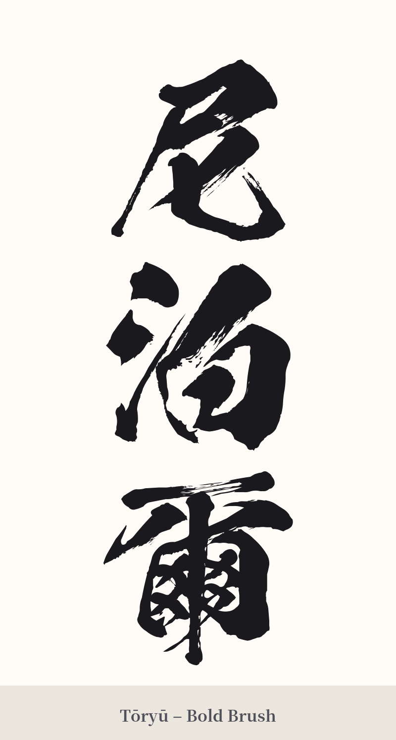
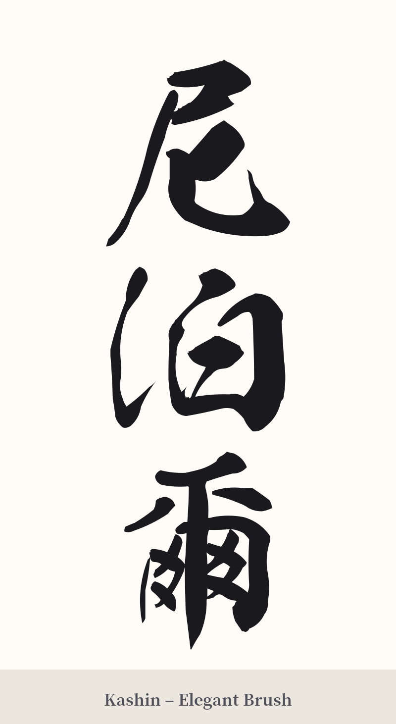
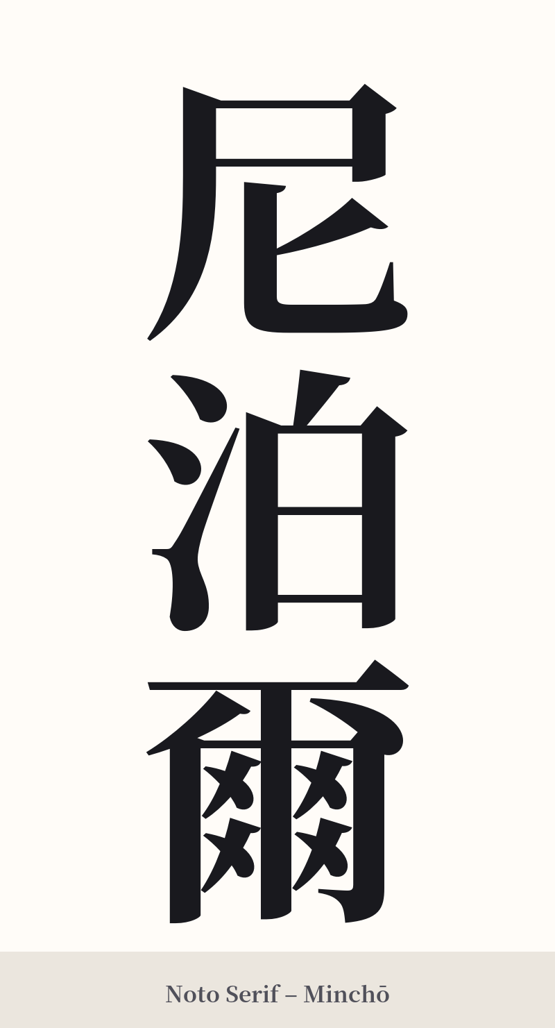
🖌️ Font Styles for 尼泊爾
The same kanji can look dramatically different depending on the calligraphy style. Choose a font that matches the mood you want for your tattoo or design.
🎨 Tattoo Suitability
📐 Tattoo Design Guide
For a tattoo of 尼泊爾, the three-character structure lends itself beautifully to a vertical arrangement. This is the traditional way of writing in Japanese and would look excellent running down the spine, forearm, or calf.
– Placement: A vertical layout is highly recommended to honor its traditional origins. A horizontal design is possible but less common for multi-character kanji compounds.
– Font Style: Opt for classic calligraphy styles. A formal 'Kaisho' (block script) will give it clarity and structure, while a semi-cursive 'Gyosho' can add a more fluid, artistic feel. Avoid overly modern or digital-looking fonts, as they would clash with the historical nature of this 'ateji' word.
– Visual Tips: The last character, 爾, is the most complex with 14 strokes. Ensure your tattoo artist is skilled in kanji and can render it clearly without the lines bleeding together, especially if the tattoo is small. Proper spacing between the three characters is key to achieving a balanced and aesthetically pleasing design.
Comments