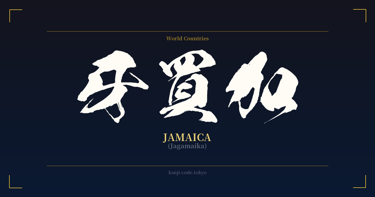
✍️ 牙買加 (Jagamaika) — Contexto cultural
La palabra 牙買加 (Jagamaika) ofrece una perspectiva fascinante sobre cómo Japón ha asimilado y representado históricamente palabras extranjeras. Este es un ejemplo perfecto de 'ateji' (当て字), una práctica en la que los kanji se utilizan por su sonido fonético en lugar de por su significado literal. En este caso, los caracteres 牙 (ja/ga), 買 (mai) y 加 (ka) se eligieron para aproximar el sonido de 'Jamaica'.
Este método era común durante la era Meiji (1868-1912) y antes, cuando Japón se modernizaba rápidamente y se veía inundado de nuevos conceptos y nombres procedentes de Occidente. Los escribas y eruditos seleccionaban kanji que sonaran como la palabra extranjera, a menudo sin tener en cuenta el significado original de los caracteres. Esto dio lugar a combinaciones como 牙買加, que se traduce literalmente como 'colmillo-comprar-añadir', una frase sin sentido que solo cobra sentido al comprender su significado fonético.
Hoy en día, el uso de ateji para los nombres de países es en gran medida arcaico. El sistema de escritura japonés moderno favorece abrumadoramente el katakana (un silabario fonético) para las palabras extranjeras. La forma estándar y cotidiana de escribir 'Jamaica' es ジャマイカ. Ver 牙買加 en un contexto moderno es extremadamente raro. Puede aparecer en un artículo de colección, en un texto histórico o como una elección deliberadamente retro o artística. Posee cierto encanto erudito y de antaño, pero no es práctico para la comunicación diaria.
A pesar de la rareza de su forma kanji, la cultura japonesa siente un profundo y genuino aprecio por Jamaica, especialmente por su música. El reggae, y Bob Marley en particular, cosechó un público apasionado en Japón a partir de la década de 1970. Esta conexión cultural es vibrante y perdura hoy en día a través de festivales de música, sistemas de sonido y comunidades de fans incondicionales. Sin embargo, toda la comunicación y la imagen de marca en torno a este intercambio cultural utilizan el katakana moderno (ジャマイカ), lo que subraya aún más la singularidad de esta forma kanji.
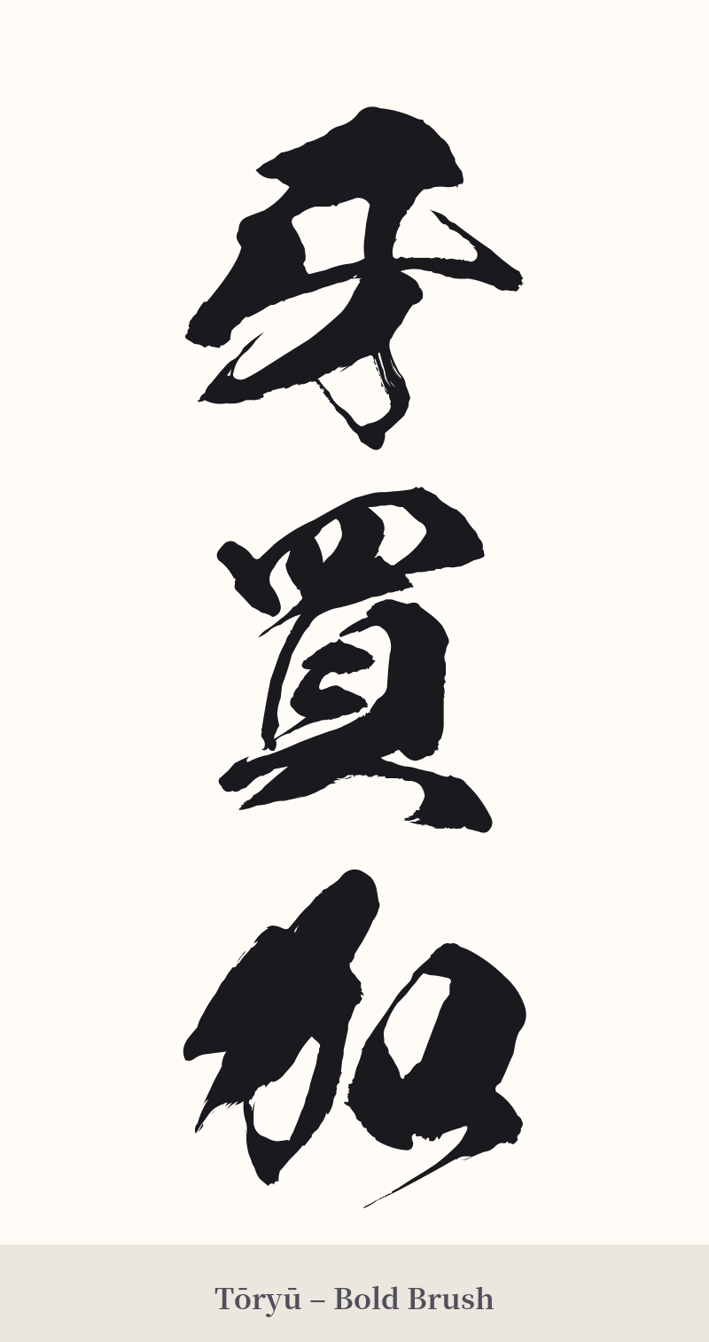
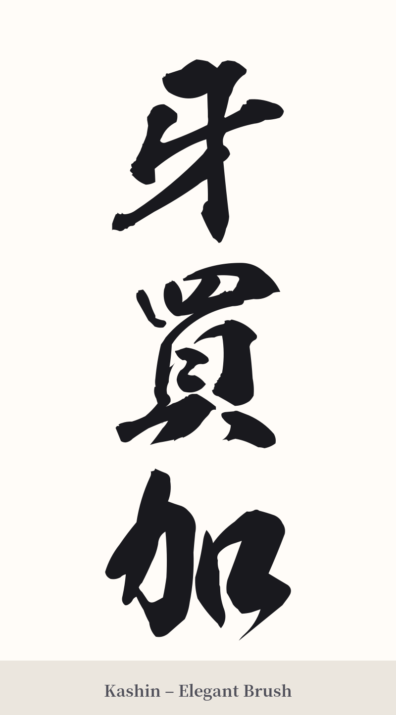
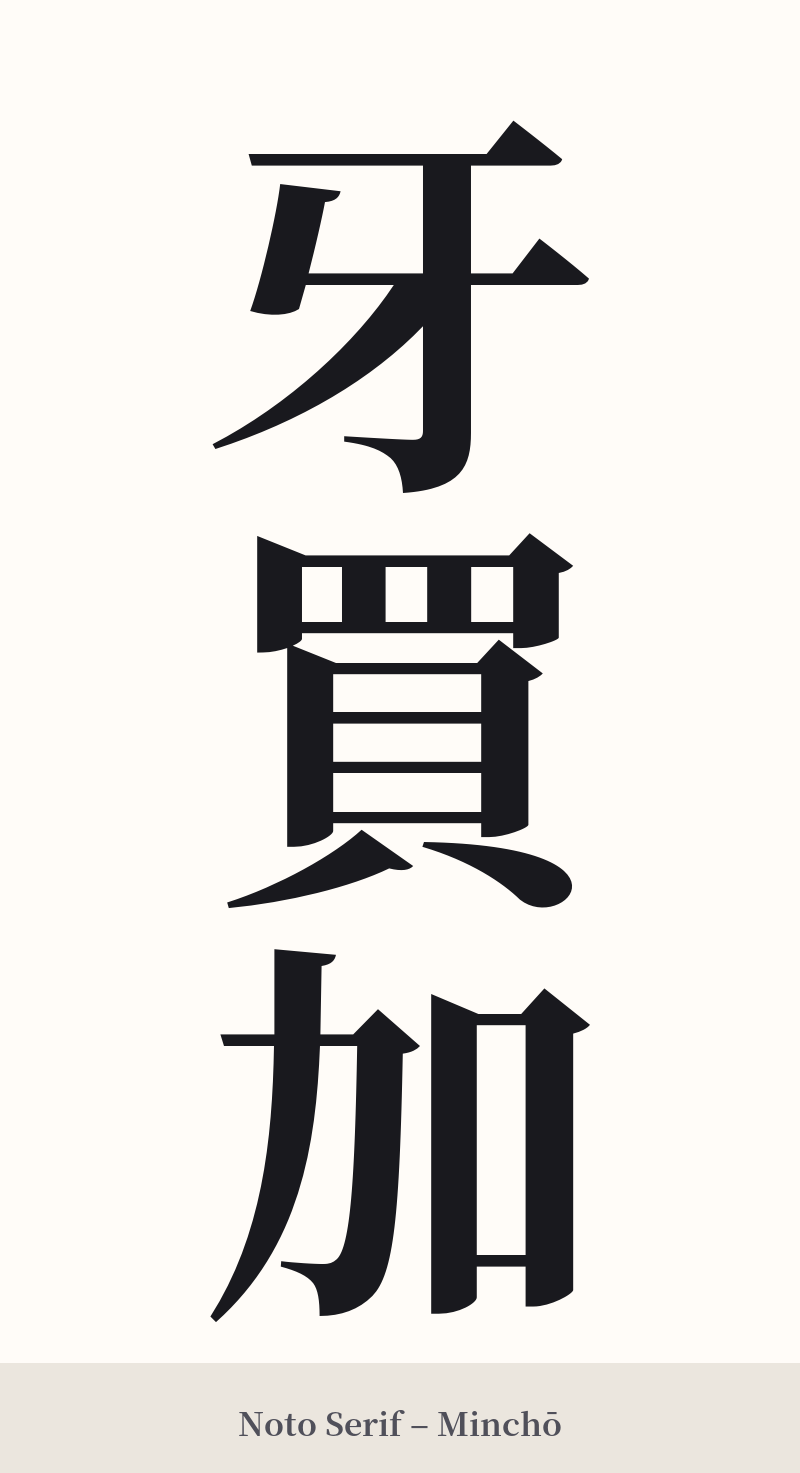
🖌️ Estilos de fuente para 牙買加
Los mismos caracteres kanji pueden verse muy diferentes según el estilo de caligrafía. Elige una fuente que se ajuste al ambiente que deseas para tu tatuaje o diseño.
🎨 Idoneidad para tatuajes
📐 Guía de diseño de tatuajes
Dado que 牙買加 es una ortografía fonética arcaica, el diseño debería adoptar su naturaleza tradicional y ligeramente peculiar.
– Ubicación: Se recomienda encarecidamente la orientación vertical. Esto se ajusta a la escritura japonesa tradicional y realza la estética clásica de los kanji. Lugares como el antebrazo, la pantorrilla o la columna vertebral funcionan muy bien para un diseño vertical de tres caracteres.
– Estilo de fuente: Opte por un estilo tradicional de pinceladas. Una fuente Gyosho (semicursiva) o incluso una Sosho (cursiva) legible pueden capturar la esencia artística e histórica de ateji. Evite las fuentes modernas, de bloques o geométricas, ya que desentonarían con la esencia arcaica de la palabra.
Contexto visual: Dado que los kanji en sí mismos carecen de significado en este contexto, considere agregar un pequeño elemento visual complementario para brindar claridad. Un sutil toque de los colores rastafari (rojo, dorado, verde), un león estilizado u otro símbolo asociado con Jamaica pueden ayudar a comprender mejor el significado literal del texto.
Comentarios