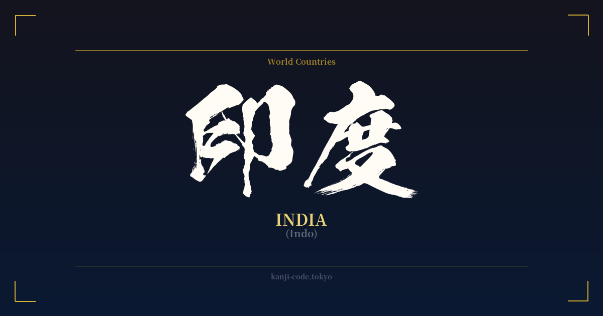
✍️ 印度 (Indo) — Contexto cultural
La palabra japonesa para India, 印度 (Indo), es un ejemplo fascinante de cómo el lenguaje se adapta para incorporar el mundo. A diferencia de los kanji, que transmiten ideas abstractas, 印度 es lo que se conoce como 'ateji' (当て字), donde los caracteres se eligen principalmente por su valor fonético para representar una palabra extranjera, y a menudo se ignoran sus significados originales.
El origen de este nombre es una historia de transmisión global. Proviene del nombre sánscrito del río Indo, 'Sindhu'. Este término viajó a Persia, donde se convirtió en 'Hind', y luego a la antigua Grecia como 'Indos'. El sonido finalmente llegó al chino y luego al japonés, donde se seleccionaron los caracteres 印 (in) y 度 (do) para aproximar su pronunciación.
Curiosamente, el carácter 印 puede significar 'marca' o 'sello', pero también tiene una asociación histórica con la India. El carácter 度 significa 'grados' o 'ocurrencia'. En el contexto de 印度, estos significados individuales son secundarios; lo que más importa son sus sonidos. Este préstamo fonético es una práctica común en japonés para nombrar países extranjeros, como 米国 (Beikoku) para Estados Unidos, donde 米 se usa por su sonido 'bei' (de 'America').
Antes de que 印度 se convirtiera en el término estándar, Japón utilizaba un nombre más poético e histórico: 天竺 (Tenjiku). Traducido literalmente como 'Morada Celestial' o 'Bambú Celestial', Tenjiku era el nombre utilizado en las escrituras budistas para referirse a la tierra donde se originó el budismo. Evoca una sensación de misterio ancestral y significado espiritual, y aparece con frecuencia en la literatura clásica y el folclore, como en el relato de 'Viaje al Oeste'.'
Hoy en día, 印度 es el nombre oficial y cotidiano de la nación de la India en Japón. Aparece en mapas, noticias y en todos los contextos modernos. Si bien Tenjiku aún se entiende, conserva un marcado carácter arcaico y literario. El cambio de Tenjiku a Indo refleja la modernización de Japón y su transición hacia un sistema de nombres de países más estandarizado y alineado con los estándares internacionales.
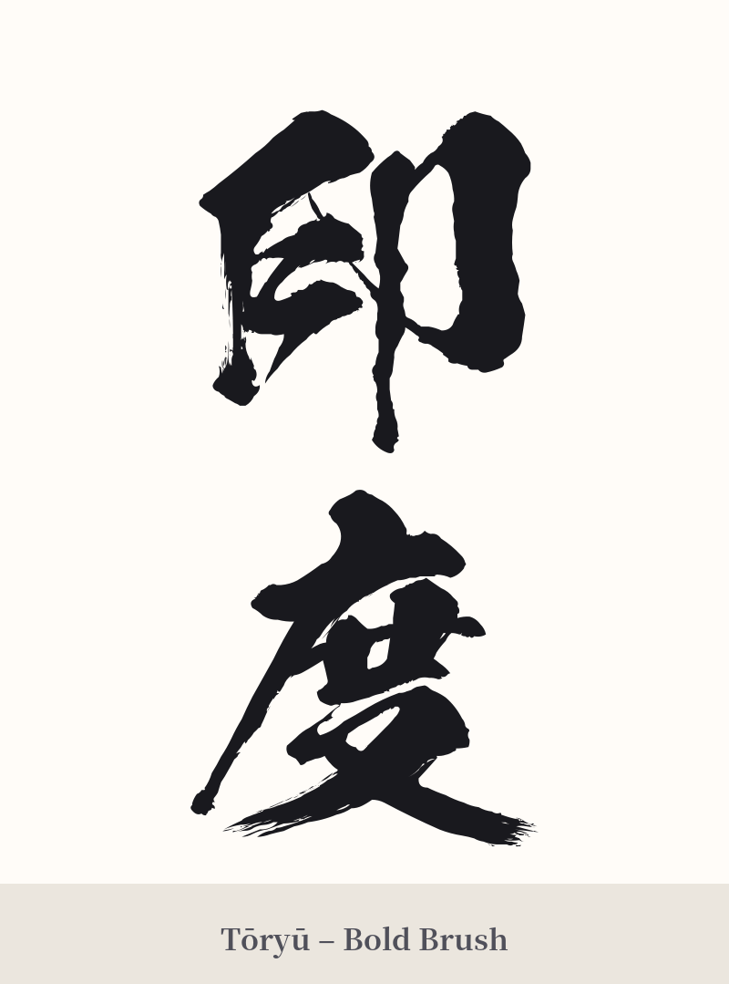
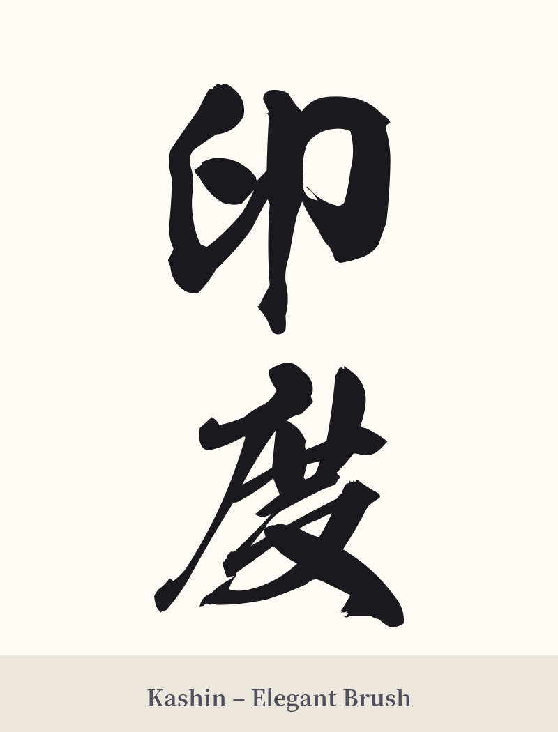
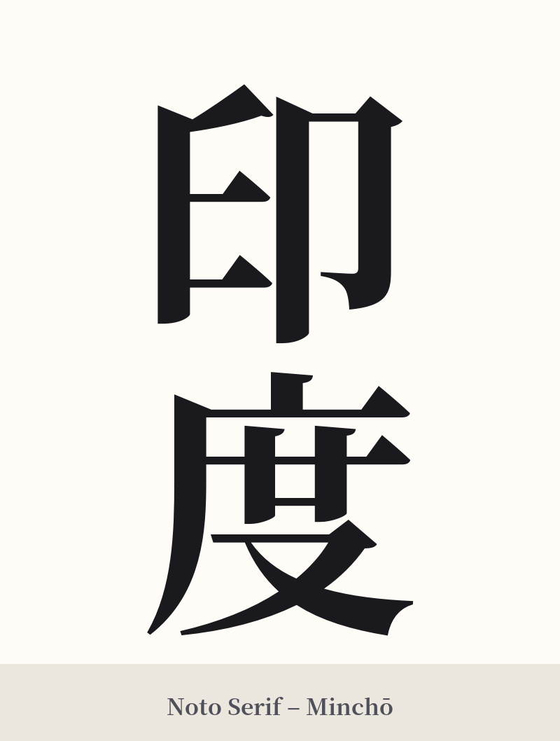
🖌️ Estilos de fuente para 印度
Los mismos caracteres kanji pueden verse muy diferentes según el estilo de caligrafía. Elige una fuente que se ajuste al ambiente que deseas para tu tatuaje o diseño.
🎨 Idoneidad para tatuajes
📐 Guía de diseño de tatuajes
Para un tatuaje de 印度, el diseño debe respetar su naturaleza como topónimo de dos caracteres. Tanto la alineación vertical como la horizontal funcionan bien.
– Ubicación: Una columna vertical en el antebrazo, la pantorrilla o a lo largo de la columna vertebral puede verse elegante. Para un diseño horizontal, la nuca, el pecho o la parte interna del bíceps son opciones excelentes.
– Estilo de fuente: Una fuente Kaisho (de imprenta) nítida y clara resalta la forma de los caracteres y es muy legible. Para un estilo más artístico y fluido, una fuente Gyosho (semicursiva) o Sosho (cursiva) puede añadir dinamismo, pero es fundamental que el artista domine la caligrafía japonesa para mantener la legibilidad.
Elementos visuales: Si bien los kanji pueden usarse solos, considere combinarlos con imágenes que reflejen su conexión personal con la India. Una delicada flor de loto, un mandala o elementos inspirados en el arte tradicional indio podrían integrarse alrededor o detrás de los caracteres. Sin embargo, tenga cuidado de hacerlo con respeto y evite crear un collage de símbolos culturales inconexos.
Comentarios