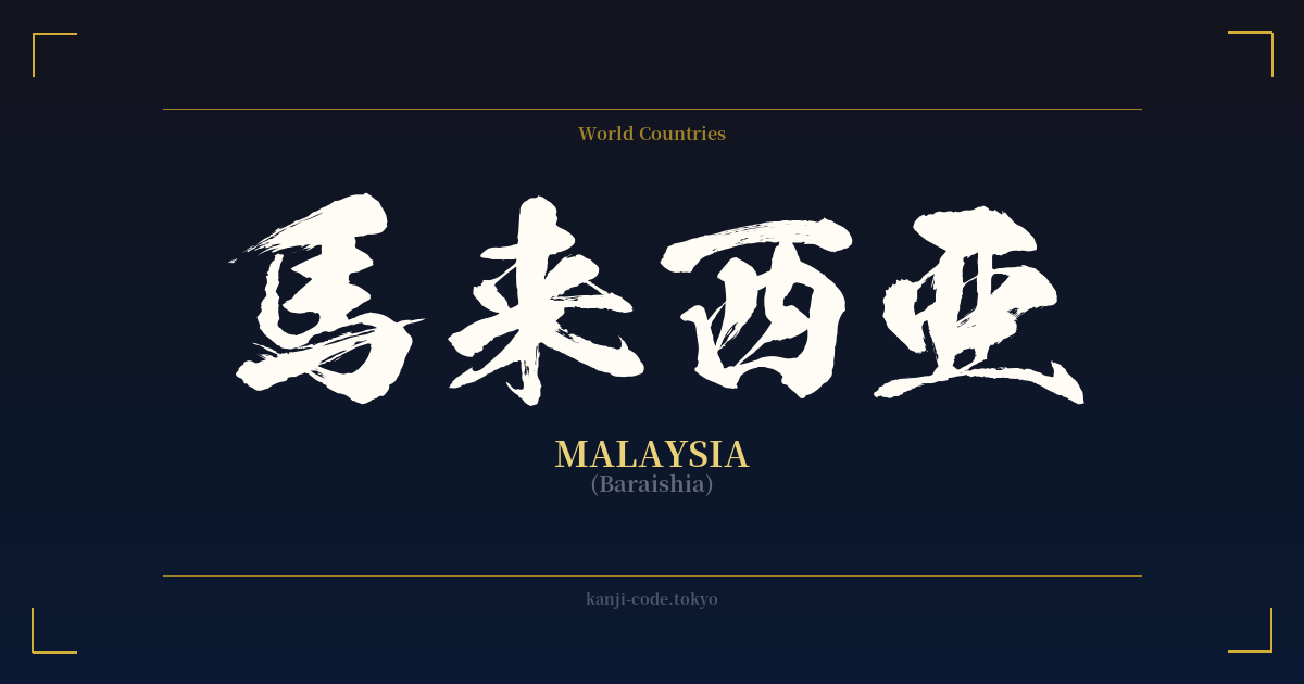
✍️ 馬来西亜 (Baraishia) — Contexto cultural
La palabra 馬来西亜 (Baraishia) es una ventana fascinante a un período específico de la historia lingüística japonesa. Representa a 'Malasia' no por su significado, sino por su sonido. Esta práctica, conocida como 'ateji' (当て字), consiste en utilizar caracteres kanji por sus valores fonéticos para transcribir palabras extranjeras. En este caso, los caracteres se seleccionaron para aproximarse al sonido de 'Malasia': 馬 (ba) + 来 (rai) + 西 (shi) + 亜 (a).
Este método prevaleció durante la Restauración Meiji (1868-1912) y antes, una época en la que Japón se abría rápidamente al mundo y necesitaba incorporar una gran cantidad de nombres y conceptos extranjeros a su sistema de escritura. Antes de que se estandarizara la escritura katakana para este propósito, el ateji era la solución habitual. Este patrón se puede observar en los nombres antiguos de muchos países, como 亜米利加 (Amerika, para Estados Unidos) y 仏蘭西 (Furansu, para Francia).
La elección de caracteres solía ser arbitraria, guiada únicamente por el sonido. Esto nos lleva al principal problema de los ateji para la interpretación moderna: los significados de los kanji individuales están completamente desvinculados del significado real de la palabra. En el caso de 馬来西亜, los caracteres significan 'caballo', 'venir', 'oeste' y 'Asia'. Interpretar un significado más profundo, como 'un caballo que viene de Asia Occidental', es un error común y totalmente incorrecto. Los caracteres son simplemente marcadores fonéticos.
Con el tiempo, este sistema resultó engorroso y potencialmente engañoso. El sistema de escritura japonés evolucionó, y el katakana se convirtió en el alfabeto estándar, universalmente comprendido, para los préstamos lingüísticos extranjeros. Hoy en día, 'Malasia' se escribe exclusivamente como マレーシア (Marēshia) en todas las formas de comunicación moderna, desde periódicos y sitios web hasta conversaciones cotidianas.
El kanji 馬来西亜 se considera arcaico y obsoleto. Puede encontrarse en textos históricos, artículos académicos especializados en lingüística o, quizás, en contextos muy formales y tradicionales donde se busca un aire de clasicismo. Sin embargo, en la práctica, ha quedado completamente en desuso. Si bien es un testimonio de la flexibilidad y la creatividad del idioma japonés, no es más que una palabra viva.
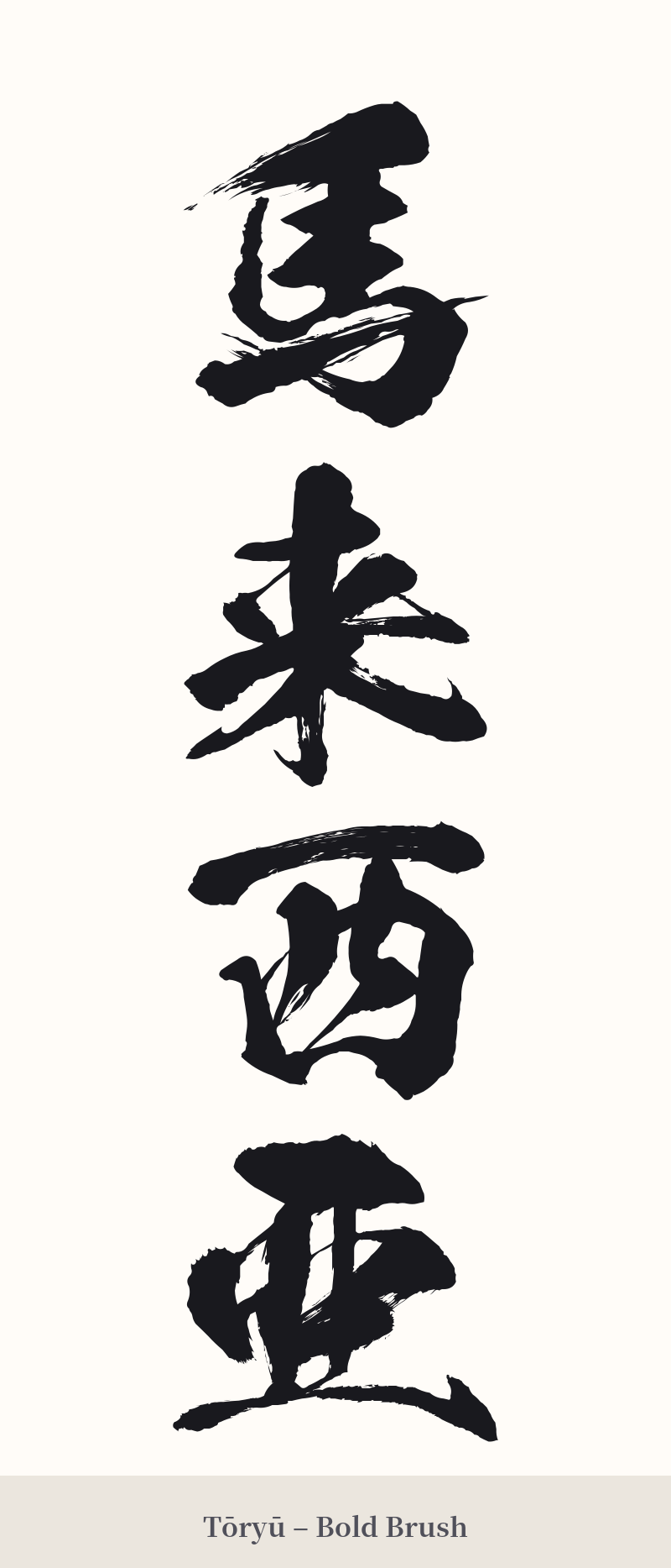
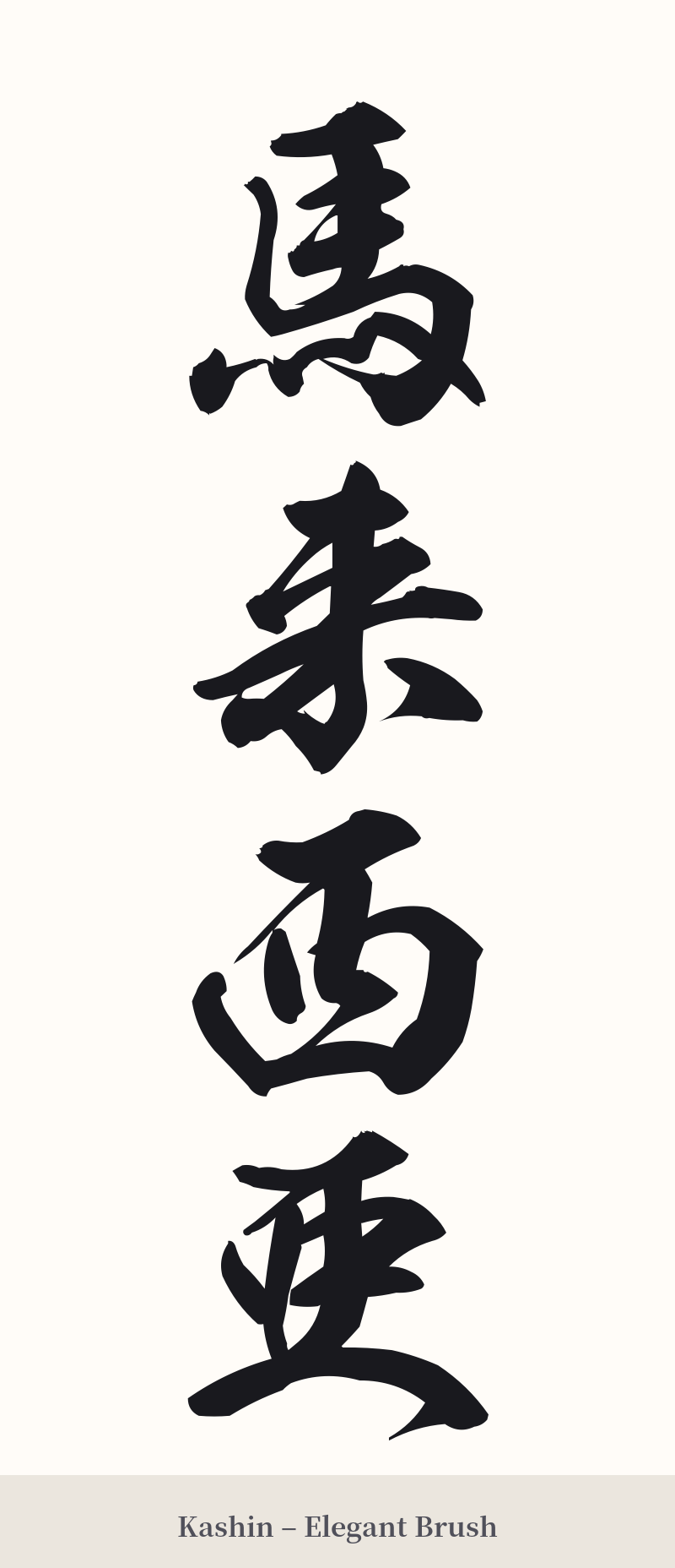
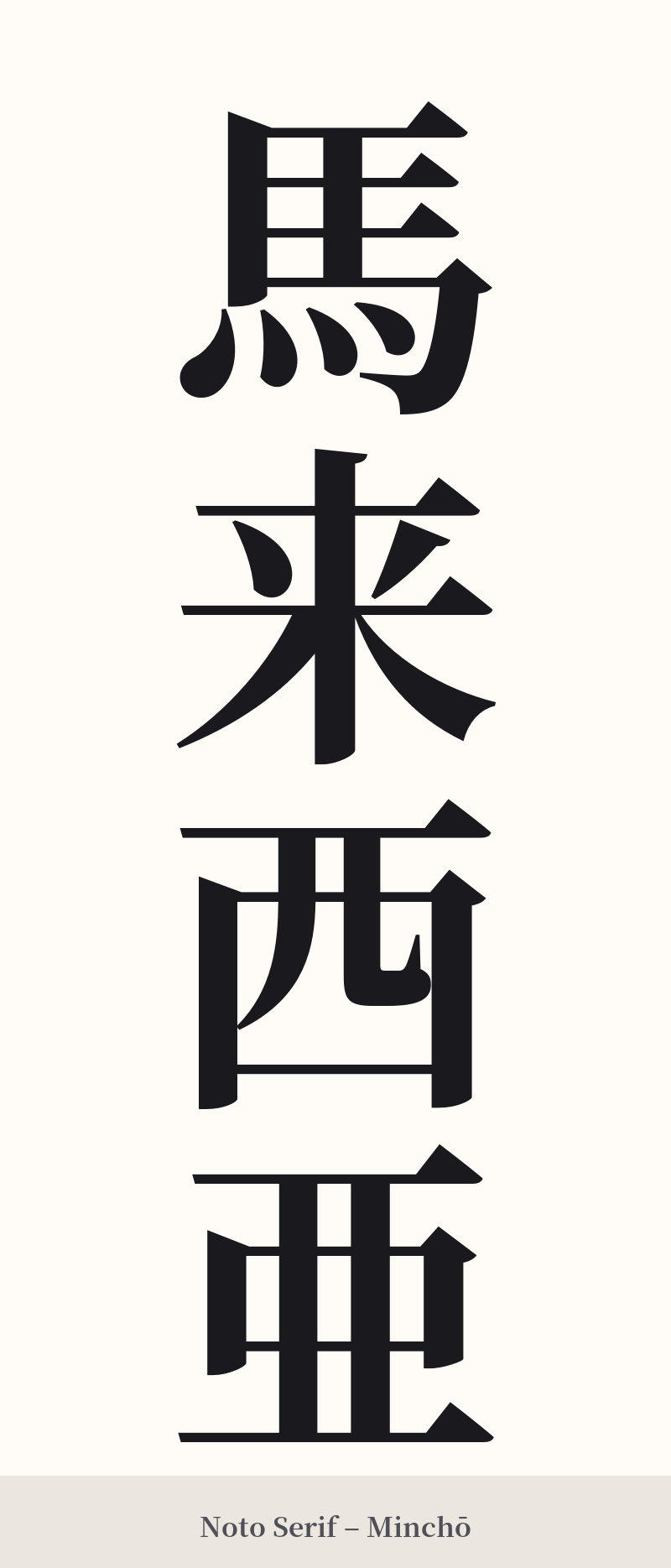
🖌️ Estilos de fuente para 馬来西亜
Los mismos caracteres kanji pueden verse muy diferentes según el estilo de caligrafía. Elige una fuente que se ajuste al ambiente que deseas para tu tatuaje o diseño.
🎨 Idoneidad para tatuajes
📐 Guía de diseño de tatuajes
Para un tatuaje de 馬来西亜, el diseño debe respetar su carácter histórico y formal. Se recomienda encarecidamente una orientación vertical, como es tradicional para las frases japonesas de varios caracteres. Quedaría excelente en el antebrazo, el costado de la pantorrilla o a lo largo de la columna vertebral.
– Estilo de fuente: Opte por la caligrafía clásica. Un estilo Kaisho (楷書) limpio y de líneas rectas resaltaría las formas distintivas de cada carácter. Como alternativa, un estilo Gyosho (行書) semicursivo podría aportar un toque de elegancia y fluidez histórica.
– Ubicación: El antebrazo, el bíceps, la pantorrilla o la espalda son ideales. La longitud de cuatro caracteres proporciona un elemento visual sustancial que funciona bien en estos espacios lineales.
Consejos visuales: Asegúrate de que el tatuador deje suficiente espacio entre cada carácter para evitar que se confundan. La complejidad relativa de 馬 (caballo) debe equilibrarse con las formas más simples de los otros tres kanji. Piensa en toda la frase como una sola columna de arte coherente.
Comentarios