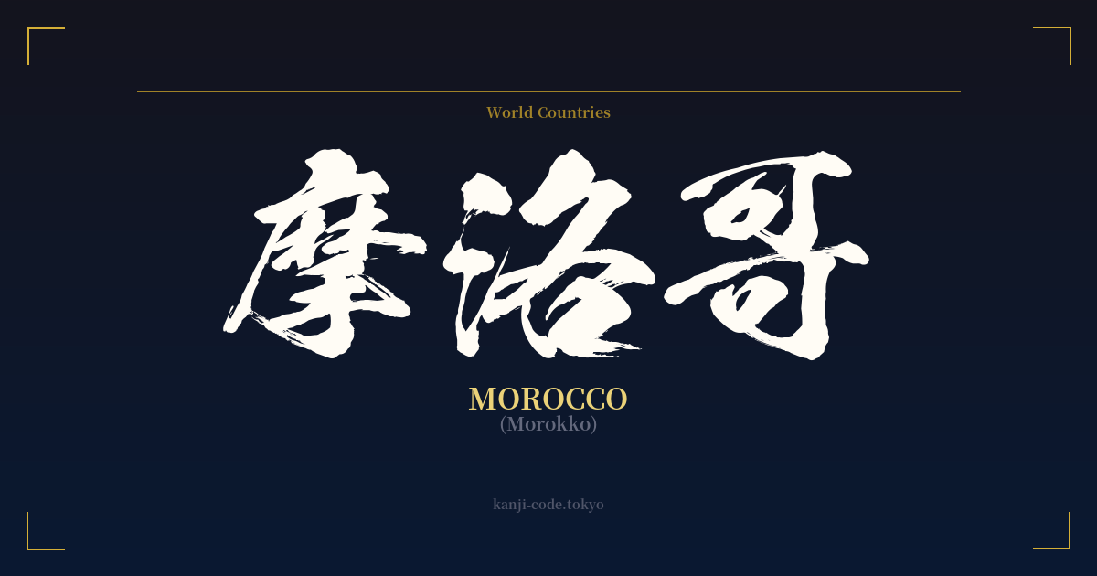
✍️ 摩洛哥 (Morokko) — Contexto cultural
La palabra japonesa 摩洛哥 (Morokko) es un ejemplo fascinante de una práctica conocida como 'ateji' (当て字), donde se utilizan caracteres kanji para representar fonéticamente una palabra extranjera, a menudo sin tener en cuenta su significado original. Este método era común durante el período Meiji (1868-1912), cuando Japón se abría rápidamente al mundo y necesitaba formas de escribir los nombres de países, personas y conceptos extranjeros.
En este caso, los caracteres se eligieron únicamente por su sonoridad. '摩' representa el sonido 'mo', '洛' el sonido 'ro' y '哥' el sonido 'kko'. Juntos, forman 'Mo-ro-kko', una aproximación bastante fiel al nombre del país. Los significados literales —'frotar' o 'rozar' (摩), 'la capital' (洛) y 'hermano mayor' (哥)— se ignoran por completo. Para un lector japonés, esta combinación no significa 'el hermano mayor de una capital que se frota'; simplemente significa, sin ambigüedad, 'Marruecos'.
Hoy en día, el uso de ateji para los nombres de países se considera algo formal o incluso arcaico. La forma moderna y estándar de escribir 'Marruecos' en japonés es con katakana, el alfabeto diseñado específicamente para palabras extranjeras: モロッコ (Morokko). Verás モロッコ en artículos de noticias, sitios web y en conversaciones cotidianas. La forma kanji 摩洛哥 es más común en documentos formales, textos históricos o como una elección estilística para evocar un sentido de clasicismo u oficialidad.
Esta distinción es crucial para cualquiera que considere usar esta palabra en un diseño. Si bien los caracteres en sí son legítimos y forman parte de la historia japonesa, su uso para 'Marruecos' representa una herramienta lingüística específica de una época concreta. No es una palabra con un profundo significado filosófico; es un ingenioso acertijo fonético, una reliquia de una época anterior a que el katakana se convirtiera en el estándar universal para los préstamos lingüísticos. Es una muestra de la flexibilidad del sistema de escritura japonés, pero, en esencia, es un nombre propio.
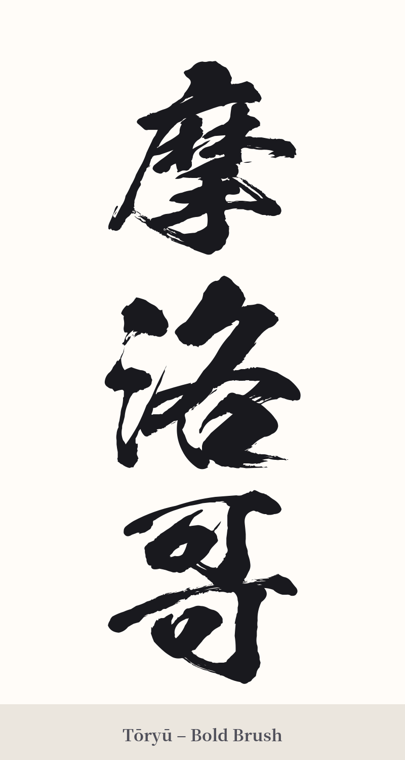
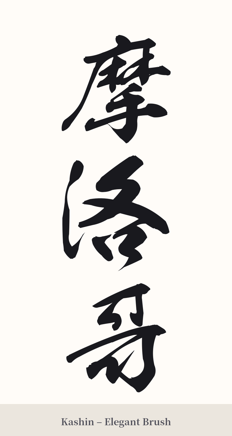
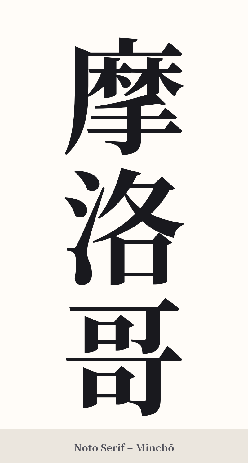
🖌️ Estilos de fuente para 摩洛哥
Los mismos caracteres kanji pueden verse muy diferentes según el estilo de caligrafía. Elige una fuente que se ajuste al ambiente que deseas para tu tatuaje o diseño.
🎨 Idoneidad para tatuajes
📐 Guía de diseño de tatuajes
Al diseñar un tatuaje para 摩洛哥, la estructura de tres caracteres ofrece un buen equilibrio visual, especialmente en orientación vertical.
– Ubicación: La disposición vertical es clásica para palabras con varios kanji. Funciona bien a lo largo del antebrazo, la pantorrilla o la columna vertebral. Para un diseño horizontal, la parte superior de la espalda o el pecho serían un lienzo adecuado.
– Estilo de fuente: Debido a la gran cantidad de trazos del primer carácter (摩), es importante usar una fuente clara y legible. Una fuente en negrita (kaisho) le daría un aspecto fuerte y definido. Para una apariencia más fluida, una fuente semicursiva (gyosho) puede conectar los caracteres de forma dinámica, pero tenga cuidado de que los trazos de '摩' no se vean borrosos.
Consejos visuales: Este diseño no es para tatuarse en tamaño pequeño. Su complejidad exige un tamaño adecuado para que sea legible y no parezca una mancha de tinta con el tiempo. Considérelo como una pieza independiente, ya que su significado es muy específico y puede no combinar bien con otras imágenes simbólicas, a menos que el tema sea viajes o geografía.
Comentarios