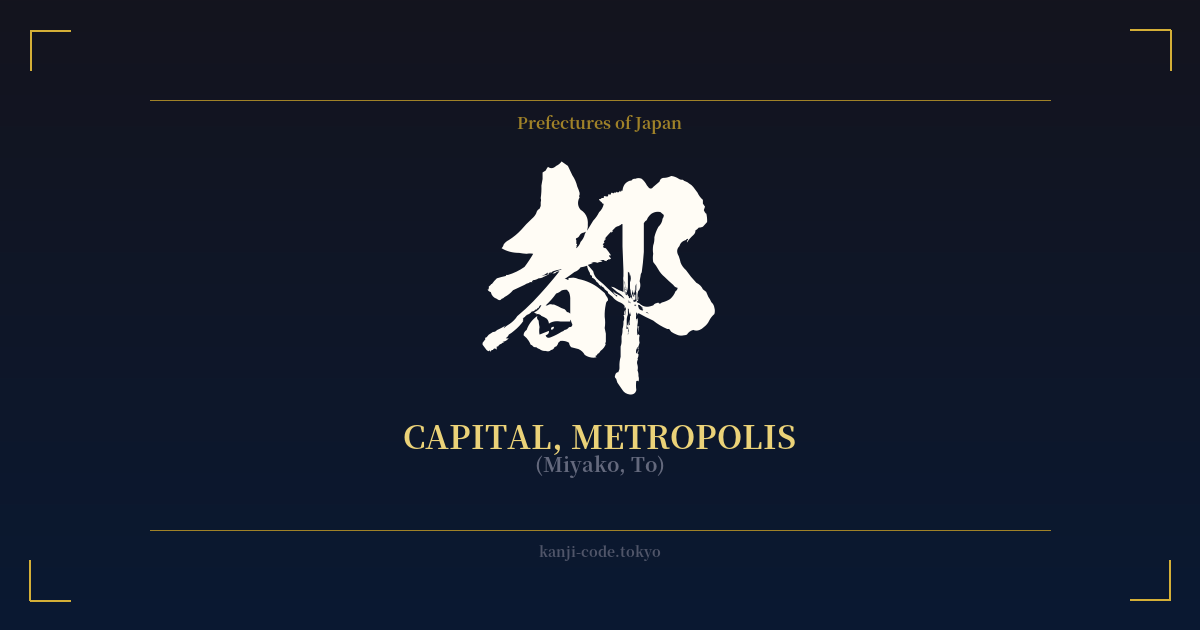
✍️ 都 (Miyako, To) — Cultural Context
The kanji 都, read as 'Miyako' or 'To,' is a character steeped in the history and identity of Japan. It translates to 'capital' or 'metropolis,' but its cultural resonance goes far beyond a simple administrative definition. It embodies the very idea of a nation's cultural, political, and spiritual heartland.
The reading 'Miyako' is particularly poetic. It doesn't just mean 'the capital city'; it evokes a sense of grandeur, refinement, and historical weight. When Japanese people hear 'Miyako,' their minds often drift to Kyoto (京都), the imperial capital for over a millennium. This was the center of courtly life, where art forms like the tea ceremony, ikebana, and classical literature flourished. The Tale of Genji, one of the world's first novels, is set in the Heian-kyō, the 'Miyako' of its time. The word carries a nostalgic beauty, a longing for a golden age of high culture and imperial elegance.
This character's history is written across the map of Japan. The country's first permanent capital was Heijō-kyō (平城京) in Nara, and later the capital moved to Heian-kyō (平安京) in Kyoto. The character 都 is a key component of these names. In the modern era, with the Meiji Restoration, the emperor moved to Edo, which was renamed Tokyo (東京), the 'Eastern Capital.'
This brings us to the other common reading, 'To.' This reading is used in the official name for Japan's modern capital: Tōkyō-to (東京都), or the Tokyo Metropolis. Here, 都 signifies a special administrative district, a sprawling urban center that is the seat of government and the engine of the modern Japanese economy. While 'Miyako' feels poetic and historical, 'To' feels official, modern, and powerful.
Therefore, the single character 都 beautifully bridges the past and the present. It represents both the serene, temple-filled landscapes of old Kyoto and the vibrant, neon-lit scramble of modern Tokyo. It speaks to the concentration of power, wealth, culture, and people that defines a great city. It’s a character that symbolizes not just a place on a map, but the center of a universe.
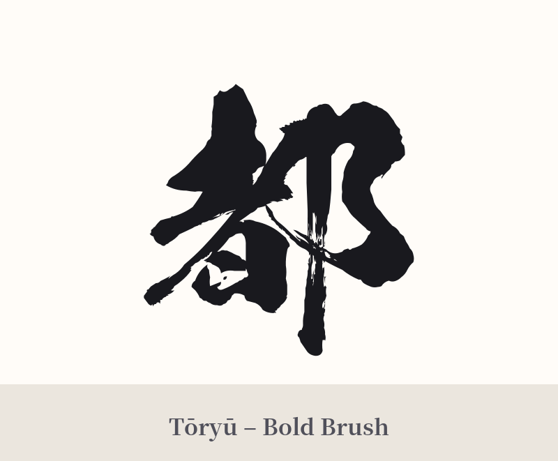
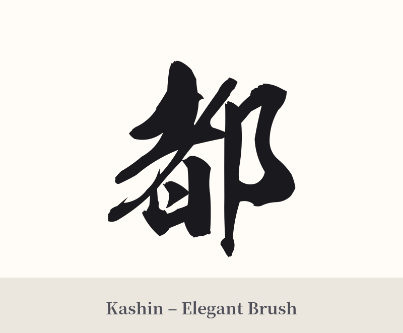
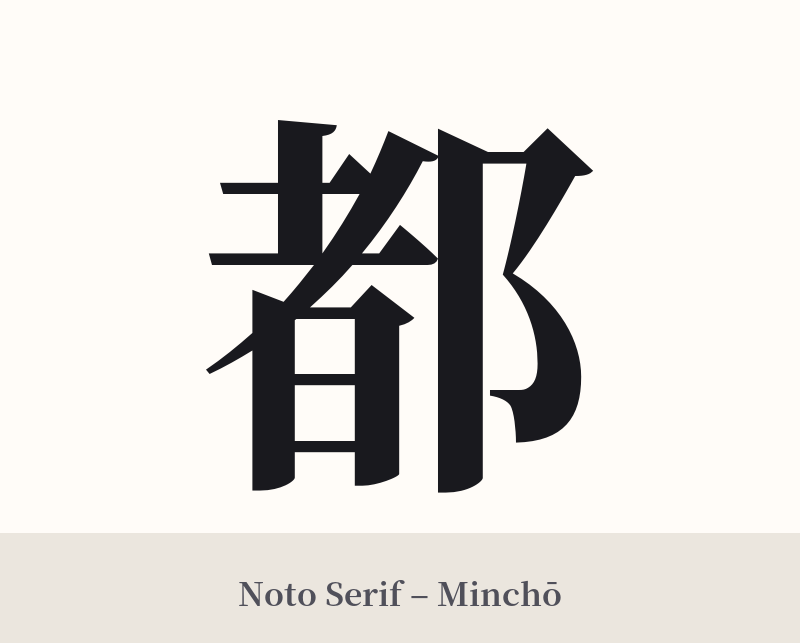
🖌️ Font Styles for 都
The same kanji can look dramatically different depending on the calligraphy style. Choose a font that matches the mood you want for your tattoo or design.
🎨 Tattoo Suitability
📐 Tattoo Design Guide
The kanji 都 is well-balanced, making it versatile for tattoo design. Its combination of the 'person' and 'city/village' radicals gives it an architectural yet human feel.
– Placement: For a standalone piece, consider the inner forearm, the back of the neck just below the hairline, the calf, or the shoulder blade. Its vertical symmetry works well in these spots.
– Font Style: The chosen font can dramatically alter the feel. A bold, crisp Kaisho (block script) style will emphasize the 'metropolis' and 'power' aspects. A flowing Gyōsho (semi-cursive) or Sōsho (cursive) style will lean into the poetic, elegant 'Miyako' nuance, evoking classical calligraphy.
– Visual Tips: While 都 stands strong on its own, it can be integrated into a larger design. Consider pairing it with imagery that reflects the specific capital you connect with—cherry blossoms or a torii gate for a Kyoto feel, or abstract geometric lines and circuits for a Tokyo vibe. A simple Enso circle around the kanji can also create a beautiful, focused design.
Comments