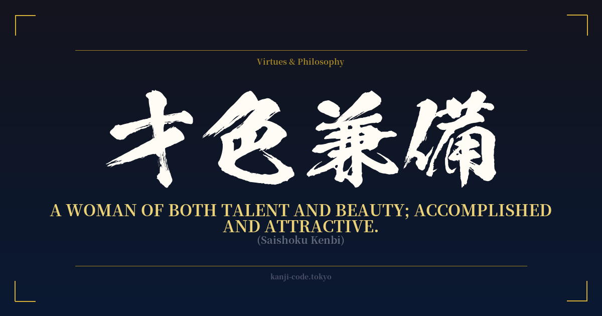
✍️ 才色兼備 (Saishoku Kenbi) — Cultural Context
才色兼備 (Saishoku Kenbi) is a 'yojijukugo,' a four-character idiomatic compound that distills a complex idea into a concise and elegant phrase. These idioms are a cherished part of the Japanese language, often drawn from classical literature and history, and Saishoku Kenbi is one of the most famous and flattering compliments one can bestow upon a woman.
Literally translated, it breaks down into 'talent' (才), 'beauty/allure' (色), 'concurrently possessing' (兼), and 'being endowed with' (備). Together, they paint a picture of a woman who is not just one or the other, but fully and simultaneously blessed with both remarkable intellect and captivating grace. This is not a description of superficiality; the 'beauty' (色) here implies more than just physical appearance. It speaks to a person's aura, their charm, and the outward expression of their inner confidence and intelligence.
Historically, the concept can be seen as a modern evolution of the more traditional ideal, 'Yamato Nadeshiko' (大和撫子). The Yamato Nadeshiko represents the classical ideal of Japanese womanhood—demure, resilient, and devoted to her family. While admirable, it is an ideal rooted in a more feudal, patriarchal social structure. Saishoku Kenbi, in contrast, places a strong emphasis on individual talent, intellect, and worldly accomplishment. It celebrates the woman who excels in her field, be it arts, science, or business, while also possessing an undeniable poise and charm.
In contemporary Japan, to be called Saishoku Kenbi is a profound compliment. It's often used in media to describe actresses, newscasters, athletes, or business leaders who are not only successful and intelligent but also carry themselves with elegance. It suggests a complete and well-rounded person who has cultivated both her mind and her presence in the world. It is a term of deep respect, acknowledging that a woman's value is a holistic combination of her capabilities and her character, her sharp mind and her graceful spirit.
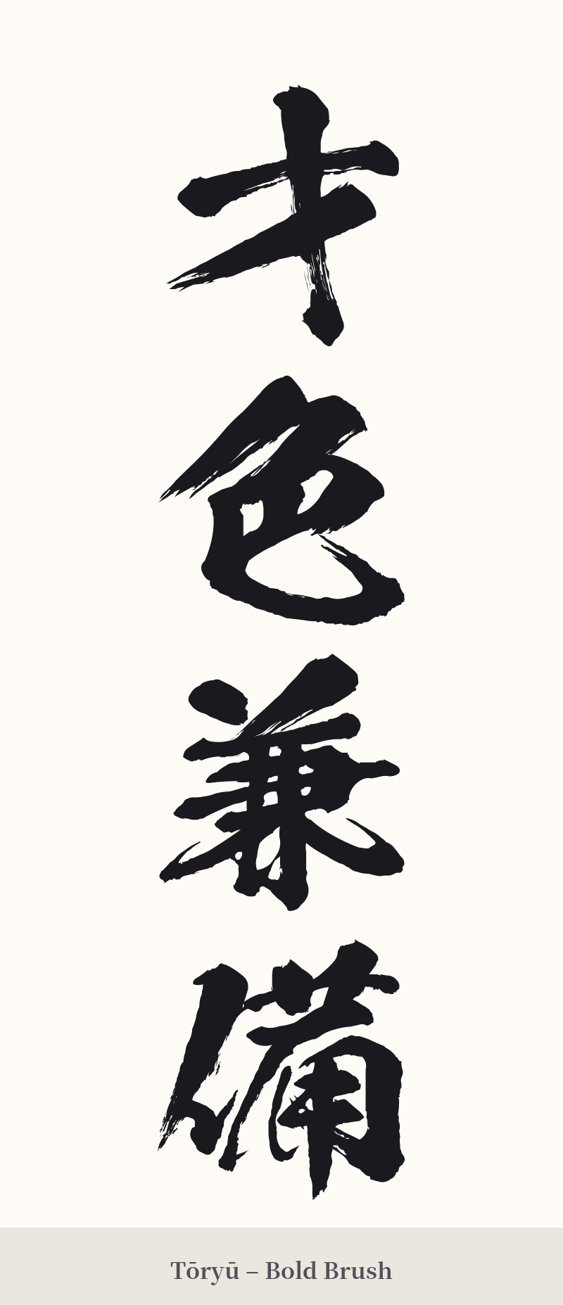
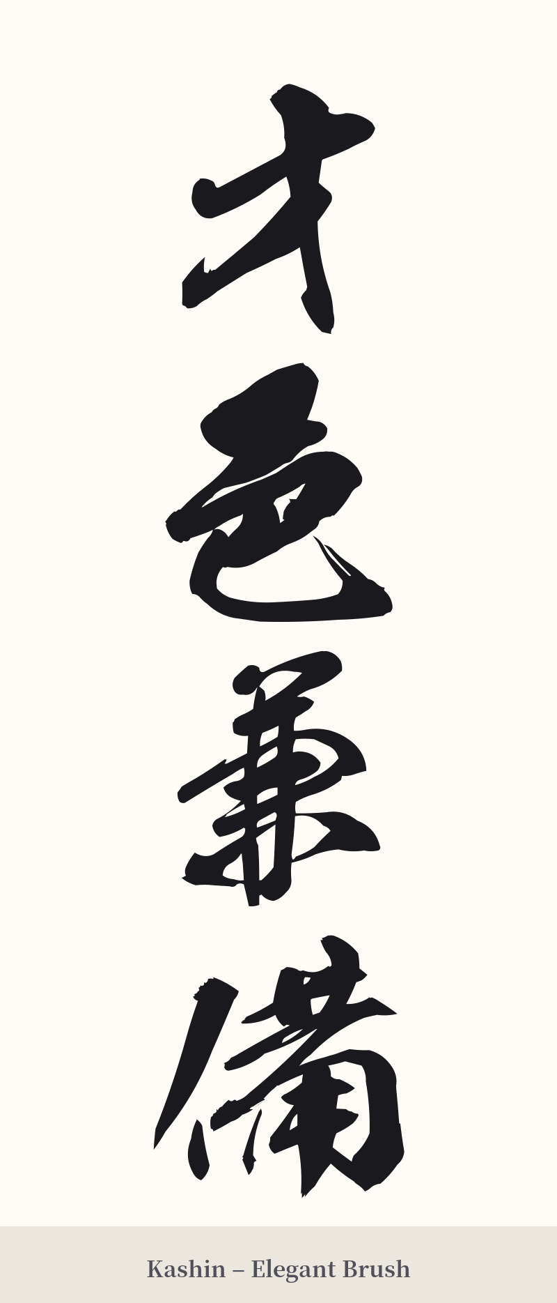
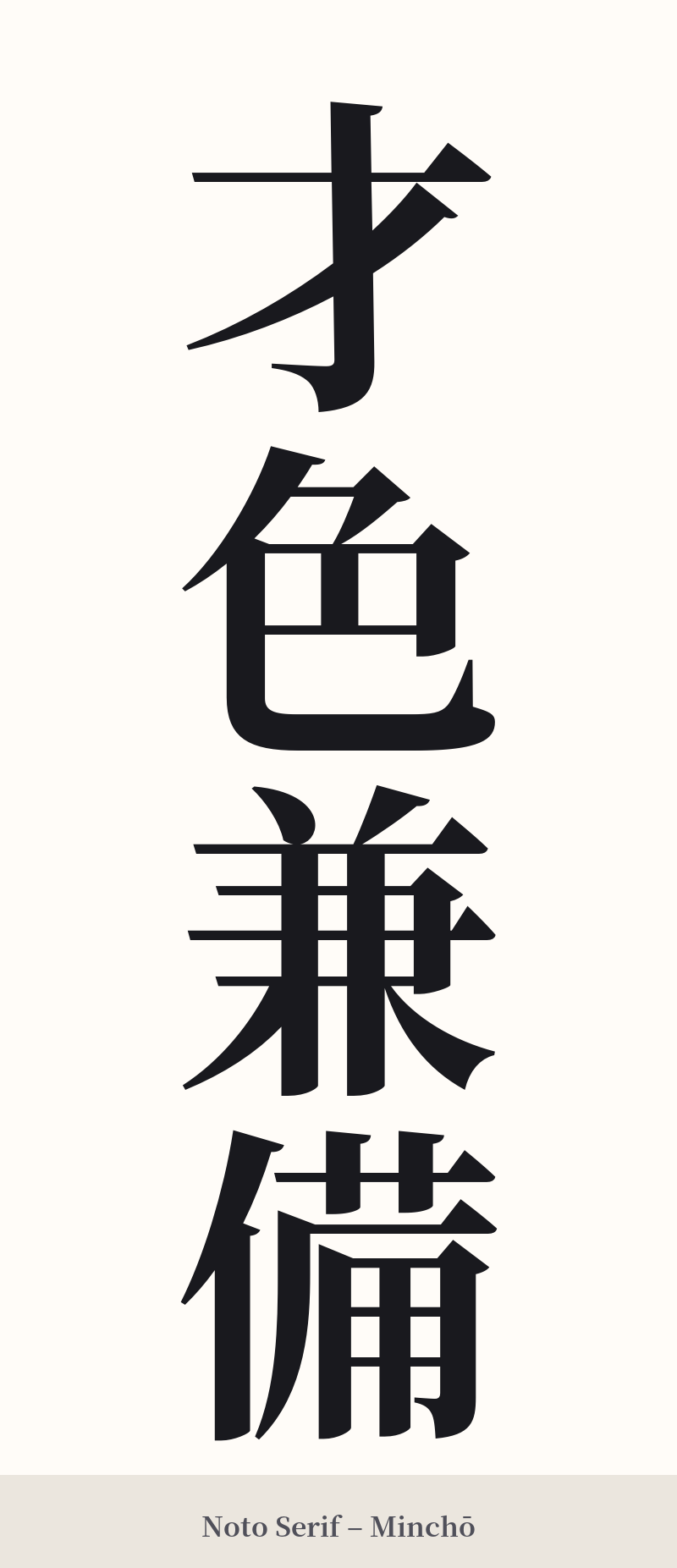
🖌️ Font Styles for 才色兼備
The same kanji can look dramatically different depending on the calligraphy style. Choose a font that matches the mood you want for your tattoo or design.
🎨 Tattoo Suitability
📐 Tattoo Design Guide
For a four-character idiom like Saishoku Kenbi, the design choices can greatly enhance its meaning. A vertical orientation is the most traditional and visually powerful way to display this phrase, echoing its calligraphic origins.
– Placement: A vertical line of script works beautifully along the spine, the forearm, the side of the ribs, or down the calf. These placements allow the characters to flow naturally with the lines of the body.
– Font Style: An elegant, flowing script like Gyosho (semi-cursive) can capture the 'grace' and 'beauty' aspects of the phrase. For a bolder, clearer statement, Kaisho (block script) offers excellent legibility and a sense of dignified strength. A modern, minimalist font can also work if you're aiming for a more contemporary feel.
– Visual Tips: The key is balance. Ensure your tattoo artist gives each character equal weight and spacing. Due to the detail in '兼' and '備', avoid making the tattoo too small, as the lines can blur over time. Consider this a standalone piece; adding other visual elements can often detract from the power and elegance of the kanji itself.
Comments