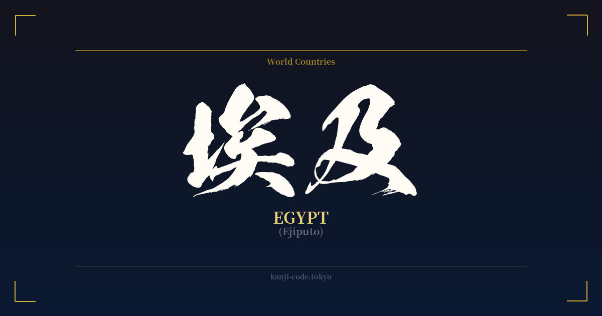
✍️ 埃及 (Ejiputo) — Cultural Context
The kanji 埃及 (Ejiputo) is a fascinating window into the history of linguistic exchange between Japan and the wider world. These characters do not describe Egypt; they transcribe its name. This is a classic example of what is known in Japanese as 'ateji' (当て字), where kanji are used for their phonetic value rather than their literal meaning.
Historically, when Japan began to have more contact with the West during the Meiji Restoration (late 19th century), it needed to create names for foreign countries. Often, Japan adopted the existing Chinese-character transliterations. The name 埃及 likely derives from the Mandarin Chinese pronunciation 'Āijí'. The Japanese 'on'yomi' (Sino-Japanese readings) of these characters, 'Ai' and 'Kyū' (with 'ji' being a common variant), were close enough to approximate the sound of 'Egypt'.
However, this method of naming countries with kanji has largely fallen out of fashion. In modern Japanese, nearly all foreign countries and names are written using Katakana, a syllabic script specifically designed for foreign loanwords. Today, you will almost exclusively see Egypt written as エジプト (Ejiputo). The kanji form 埃及 is now considered archaic and literary. You might encounter it in historical texts, formal documents, or in names of companies or academic societies aiming for a classic, established feel, such as the 'Japan-Egypt Society' (日本エジプト協会).
For someone interested in Japanese culture, 埃及 represents a specific historical period of globalization and adaptation. It shows the flexibility of the kanji system but also its limitations, which led to the widespread adoption of Katakana. While the characters themselves might look profound, their use in this context is purely functional and phonetic. They don't carry any inherent meaning related to pyramids, pharaohs, or ancient wisdom; they are simply a linguistic fossil from a bygone era of international diplomacy and cartography.
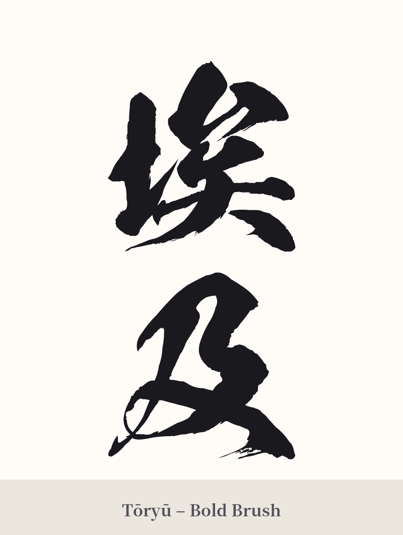
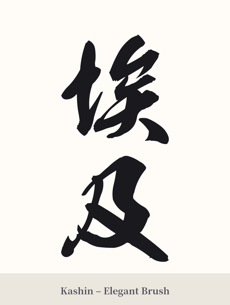
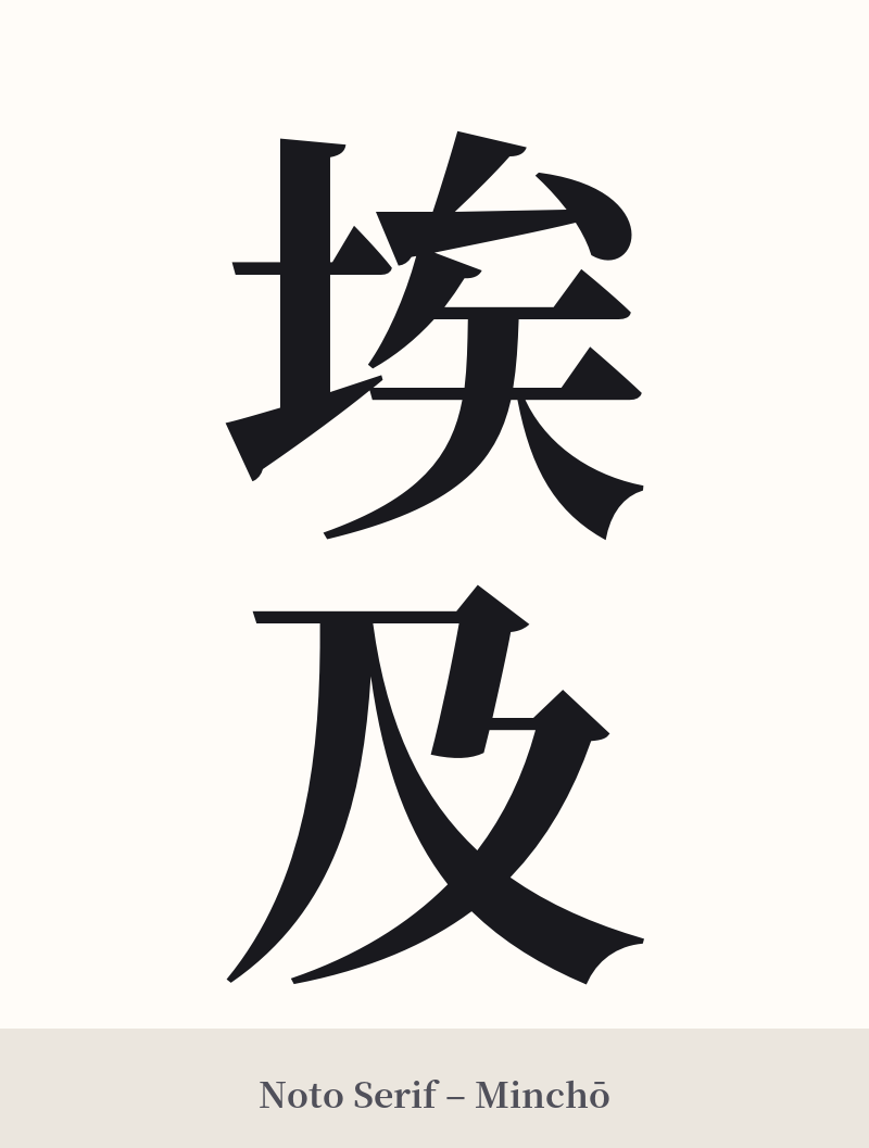
🖌️ Font Styles for 埃及
The same kanji can look dramatically different depending on the calligraphy style. Choose a font that matches the mood you want for your tattoo or design.
🎨 Tattoo Suitability
📐 Tattoo Design Guide
While 埃及 is a challenging choice for a tattoo due to its phonetic nature, if you are drawn to its historical and linguistic significance, a thoughtful design is key.
– Placement: A vertical orientation is traditional for two-character words. The inner forearm, calf, or along the spine are all excellent choices that allow the characters to be read from top to bottom.
– Font Style: To honor the word's archaic feel, traditional calligraphy styles are highly recommended. A crisp, formal 'Kaisho' (block script) emphasizes the structure of the characters. A slightly more fluid 'Gyosho' (semi-cursive script) can add a touch of elegance and movement.
– Visual Tips: Because the standalone meaning is weak, consider incorporating 埃及 into a larger piece. A tattoo that combines these kanji with recognizable Egyptian imagery—such as a pyramid, the Eye of Horus, or a scarab beetle—can provide the necessary context. This transforms the design from a potentially confusing word into a clear homage to Egypt, blending two distinct cultures visually.
Comments