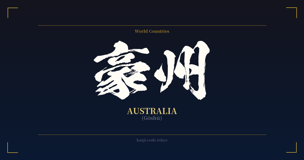
✍️ 豪州 (Gōshū) — Contexto cultural
El término 豪州 (Gōshū) es la representación tradicional japonesa en kanji del continente y país de Australia. Constituye un ejemplo fascinante de 'ateji' (当て字), una práctica en la que los caracteres kanji se utilizan por sus valores fonéticos para transcribir palabras extranjeras, a menudo con una sutil alusión a su significado.
Durante la Restauración Meiji (1868-1912), Japón abrió sus puertas al mundo y necesitó crear rápidamente nombres para países y conceptos extranjeros. En lugar de inventar nuevos alfabetos, reutilizaron kanji ya existentes. Para 'Australia', los sonidos se aproximaron a 'Gō-shū'.'
El primer carácter, 豪 (gō), fue elegido por su sonido. Sin embargo, su significado de 'grandioso', 'heroico' o 'poderoso' le confiere una grandeza inesperada, pero apropiada. Evoca una sensación de inmensidad y fuerza, pintando la imagen de una tierra formidable y extensa. Esta feliz coincidencia, donde la elección fonética también conlleva un significado adecuado, es un sello distintivo de los ateji bien elaborados.
El segundo carácter, 州 (shū), significa 'estado', 'provincia' o 'continente'. Esta elección fue tanto fonética como semántica, encajando a la perfección con una masa de tierra que es a la vez un país y un continente. En conjunto, 豪州 puede interpretarse libremente como 'Gran Continente' o 'Estado Poderoso', un nombre mucho más evocador de lo que podría sugerir una simple transcripción fonética.
Hoy en día, la forma más común de escribir 'Australia' en japonés cotidiano es con Katakana: オーストラリア (Ōsutoraria). Este es el estándar para los préstamos extranjeros. Sin embargo, 豪州 todavía se usa ampliamente en contextos más formales o tradicionales. Lo verá en titulares de periódicos, documentos oficiales y en los nombres de empresas, como en '日豪関係' (Nichigō kankei), que significa 'relaciones Japón-Australia'. El uso de 豪州 aporta una sensación de historia y formalidad de la que carece la versión moderna de Katakana.
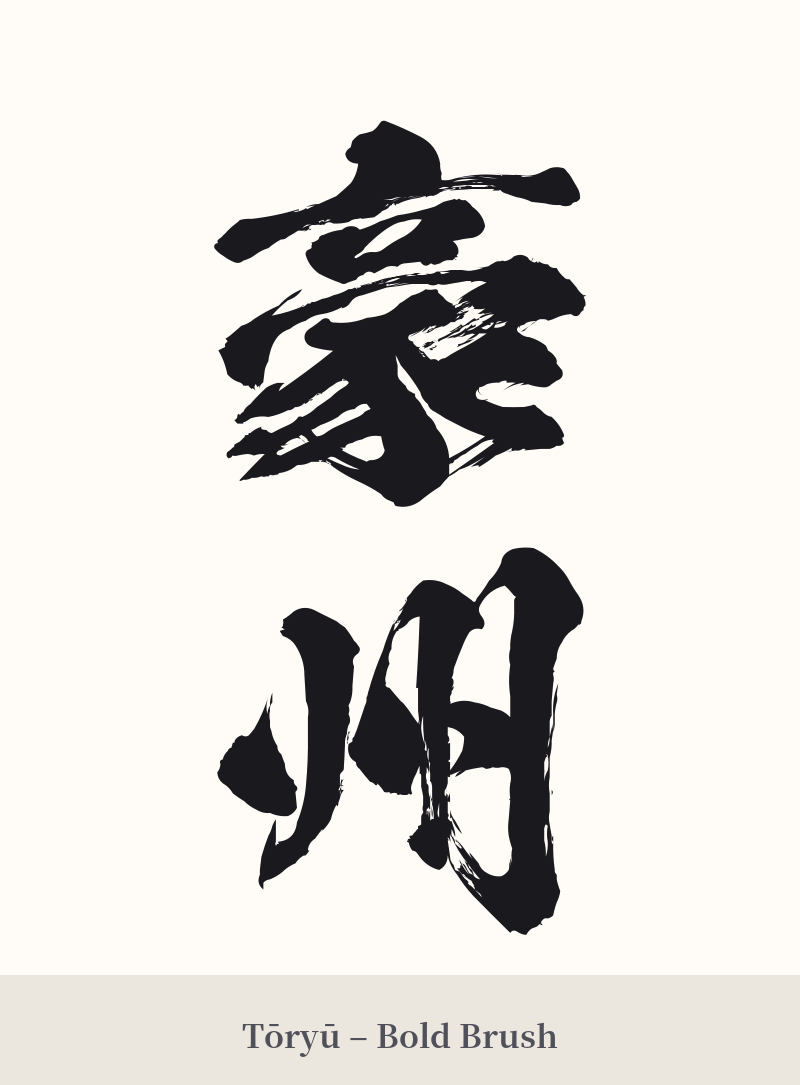
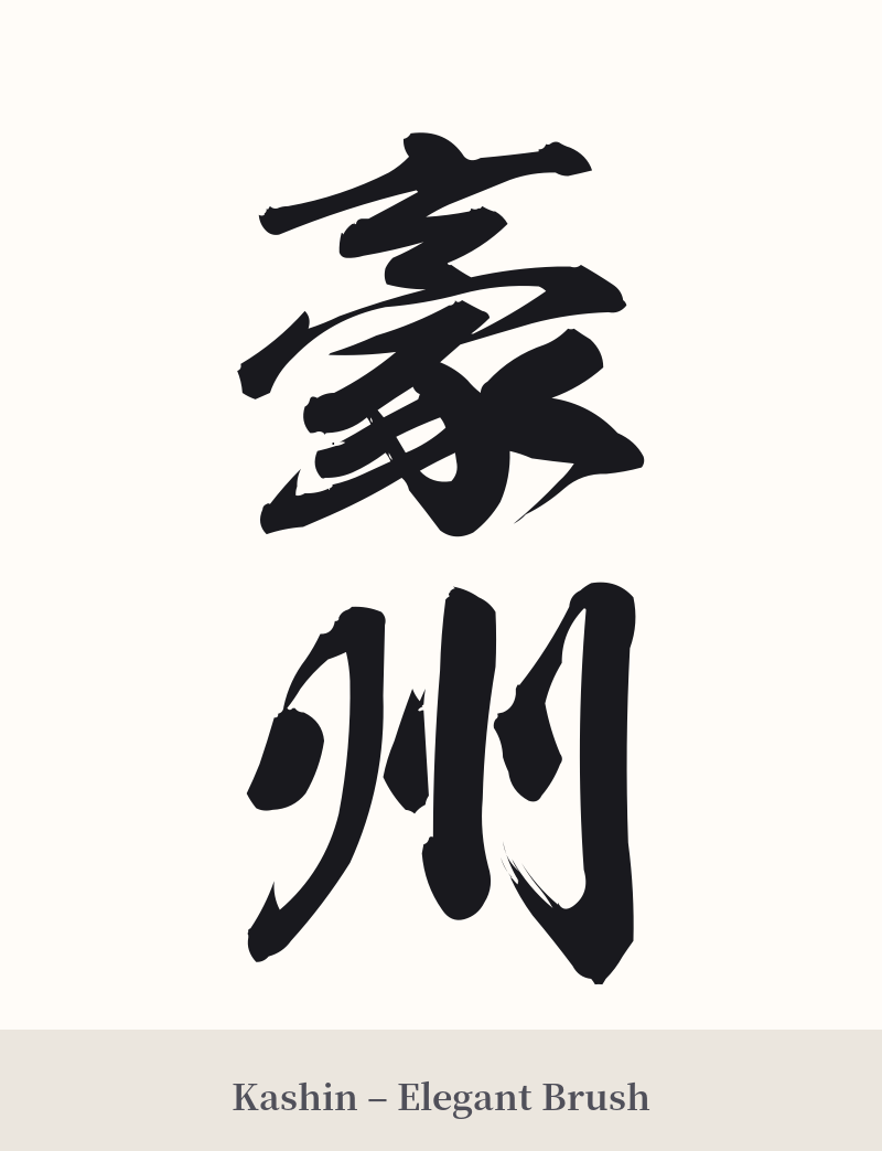
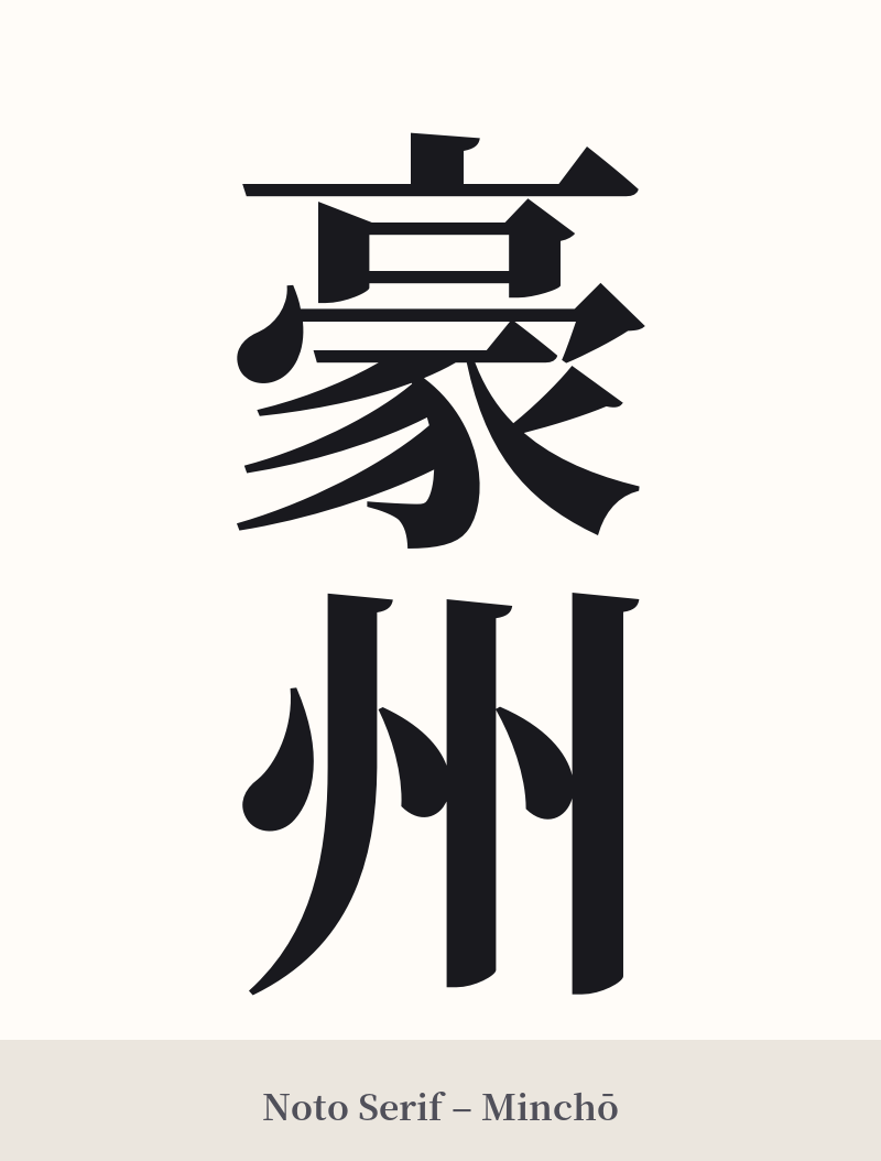
🖌️ Estilos de fuente para 豪州
Los mismos caracteres kanji pueden verse muy diferentes según el estilo de caligrafía. Elige una fuente que se ajuste al ambiente que deseas para tu tatuaje o diseño.
🎨 Idoneidad para tatuajes
📐 Guía de diseño de tatuajes
Para un tatuaje de 豪州, el diseño debe enfatizar la fuerza inherente al primer carácter, 豪.
– Ubicación: Debido a la complejidad de 豪 (14 trazos), este diseño funciona mejor en áreas más grandes y planas del cuerpo. El antebrazo, la pantorrilla, el brazo o la espalda ofrecen espacio suficiente para asegurar que los trazos no se difuminen con el tiempo.
Estilo: Se recomienda una caligrafía audaz y segura. Las pinceladas gruesas en estilo Kaisho (impreso) o Gyosho (semicursivo) complementarían el significado de "poderoso" de 豪. Evite las fuentes finas y delicadas que podrían no capturar la solemnidad de la palabra.
– Orientación: La alineación vertical es la disposición más tradicional y estéticamente agradable para un compuesto de dos caracteres kanji. Crea una columna fuerte y equilibrada que se integra armoniosamente con las líneas del cuerpo.
Comentarios