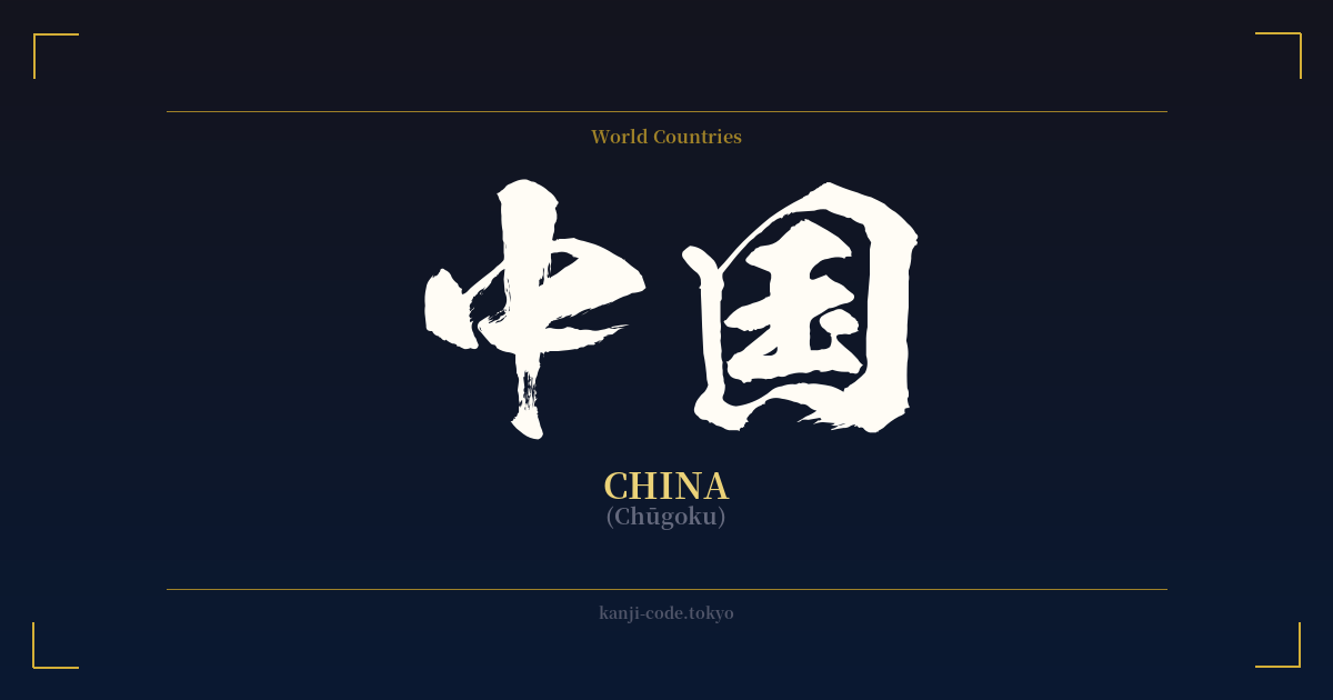
✍️ 中国 (Chūgoku) — Contexto cultural
El término 中国 (Chūgoku) es la palabra japonesa para China, pero sus orígenes revelan una cosmovisión que moldeó el este de Asia durante siglos. Literalmente, los caracteres significan 'Reino Medio' o 'Nación Central'. Este nombre proviene del antiguo concepto chino de sinocentrismo, la creencia de que China era el centro geográfico, cultural y político del mundo, un reino divino rodeado de estados tributarios 'menores' y pueblos 'bárbaros'.
Esta perspectiva no era solo una creencia interna; fue la base de las relaciones internacionales en la región durante milenios. Los emperadores de China eran considerados el 'Hijo del Cielo', que gobernaba sobre todo 'bajo el cielo'. Por lo tanto, el nombre 中国 no es solo una descripción geográfica, sino una poderosa declaración de identidad histórica y de la importancia cósmica que se le atribuía.
Cuando Japón adoptó el sistema de escritura chino (kanji), también importó muchos de estos conceptos culturales y políticos. Con el tiempo, a medida que Japón desarrolló su propia identidad nacional, su relación con el 'Reino Medio' evolucionó. Hoy en día, Chūgoku es el término estándar y neutral que se utiliza en Japón para referirse a la China moderna, la República Popular China (RPC).
Curiosamente, la palabra 'Chūgoku' tiene un significado secundario, puramente japonés. También se refiere a la región de Chūgoku (中国地方, Chūgoku-chihō), la parte más occidental de la isla principal de Japón, Honshu. Esta región incluye prefecturas como Hiroshima, Okayama y Shimane. Tanto en la conversación como en la escritura, el contexto lo es todo. Los hablantes de japonés pueden distinguir fácilmente entre ambos significados según el tema de conversación, y en la escritura formal, el término para la región a menudo se escribe explícitamente como 中国地方 para evitar cualquier ambigüedad.
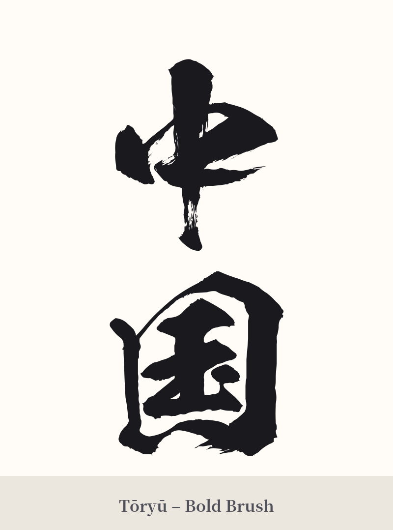
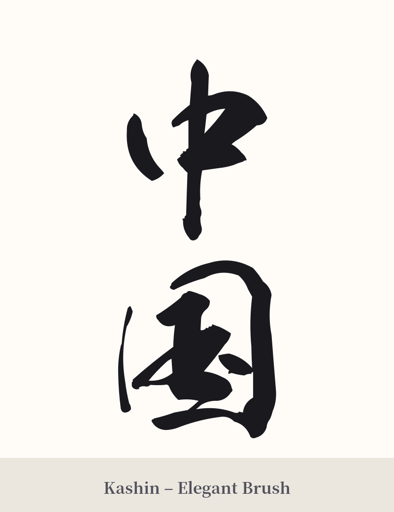
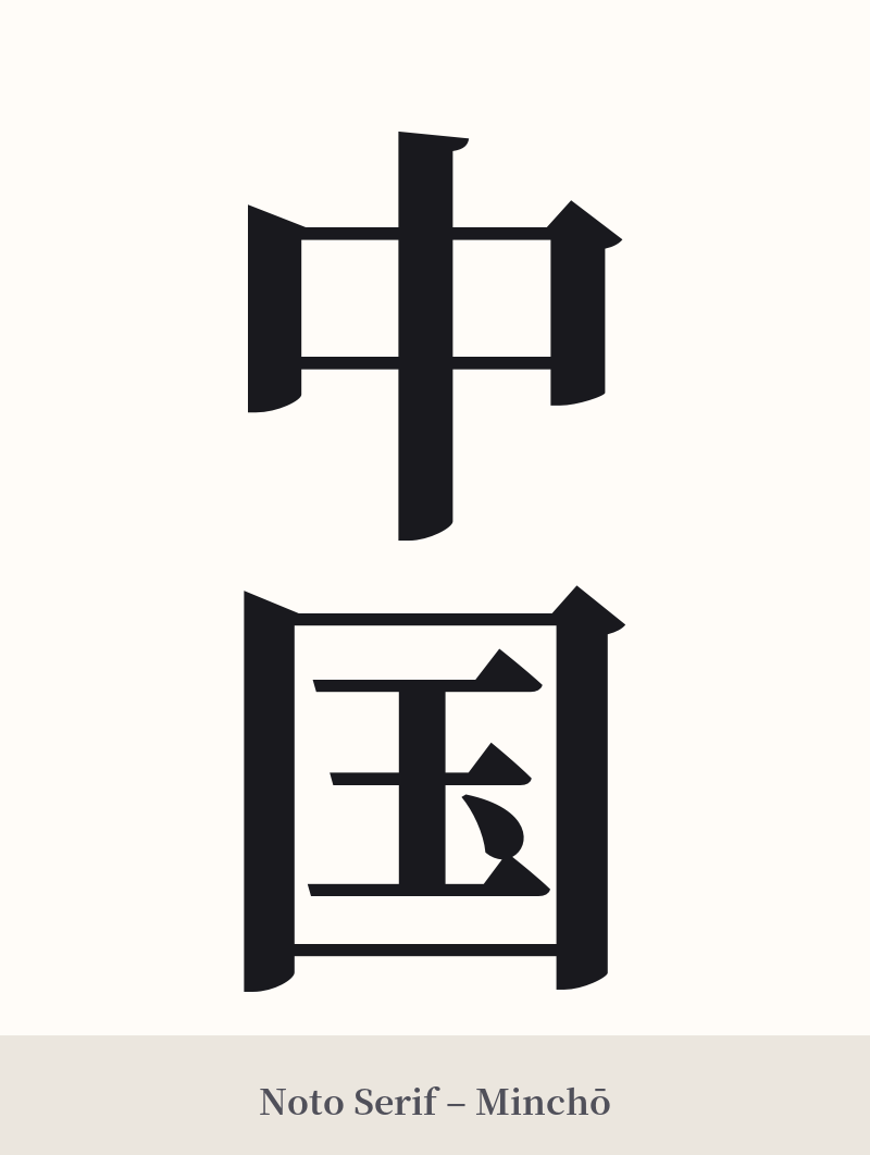
🖌️ Estilos de fuente para 中国
Los mismos caracteres kanji pueden verse muy diferentes según el estilo de caligrafía. Elige una fuente que se ajuste al ambiente que deseas para tu tatuaje o diseño.
🎨 Idoneidad para tatuajes
📐 Guía de diseño de tatuajes
Los caracteres kanji de 中国 (Chūgoku) ofrecen un diseño equilibrado y sencillo, tanto si se escriben horizontal como verticalmente.
– Colocación: La alineación vertical es clásica y funciona bien en el antebrazo, la nuca o a lo largo de la columna vertebral. La alineación horizontal se ajusta bien al pecho, la parte superior de la espalda o por encima del codo.
– Estilo de fuente: Para un toque histórico, considere una caligrafía tradicional como Kaisho (escritura en bloque) para mayor claridad y formalidad, o Gyosho (semicursiva) para un estilo más fluido y artístico. Una fuente moderna y llamativa como Mincho o Gótica le daría a los caracteres un aspecto gráfico y austero, pero podría resultar menos natural.
Consejos visuales: Dada la simplicidad de los caracteres, la calidad del trazo es fundamental. Asegúrate de que tu artista domine el kanji. Al tratarse del nombre de un país, añadir otras imágenes "orientales" comunes, como dragones o flores de cerezo, puede hacer que el diseño parezca genérico o estereotipado. A menudo, es mejor dejar que los caracteres hablen por sí solos.
Comentarios