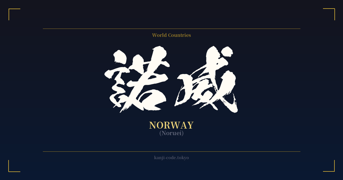
✍️ 諾威 (Noruei) — Contexto cultural
La palabra 諾威 (Noruei), que significa Noruega, ofrece una fascinante perspectiva de una época pasada de la lingüística japonesa. Se trata de una forma de ateji (当て字), donde los caracteres kanji se utilizan por su valor fonético para representar palabras extranjeras, ignorando en gran medida su significado literal. Esta práctica era común durante la Restauración Meiji (1868-1912) y antes, cuando Japón absorbía rápidamente la cultura, la tecnología y la geografía occidentales.
En este caso, se eligieron 諾 (no) y 威 (i o ei) para aproximar el sonido de "Noruega". El primer carácter, 諾, significa "consentimiento" o "acuerdo", mientras que el segundo, 威, transmite una poderosa sensación de "majestad", "dignidad" o "poder". Si bien se podría argumentar que estos significados evocan una imagen regia o agradable de la nación, su elección se basó exclusivamente en la sonoridad. La combinación crea una palabra que suena majestuosa y clásica, un sello distintivo de las transliteraciones de la era Meiji.
Sin embargo, el uso de ateji para referirse a países y nombres extranjeros ha sido prácticamente reemplazado por el katakana. Hoy en día, todos los japoneses aprenden y usan ノルウェー (Noruwē) para referirse a Noruega. El kanji 諾威 se considera arcaico y rara vez se ve fuera de documentos históricos o contextos especializados. Para un japonés moderno, ver 諾威 sería desconcertante; no pensaría inmediatamente en el país escandinavo.
Otros países recibieron un tratamiento ateji similar, muchos de los cuales también han dejado de ser de uso común pero persisten en nombres formales o abreviaturas. Por ejemplo, Estados Unidos se convirtió en 亜米利加 (Amerika), que más tarde se abrevió como 米国 (Beikoku), un término que todavía se utiliza en noticias y escritos formales. De manera similar, en Francia, 仏蘭西 (Furansu), se abrevia como 仏国 (Fukkoku).
Elegir 諾威 hoy en día es una decisión estilística deliberada. Se aleja de lo mundano y adopta una representación histórica, casi poética. Refleja una apreciación por la historia del lenguaje y las bellas, aunque a veces confusas, formas en que las culturas han interactuado y se han adaptado. Si bien carece de utilidad práctica moderna, 諾威 conserva un encanto y una dignidad únicos, que encarnan la grandeza de sus caracteres.
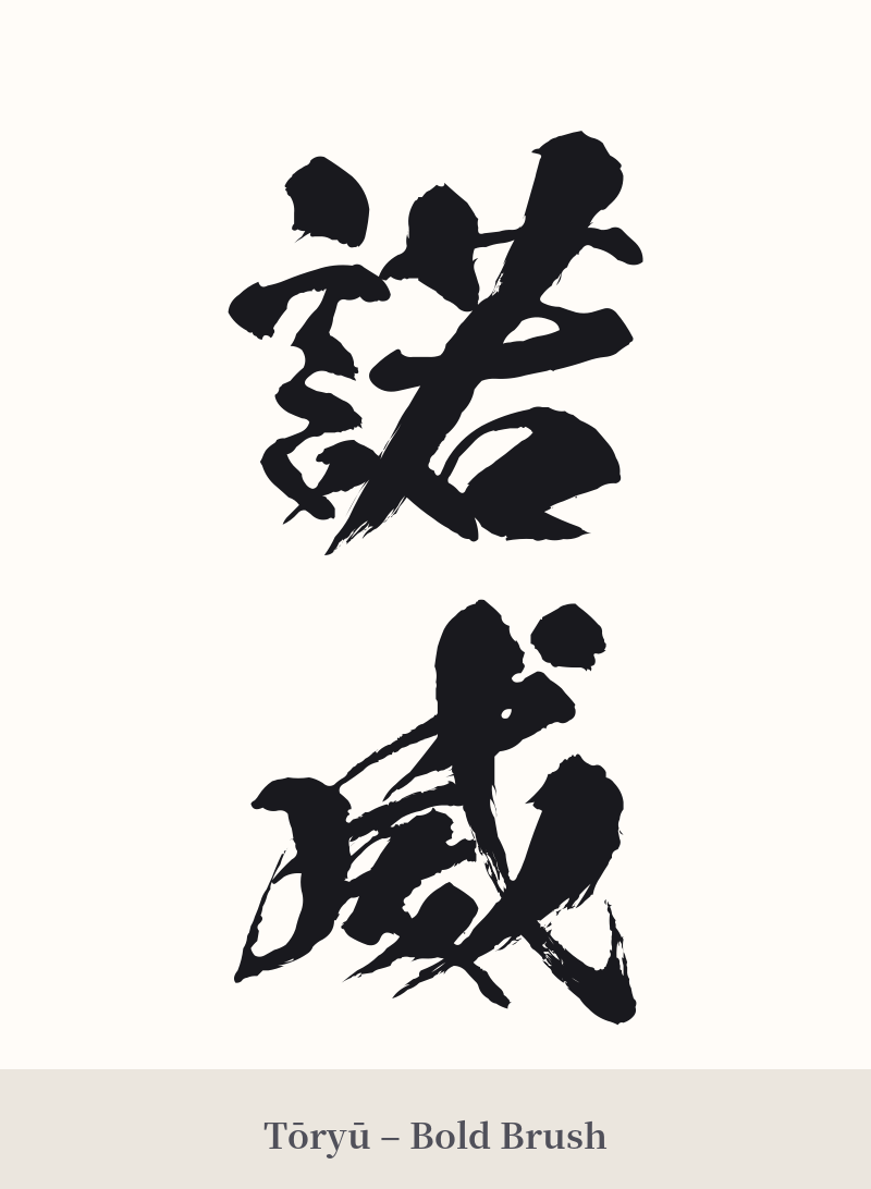
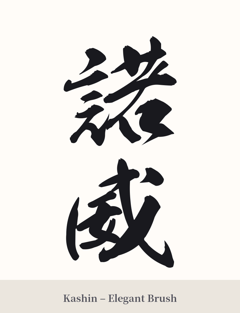
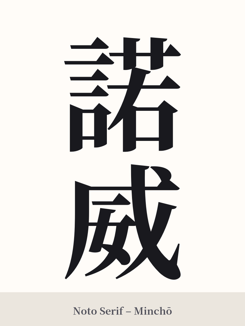
🖌️ Estilos de fuente para 諾威
Los mismos caracteres kanji pueden verse muy diferentes según el estilo de caligrafía. Elige una fuente que se ajuste al ambiente que deseas para tu tatuaje o diseño.
🎨 Idoneidad para tatuajes
📐 Guía de diseño de tatuajes
Dada la naturaleza arcaica y la complejidad visual de 諾威, un tatuaje requiere una cuidadosa consideración del estilo y la ubicación.
– Ubicación: No se trata de un tatuaje pequeño y discreto. El primer carácter, 諾, tiene 15 trazos y puede volverse ilegible si no se deja suficiente espacio. Opta por zonas más grandes y planas como el antebrazo, la pantorrilla o la parte superior de la espalda para mayor claridad.
– Estilo de fuente: Resalta sus raíces históricas. Una caligrafía tradicional como Kaisho (escritura de imprenta) le dará un aspecto formal y distinguido. Para un estilo más fluido y artístico, Gyosho (escritura semicursiva) puede ser hermosa, pero asegúrate de que el artista domine la caligrafía japonesa para garantizar la legibilidad.
Consejos visuales: La orientación vertical suele favorecer a los tatuajes de kanji tradicionales y quedaría espectacular en la columna vertebral o el brazo. Evita las fuentes demasiado modernas o estilizadas, ya que desentonarían con la estética clásica de la palabra. Dado que el kanji en sí mismo es el elemento principal, añadir otras imágenes suele ser innecesario y podría recargar el diseño.
Comentarios