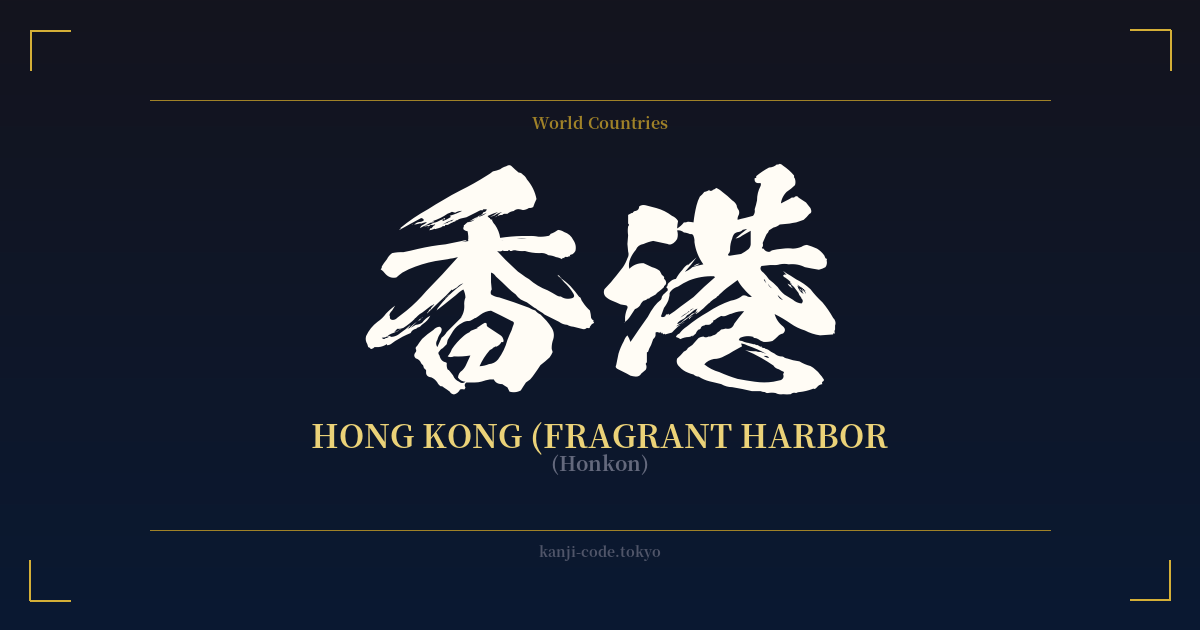
✍️ 香港 (Honkon) — Contexto cultural
El kanji 香港 (Honkon) es el nombre japonés de Hong Kong, una ciudad que desde hace mucho tiempo cautiva la imaginación del mundo como un deslumbrante nexo entre Oriente y Occidente. El nombre en sí es bellamente poético, y se traduce literalmente como “Puerto Fragante”. Esto no es mera fantasía; tiene sus raíces en la historia de la región. Hace siglos, la zona era un puerto crucial para el comercio de incienso aromático y madera de agar, productos derivados de los árboles de los Nuevos Territorios. El aroma de este comercio perduró, y así nació el nombre de “Puerto Fragante”.
En Japón, Hong Kong se reconoce inmediatamente como una metrópolis vibrante, símbolo de las finanzas, el comercio y la cultura internacionales. Si bien los caracteres son idénticos a los chinos Hanzi, la pronunciación japonesa "Honkon" es una adaptación particular que refleja los lazos lingüísticos y las interacciones históricas entre ambas culturas. Para los japoneses, Hong Kong suele evocar imágenes de películas clásicas de artes marciales, una gastronomía exquisita como el dim sum y los icónicos paisajes urbanos iluminados con luces de neón que han inspirado innumerables historias.
La singular historia de la ciudad como colonia británica que regresó a China en 1997 añade complejidad a su identidad. Esta dualidad es palpable en su cultura: una fusión de tradiciones cantonesas e influencias occidentales. Esta hibridez ha convertido a Hong Kong en un poderoso símbolo en el arte y los medios de comunicación, desde las calles atmosféricas y mojadas por la lluvia en películas de Wong Kar-wai como "Chungking Express" hasta su papel fundamental en el género cyberpunk, que a menudo representa megaciudades asiáticas futuristas y de alta densidad.
Por lo tanto, los caracteres 香港 conllevan mucho más que una simple designación geográfica. Representan una historia de comercio, colonialismo, fusión cultural y resiliencia. Es un nombre que evoca un lugar específico, pero que también encierra temas más amplios como la globalización, la identidad y la dinámica tensión entre tradición y modernidad. Es un microcosmos de la historia, condensado en dos caracteres evocadores.
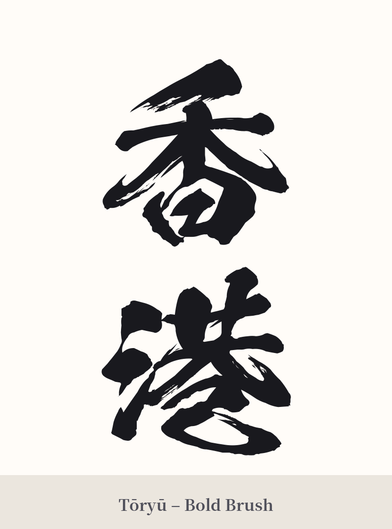
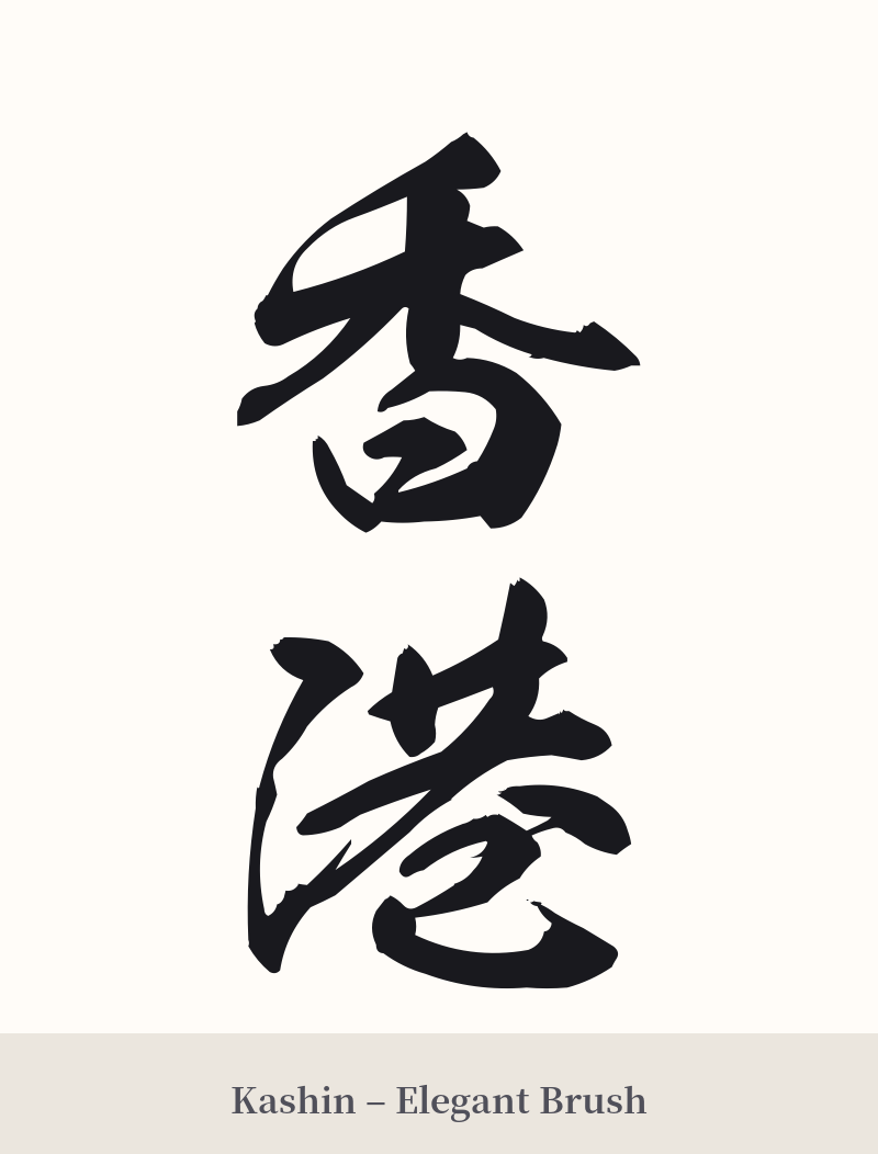
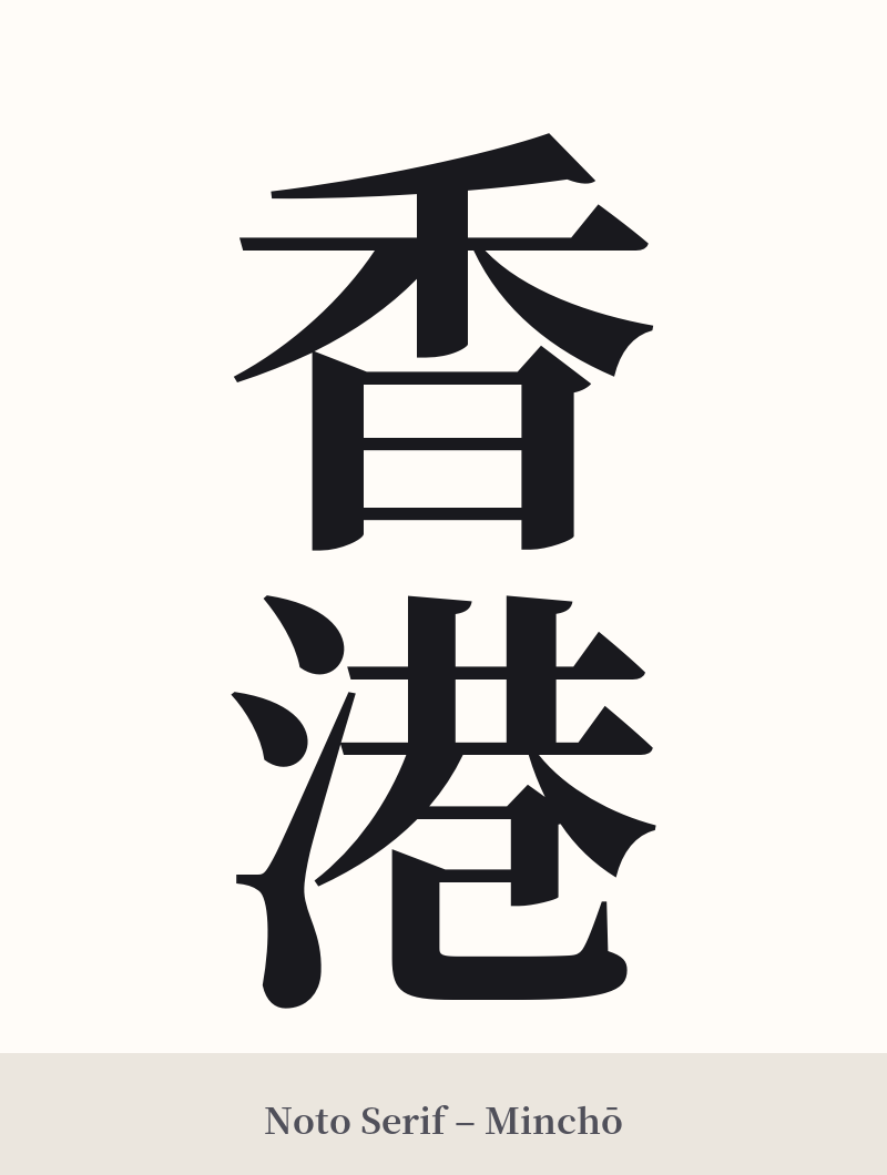
🖌️ Estilos de fuente para 香港
Los mismos caracteres kanji pueden verse muy diferentes según el estilo de caligrafía. Elige una fuente que se ajuste al ambiente que deseas para tu tatuaje o diseño.
🎨 Idoneidad para tatuajes
📐 Guía de diseño de tatuajes
Para un tatuaje de Hong Kong, el diseño debe respetar su equilibrio visual y su importancia cultural. Los dos caracteres combinan bien tanto horizontal como verticalmente, y la orientación vertical suele transmitir una sensación más tradicional y elegante.
– Ubicación: Debido a la complejidad de los 21 trazos, evite áreas pequeñas o estrechas. Un tatuaje en el antebrazo, la pantorrilla o la espalda le brinda al artista suficiente espacio para plasmar los detalles con precisión, evitando que los trazos se mezclen con el tiempo.
Estilo de fuente: Una escritura Kaisho (de imprenta) estándar y nítida le dará al tatuaje un aspecto fuerte, clásico y legible. Para un estilo más artístico y dinámico, una escritura Gyosho (semicursiva) puede capturar la energía y el movimiento de la ciudad. Una escritura Sosho (cursiva) muy estilizada puede ser hermosa, pero podría sacrificar la legibilidad.
– Adornos visuales: Considere combinar los kanji con imágenes que realcen su significado. Un fondo de sutiles olas o agua puede aludir al concepto de "Puerto". Otros elementos simbólicos podrían ser una flor de bauhinia (emblema de Hong Kong), la silueta del icónico horizonte o incluso un junco tradicional chino.
Comentarios