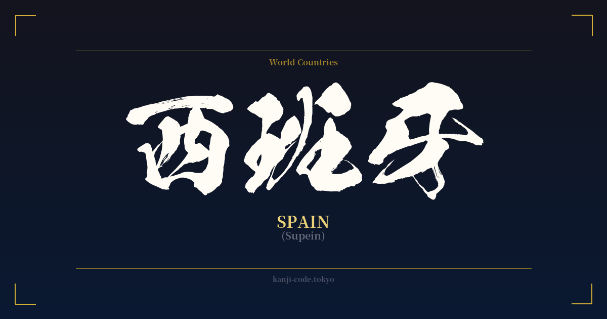
✍️ 西班牙 (Supein) — Contexto cultural
El kanji 西班牙 para 'España' es un ejemplo clásico de lo que en japonés se conoce como 'ateji' (当て字), una práctica en la que los caracteres kanji se utilizan por su valor fonético, a menudo sin tener en cuenta su significado original. Este método fue particularmente común durante la Restauración Meiji (1868-1912), cuando Japón incorporó rápidamente una gran cantidad de palabras, nombres y conceptos extranjeros procedentes de Occidente.
En este caso, se seleccionaron los caracteres 西 (su), 班 (pan) y 牙 (a) para imitar el sonido de 'España'. Es importante destacar que estas lecturas fonéticas son específicas de esta palabra y no representan la pronunciación estándar de los caracteres. Esta creatividad lingüística permitió a los japoneses escribir nombres extranjeros utilizando su propio alfabeto logográfico antes de que el silabario katakana se convirtiera en el estándar para los préstamos lingüísticos.
La relación de Japón con España se remonta al siglo XVI, la Era de los Descubrimientos. El misionero jesuita Francisco Javier llegó a Japón en 1549, dando inicio a un período de intercambio cultural y religioso. Si bien este contacto inicial fue posteriormente reprimido durante la era de aislamiento de Japón (sakoku), sentó las bases para futuras relaciones. Cuando Japón reabrió sus fronteras siglos después, fue necesario estandarizar los nombres de países como España por escrito, lo que dio lugar a la creación de ateji como 西班牙.
Hoy en día, el uso de 西班牙 es bastante formal y algo arcaico. En las noticias, los medios y las conversaciones cotidianas, la escritura katakana スぺイン (Supein) es abrumadoramente preferida. Es más probable que encuentre el kanji en documentos históricos, contextos diplomáticos formales o en nombres de organizaciones que buscan una sensación tradicional o establecida, como la 'Sociedad Japón-España' (日本スペイン協会, Nihon Supein Kyōkai).
Curiosamente, el primer carácter, 西 (nishi), significa 'oeste'. Esto ha propiciado su uso como abreviatura común de España, de forma similar a como 米 (bei) se usa para América (米国) y 英 (ei) para el Reino Unido (英国). Por ejemplo, las relaciones entre Japón y España suelen denominarse 日西関係 (Nissei kankei). Esto demuestra cómo, incluso en una transcripción fonética, puede surgir un matiz de lógica semántica que influye en el uso moderno.
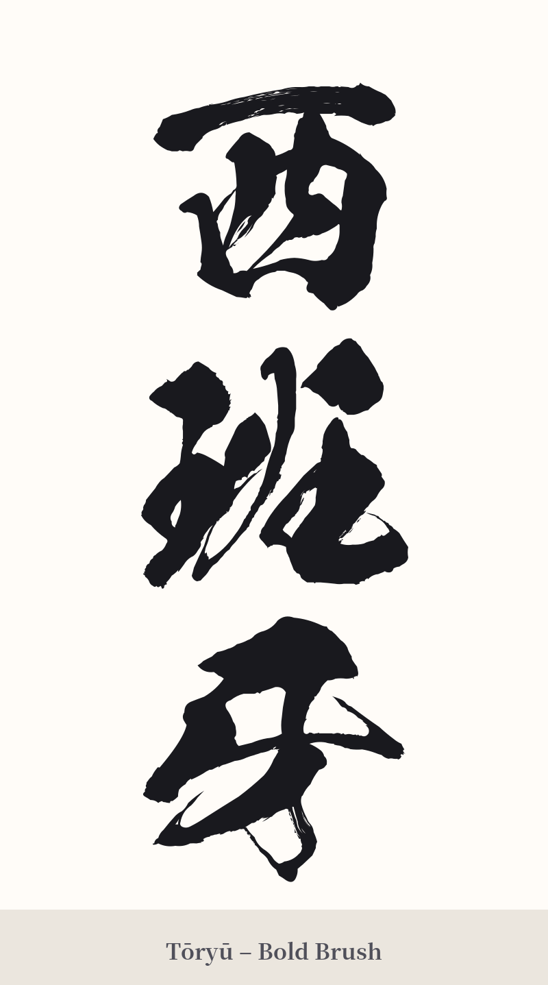
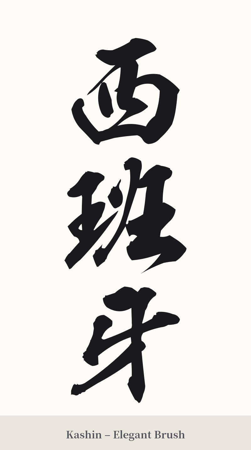
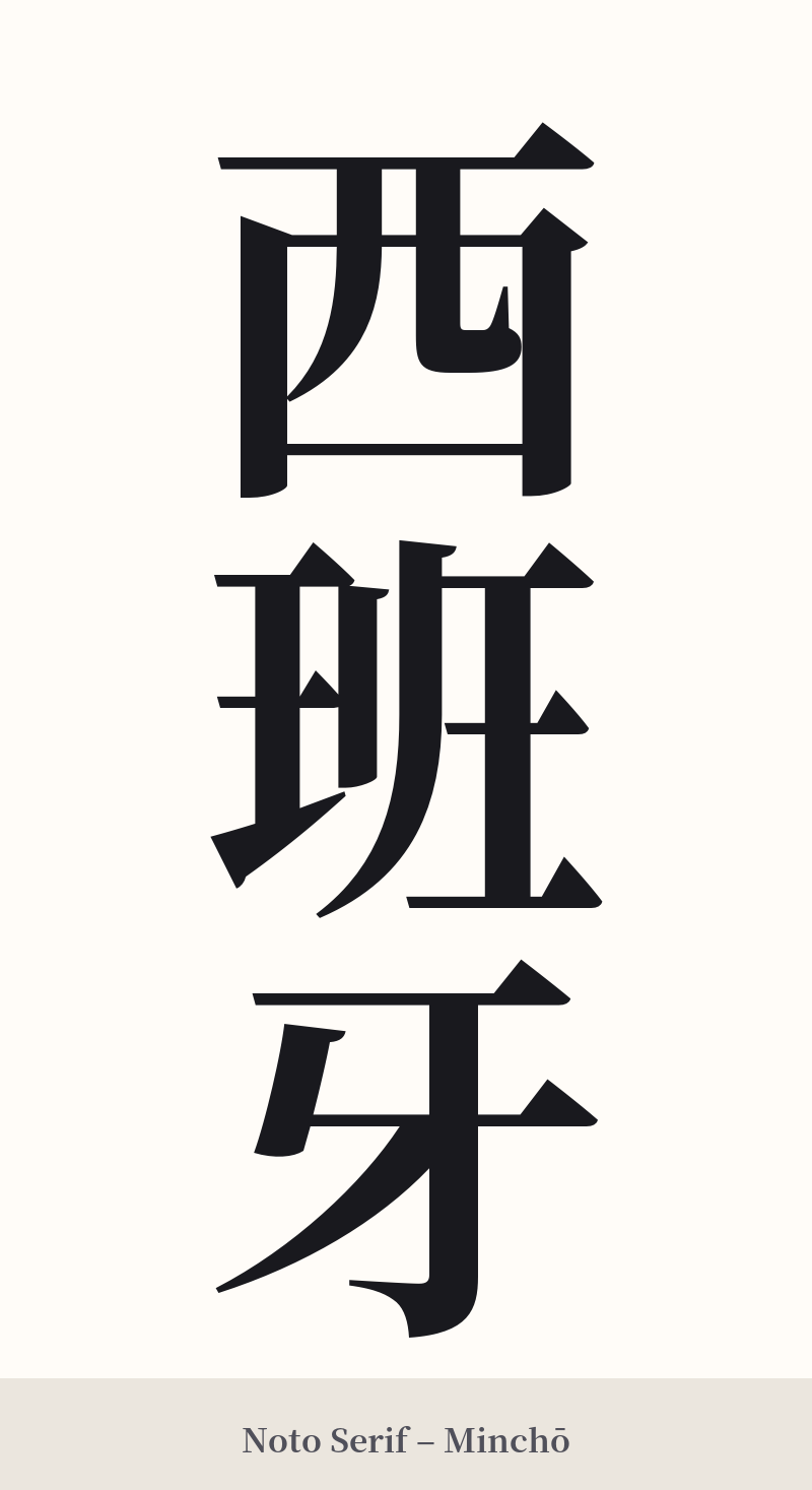
🖌️ Estilos de fuente para 西班牙
Los mismos caracteres kanji pueden verse muy diferentes según el estilo de caligrafía. Elige una fuente que se ajuste al ambiente que deseas para tu tatuaje o diseño.
🎨 Idoneidad para tatuajes
📐 Guía de diseño de tatuajes
Para un tatuaje de 西班牙, la composición de tres caracteres ofrece un excelente potencial visual, especialmente en alineación vertical. Esta disposición funciona de maravilla a lo largo de la columna vertebral, el antebrazo o la pantorrilla, creando una sensación de fluidez elegante.
Considere estos enfoques estilísticos:
– Gyosho (Semicursiva): Este estilo transmite dinamismo y pasión, con sutiles referencias a elementos culturales españoles como el flamenco. Sus trazos fluidos y conectados crean diseños muy artísticos y personales.
– Kaisho (Escritura en bloque): Para un aspecto más formal, majestuoso e impactante, una fuente kaisho en negrita es una excelente opción. Sus trazos claros y precisos enfatizan la estructura de cada carácter, lo que la hace muy legible y potente.
– Sosho (Cursiva): Si buscas un diseño abstracto y expresivo, la escritura sosho podría ser una opción. Sin embargo, ten en cuenta que su ilegibilidad para el ojo inexperto puede hacer que la palabra se oculte por completo, convirtiéndola en una obra de arte.
Para añadir un toque personal, podrías considerar incorporar sutilmente un pequeño elemento visual relacionado, como un clavel (la flor nacional de España) o un sol estilizado, sin que los kanji resalten demasiado.
Comentarios