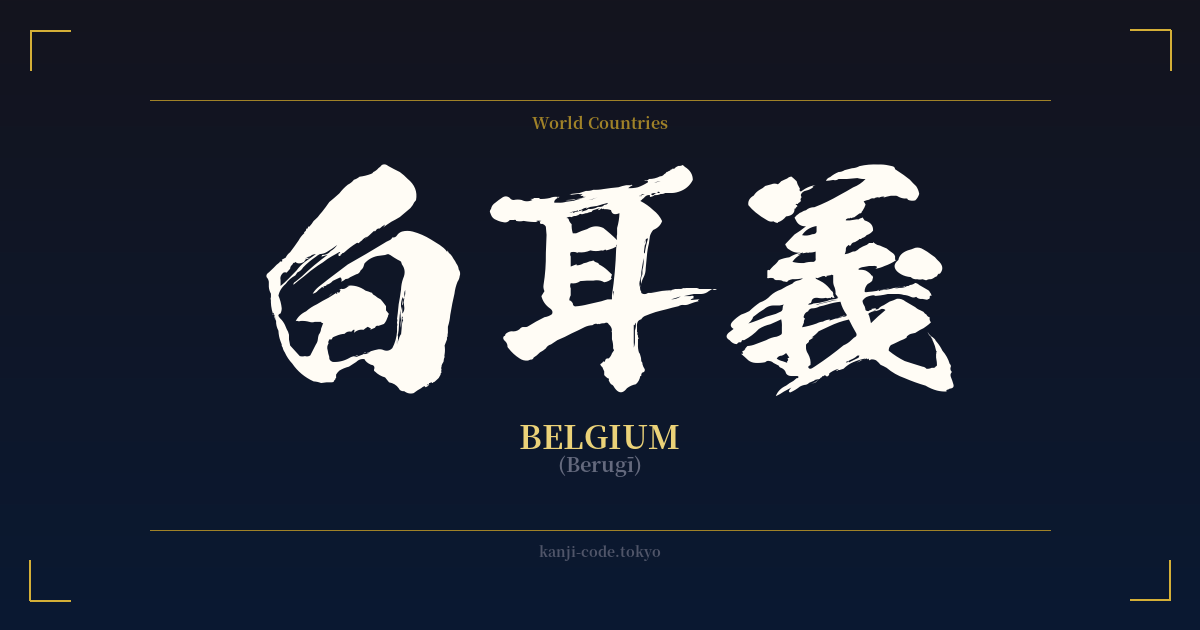
✍️ 白耳義 (Berugī) — Contexto cultural
La palabra 白耳義 (Berugī) ofrece una fascinante perspectiva de una época pasada de la lingüística japonesa, concretamente de la práctica del 'ateji' (当て字). El ateji consiste en utilizar los caracteres kanji por su fonética, en lugar de por su significado, para transcribir palabras extranjeras. Este método fue común durante el período Meiji (1868-1912), cuando Japón se modernizaba rápidamente y se veía inundado de nuevos conceptos y nombres procedentes de Occidente.
En este caso, se eligieron los caracteres 白 (BE), 耳 (RU) y 義 (GĪ) para aproximar el sonido de "Bélgica". La selección es puramente fonética; los significados literales de "Blanco", "Oreja" y "Justicia" no tienen absolutamente ninguna relación con la nación europea. Fue una forma creativa, aunque engorrosa, de escribir el nombre del país utilizando la escritura logográfica establecida antes de que el sistema katakana se convirtiera en el estándar para los préstamos lingüísticos extranjeros.
Hoy en día, 白耳義 se considera arcaico y casi nunca se usa. En japonés moderno, el nombre del país se escribe universalmente en katakana como ベルギー (Berugī). Es posible encontrar 白耳義 en documentos históricos antiguos, textos académicos sobre el idioma de la era Meiji o como dato curioso, pero no tiene cabida en la vida cotidiana contemporánea. Su existencia pone de manifiesto la transición en el sistema de escritura japonés.
A diferencia de otros nombres de países escritos con kanji, como 米国 (Beikoku – EE. UU.) o 英国 (Eikoku – Reino Unido), que siguen utilizándose en contextos formales y periodísticos, 白耳義 no alcanzó el mismo nivel de permanencia cultural. Esto lo convierte en una elección particularmente enigmática, un vestigio histórico que revela más sobre la evolución del idioma japonés que sobre Bélgica en sí. Representa un puente entre dos culturas, pero uno que hace tiempo fue reemplazado por una vía más directa y eficiente.
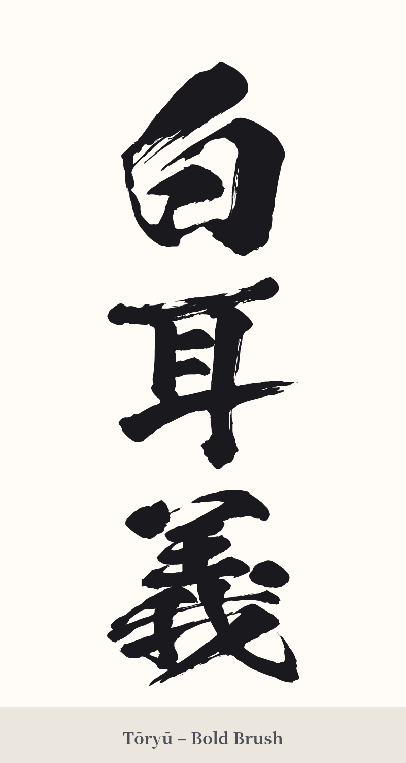
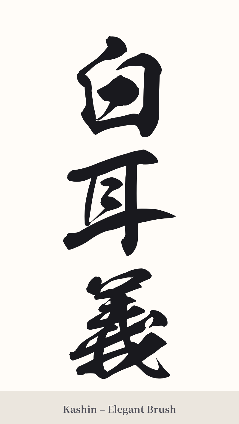
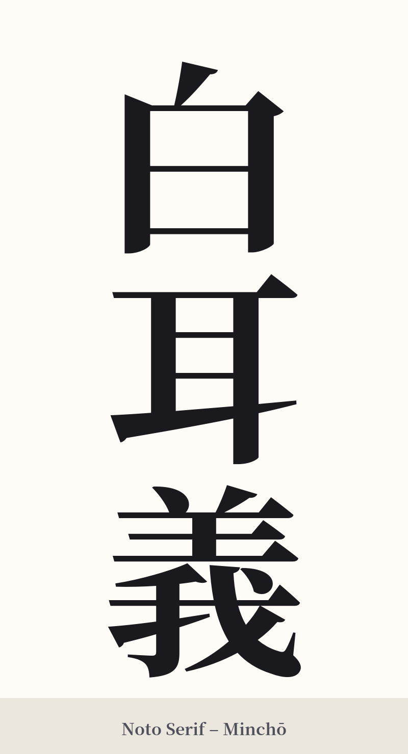
🖌️ Estilos de fuente para 白耳義
Los mismos caracteres kanji pueden verse muy diferentes según el estilo de caligrafía. Elige una fuente que se ajuste al ambiente que deseas para tu tatuaje o diseño.
🎨 Idoneidad para tatuajes
📐 Guía de diseño de tatuajes
Dada su naturaleza histórica y formal, un tatuaje de 白耳義 funciona mejor cuando se inclina hacia una estética tradicional.
– Ubicación: Se recomienda una disposición vertical, ya que se alinea con la escritura tradicional japonesa. Luce elegante en el antebrazo, la pantorrilla o la columna vertebral. Si bien es posible una disposición horizontal, se pierde parte de su encanto clásico.
– Estilo de fuente: Opte por fuentes caligráficas tradicionales. Un estilo Kaisho (escritura en bloque) nítido y formal resalta la estructura de cada carácter, mientras que un estilo Gyosho (semicursivo) fluido puede añadir un toque artístico e histórico. Evite las fuentes modernas o estilizadas, ya que desentonarían con el aire arcaico de la palabra.
Consejos visuales: Los tres caracteres ofrecen un buen equilibrio visual, desde los sencillos 白 y 耳 hasta el más complejo 義. Deje que los caracteres hablen por sí solos. Añadir otras imágenes (como un león o un gofre) solo aumentaría la confusión, ya que el kanji en sí no significa "Bélgica" en sentido literal.
Comentarios