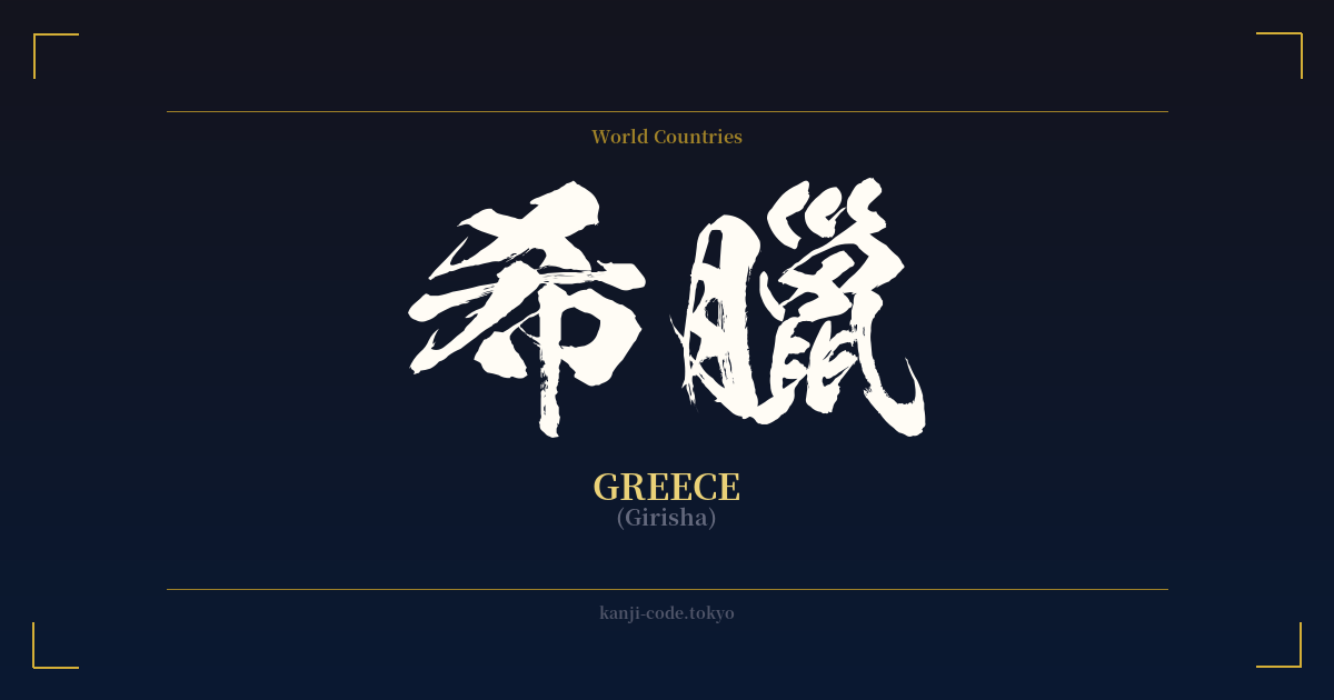
✍️ 希臘 (Girisha) — Contexto cultural
La palabra japonesa 希臘 (Girisha), que significa Grecia, ofrece una fascinante perspectiva de un período específico de la historia de Japón. Es un ejemplo paradigmático de 'ateji' (当て字), una práctica que consiste en utilizar los caracteres kanji por su valor fonético para transcribir palabras extranjeras, independientemente de su significado original.
Este método fue particularmente común durante la Restauración Meiji (1868-1912), cuando Japón abrió sus fronteras y comenzó a importar rápidamente tecnología, cultura e ideas occidentales. A menudo, los nombres de países, ciudades y conceptos que no tenían equivalente en japonés recibían estas grafías en kanji. Palabras como 'club' se convirtieron en 倶楽部 (kurabu) y 'café' en 珈琲 (kōhī).
En el caso de 希臘, los caracteres se seleccionaron para aproximarse al sonido de 'Grecia' o un término relacionado como 'Graecia'. El carácter 希 puede leerse como 'gi' en algunos contextos, mientras que 臘 se usaba para un sonido como 'sha' o similar. Es importante comprender que esta correspondencia fonética no siempre fue perfecta ni se basó en lecturas estándar modernas; fue una aproximación basada en los sonidos de la época.
Los significados individuales de los caracteres están completamente desvinculados del concepto de Grecia. 希 significa 'esperanza' o 'raro', y 臘 se refiere al duodécimo mes lunar. Si bien podría encontrarse una conexión poética en 'esperanza rara', esto es pura coincidencia. Los caracteres fueron elegidos por su sonoridad, no por su significado.
Hoy en día, el uso de 希臘 es bastante limitado. La forma estándar y cotidiana de escribir 'Grecia' es con el alfabeto katakana: ギリシャ (Girisha). El katakana es el sistema moderno diseñado específicamente para préstamos lingüísticos extranjeros, por lo que es la opción predeterminada para los nombres de países. Verás ギリシャ en mapas, artículos de noticias y folletos turísticos.
Entonces, ¿cuándo se suele ver el prefijo '希臘'? Actualmente se utiliza en contextos más formales, históricos o literarios. Puede aparecer en textos académicos sobre historia, en los nombres oficiales de organizaciones bilaterales o cuando una empresa busca proyectar una imagen clásica, erudita o eurocéntrica. Su uso transmite una sensación de formalidad anticuada, similar a usar 'Hellas' en lugar de «Grecia» en inglés.
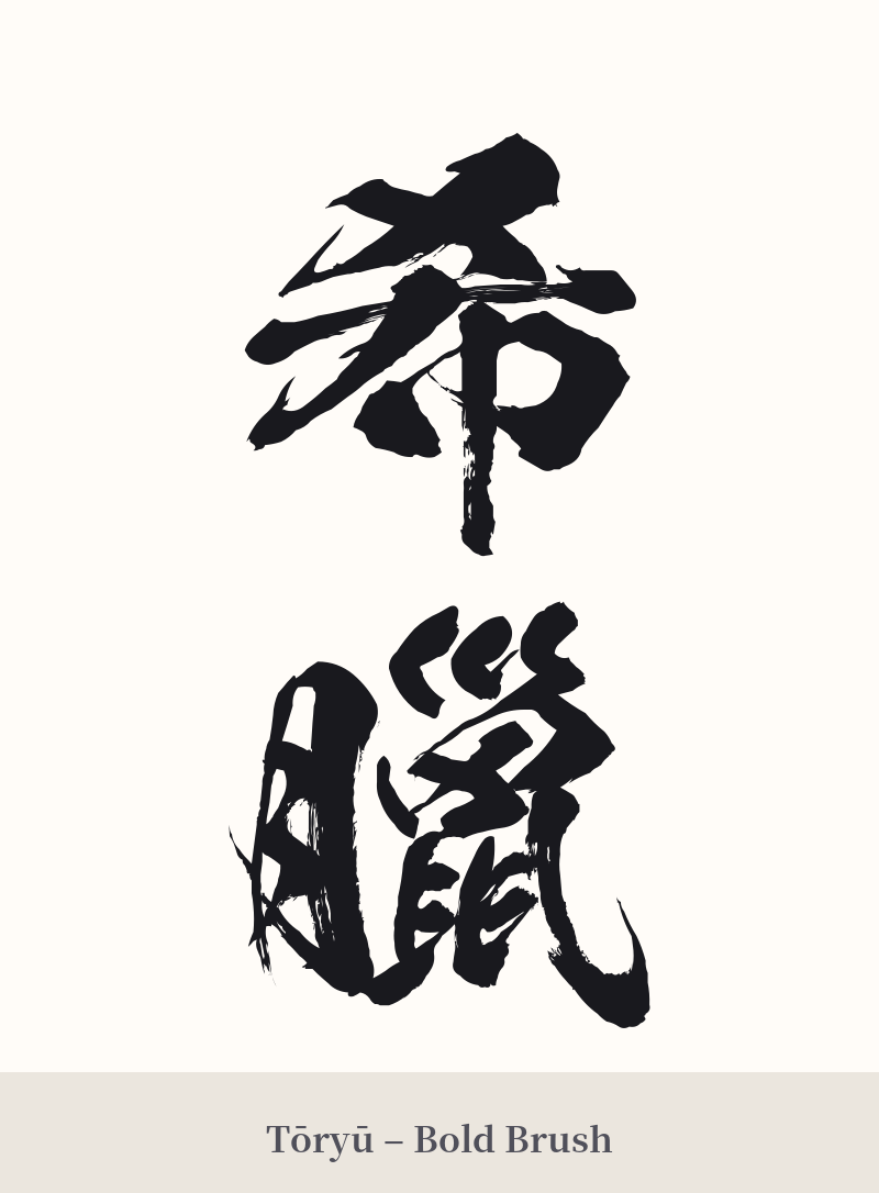
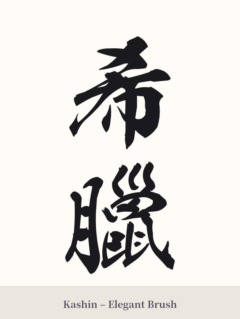
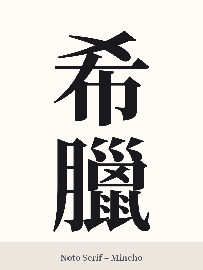
🖌️ Estilos de fuente para 希臘
Los mismos caracteres kanji pueden verse muy diferentes según el estilo de caligrafía. Elige una fuente que se ajuste al ambiente que deseas para tu tatuaje o diseño.
🎨 Idoneidad para tatuajes
📐 Guía de diseño de tatuajes
Debido a la complejidad del segundo carácter, 臘, un tatuaje de 希臘 requiere una cuidadosa consideración del diseño y la ubicación.
– Ubicación: Este diseño no es adecuado para áreas pequeñas. Los 19 trazos de 臘 necesitan espacio para mantenerse visibles con el tiempo. Considere áreas más grandes y planas como el antebrazo, la pantorrilla, la parte superior de la espalda o el pecho.
Estilo: Es fundamental una tipografía clara y nítida. La escritura en bloque estándar (Kaishotai) es una excelente opción, ya que prioriza la legibilidad de cada trazo. Un estilo semicursivo (Gyoshotai) puede aportar fluidez, pero solo si el artista logra mantener la integridad del carácter complejo. No se recomienda la cursiva muy estilizada (Soushotai), ya que probablemente convertiría el carácter 臘 en una mancha ilegible.
– Consejos visuales: La alineación vertical es una opción clásica y visualmente atractiva para esta palabra de dos caracteres. Dado que el significado del kanji no es obvio, considere incorporar un elemento griego sutil al diseño general, como una rama de olivo, un patrón de llave (meandro) o un pequeño pilar, para brindar contexto.
Comentarios