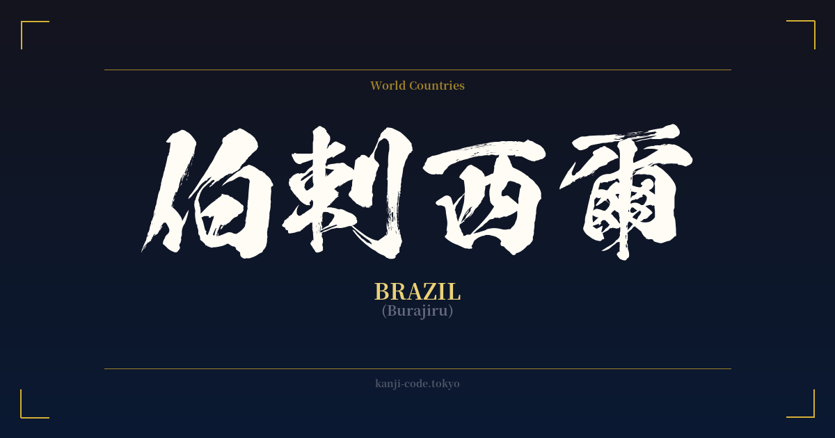
✍️ 伯剌西爾 (Burajiru) — Contexto cultural
La palabra 伯剌西爾 (Burajiru) ofrece una fascinante perspectiva de un momento específico de la historia japonesa. Es un ejemplo de 'ateji' (当て字), una práctica que consiste en utilizar caracteres kanji para representar fonéticamente palabras extranjeras, ignorando por completo su significado original. Este método fue particularmente común durante la Restauración Meiji (finales del siglo XIX), cuando Japón se abría rápidamente a Occidente y necesitaba crear nombres para países, personas y conceptos extranjeros.
En este caso, se seleccionaron los caracteres 伯 (bu), 剌 (ra), 西 (ji) y 爾 (ru) para imitar el sonido de la palabra portuguesa 'Brasil'. Los significados literales —'jefe', 'opuesto', 'oeste' y 'tú'— son completamente irrelevantes al combinarse. Su único propósito es crear el sonido 'Burajiru'. Esta práctica pone de manifiesto la flexibilidad y la capacidad de adaptación creativa del sistema de escritura japonés.
Sin embargo, el uso de ateji para los nombres de países ha caído en desuso. Hoy en día, las palabras extranjeras se escriben casi exclusivamente en katakana, un alfabeto silábico diseñado precisamente para este fin. La forma moderna y estándar de escribir Brasil en japonés es ブラジル. La verás en mapas, artículos de noticias y en conversaciones cotidianas. La forma kanji 伯剌西爾 se considera ahora arcaica y literaria, algo que podría encontrarse en un texto histórico o usarse para lograr un efecto estilístico clásico y anticuado.
Curiosamente, la conexión entre Japón y Brasil es profunda. Brasil alberga la mayor comunidad japonesa fuera de Japón, con una población de más de dos millones de personas. Esta diáspora comenzó a principios del siglo XX, y el intercambio cultural entre ambas naciones ha sido rico y constante desde entonces. Si bien el kanji 伯剌西爾 puede resultar poco conocido, el vínculo que representa está muy vivo y vibrante, entretejido en el tejido de ambas sociedades.
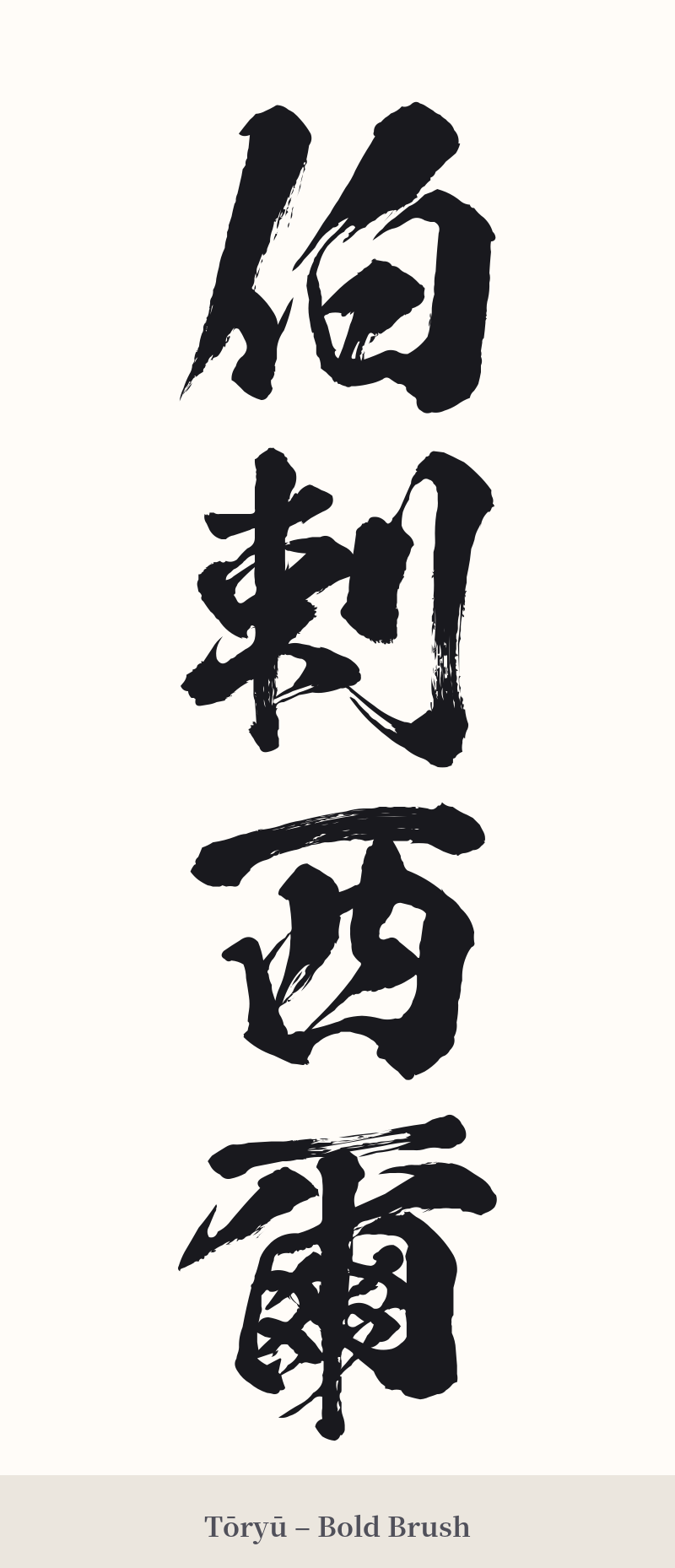
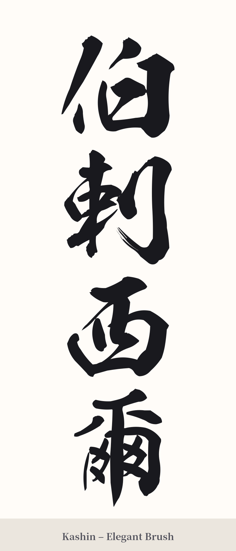
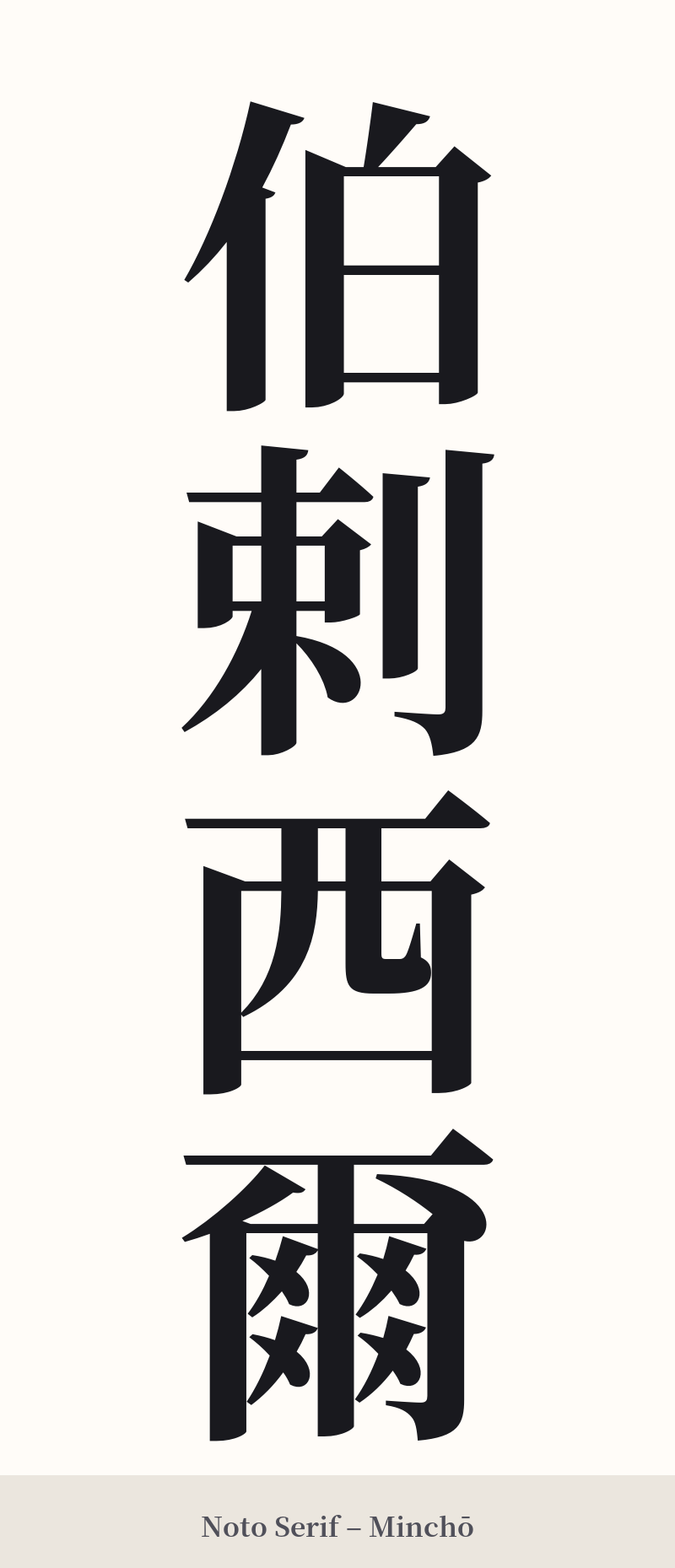
🖌️ Estilos de fuente para 伯剌西爾
Los mismos caracteres kanji pueden verse muy diferentes según el estilo de caligrafía. Elige una fuente que se ajuste al ambiente que deseas para tu tatuaje o diseño.
🎨 Idoneidad para tatuajes
📐 Guía de diseño de tatuajes
Para un tatuaje de 伯剌西爾, las opciones de diseño deben honrar su naturaleza histórica y compleja.
– Ubicación: La orientación vertical es casi obligatoria para un dibujo compuesto de cuatro caracteres como este. Crea un poderoso efecto visual. Las ubicaciones ideales incluyen la columna vertebral, el antebrazo o la pantorrilla.
– Estilo de fuente: Adopte la caligrafía tradicional japonesa. Un estilo 'Gyosho' audaz y semicursivo puede evocar un sentido de arte histórico, mientras que una escritura formal 'Kaisho' (de imprenta) enfatizará la estructura de cada carácter. Evite las fuentes modernas, geométricas o delgadas, ya que desentonan con el aire arcaico de la palabra.
Consejos visuales: Debido a la gran cantidad de trazos (36), la claridad es fundamental. Asegúrese de que el artista deje suficiente espacio entre los caracteres y dentro de cada uno para evitar que se difuminen con el tiempo, especialmente en tamaños pequeños. Este diseño se aprecia mejor en un tamaño mayor para poder apreciar los detalles.
Comentarios