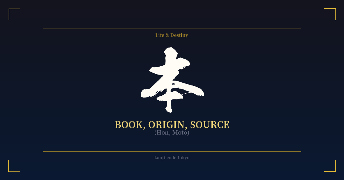
✍️ 本 (Cariño, Moto) — Contexto cultural
El kanji 本 (hon/moto) es uno de los caracteres más fundamentales y versátiles del idioma japonés, que encarna una fascinante dualidad entre lo mundano y lo profundo.
Su origen es maravillosamente simple e ilustrativo. El carácter es un pictograma derivado del kanji para árbol, 木 (ki). Se añadió un trazo horizontal en la parte inferior para indicar las raíces del árbol. De esta imagen, obtenemos su significado primario y fundamental: 'moto' (もと), que se traduce como 'origen', 'fuente', 'raíz' o 'fundamento'. Este concepto de volver a la fuente esencial es una piedra angular de muchas filosofías orientales.
Esta idea de 'origen' se manifiesta con fuerza en el nombre de Japón: 日本 (Nihon o Nippon). Compuesto por los caracteres de 'sol' (日) y 'origen' (本), el nombre significa literalmente 'el origen del sol', una referencia poética a la ubicación de Japón al este del continente asiático.
¿Cómo es que un carácter que significa "origen" llegó a significar "libro" (hon)? La conexión reside en la historia de la escritura. Los registros y conocimientos antiguos se inscribían en tablillas de madera o rollos de bambú. Estos materiales, la "fuente" física de la información, se convirtieron en sinónimo de la información que contenían. Así, "hon" evolucionó para significar "libro", el recipiente del conocimiento.
Esta conexión explica por qué vemos 本 en palabras como 基本 (kihon – fundamento, base), 本当 (hontō – verdadero, real, del origen real) y 本質 (honshitsu – esencia, verdadera naturaleza). En todos estos casos, el kanji apunta a algo fundamental, auténtico y original.
Sin embargo, esta profundidad contrasta con sus usos cotidianos y muy comunes. Funciona como prefijo para 'este' o 'principal', como en 本日 (honjitsu – este día) o 本社 (honsha – oficina principal). Quizás su uso más conocido entre los estudiantes de idiomas sea como contador de objetos largos y cilíndricos. Un lápiz es 'ippon', dos son 'nihon' y tres son 'sanbon'.'
Esta amplia gama de usos, desde el nombre de un país hasta un simple contador gramatical, convierte a 本 en un ejemplo perfecto de la naturaleza multifacética de los kanji. Representa el nacimiento de un río, la raíz de un árbol, la esencia de una idea y el libro en tu estantería, todo a la vez. Es un símbolo tanto del punto de partida como del conocimiento que adquirimos en el camino.
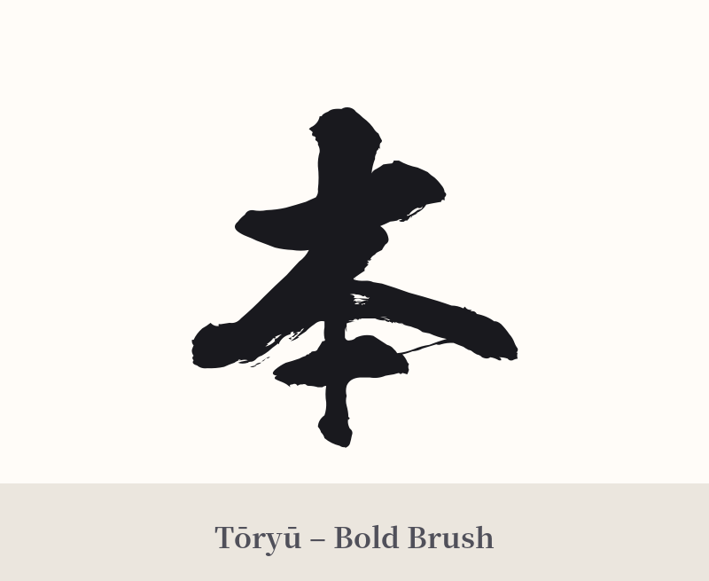
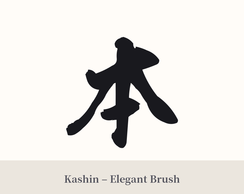
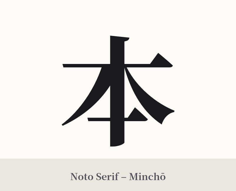
🖌️ Estilos de fuente para 本
Los mismos caracteres kanji pueden verse muy diferentes según el estilo de caligrafía. Elige una fuente que se ajuste al ambiente que deseas para tu tatuaje o diseño.
🎨 Idoneidad para tatuajes
📐 Guía de diseño de tatuajes
Debido a su simplicidad y potencial ambigüedad, el diseño y la ubicación de un tatuaje con la sigla 本 son cruciales para transmitir su significado.
– Ubicación: Este personaje funciona bien en lugares pequeños y discretos donde su minimalismo se percibe intencional. Considere la muñeca, detrás de la oreja, en el tobillo o a lo largo de la clavícula. Una versión de gran tamaño en la espalda o el pecho podría verse escasa o inacabada a menos que se integre en una pieza más grande.
Estilo de fuente: Un estilo clásico de caligrafía japonesa (shodō) es una opción fantástica. Un trazo rápido y seguro puede capturar la energía y la historia del kanji. Como alternativa, una fuente sans-serif limpia, geométrica o minimalista puede resaltar su simplicidad estructural y su atractivo moderno. Evite los estilos demasiado ornamentados o complejos que contradigan la naturaleza fundamental del carácter.
Consejos visuales: Para orientar el significado hacia 'origen' o 'fuente' y alejarlo de 'libro', considere incorporar un elemento sutil relacionado. Un pequeño círculo enso detrás del kanji puede simbolizar la totalidad y el universo. Líneas tenues que sugieren raíces que se extienden desde el trazo inferior pueden reforzar visualmente el significado de 'moto'. Otra opción es un simple círculo rojo (que representa el sol) colocado cerca para evocar la conexión con 'Nihon' (Japón).
Comentarios