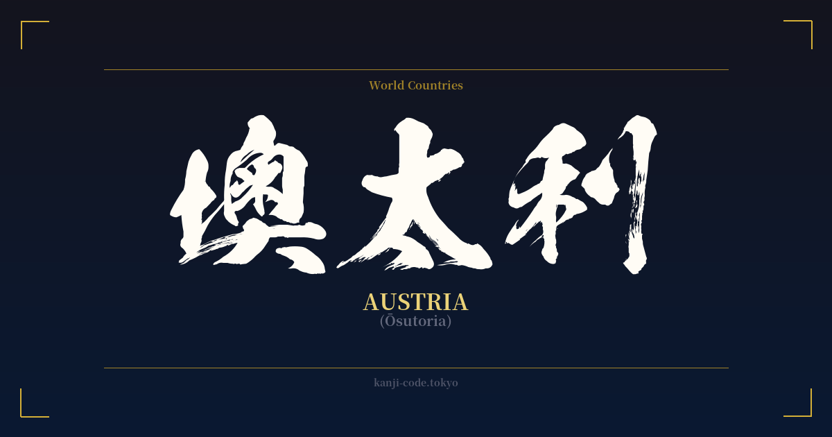
✍️ 墺太利 (Ōsutoria) — Contexto cultural
El término 墺太利 (Ōsutoria) ofrece una fascinante perspectiva de un período específico de la historia japonesa, principalmente la Era Meiji (1868-1912). Durante este tiempo, Japón abrió sus puertas al mundo tras siglos de aislamiento y se esforzó por incorporar a su idioma una gran cantidad de nuevos conceptos, tecnologías y nombres occidentales. Para nombrar países extranjeros, los japoneses empleaban un sistema llamado 'ateji' (当て字), en el que los caracteres kanji se elegían por su fonética en lugar de por su significado.
Así nació precisamente 墺太利. Los caracteres se seleccionaron para aproximarse al sonido de "Austria": 墺 (ō), 太 (su) y 利 (ri). Si se tradujeran literalmente, se obtendría algo como "costa-gruesa-ganancia", lo cual carece de sentido. Esto pone de manifiesto el principio fundamental del ateji para topónimos: el significado de cada kanji se ignora por completo en favor de su sonido.
Esta práctica era común en muchos países, dando lugar a grafías en kanji como 米国 (Beikoku) para Estados Unidos, 英国 (Eikoku) para el Reino Unido y 独国 (Doitsukoku) para Alemania. Sin embargo, a medida que avanzaba el siglo XX, un nuevo sistema de escritura diseñado específicamente para palabras extranjeras, el katakana, se convirtió en el estándar. Hoy en día, cualquier persona en Japón que escriba sobre el país de Mozart y el schnitzel usaría オーストリア (Ōsutoria).
La versión en kanji 墺太利 se considera arcaica. Puede encontrarse en textos históricos, documentos diplomáticos formales o, quizás, en nombres de antiguas empresas o tratados que buscan evocar un sentido de historia y tradición. Su uso implica cierta formalidad y peso histórico de los que carece la escritura moderna en katakana. Por esta razón, aunque no se usa a diario, sigue siendo una parte reconocida e históricamente significativa del idioma japonés escrito.
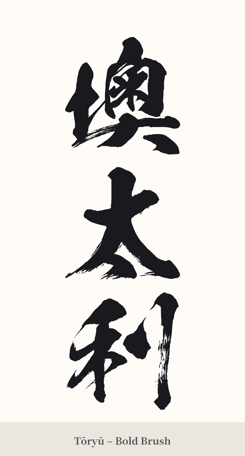
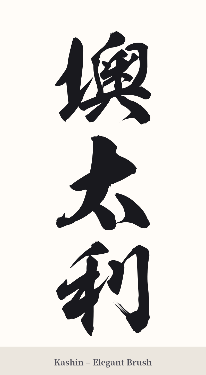
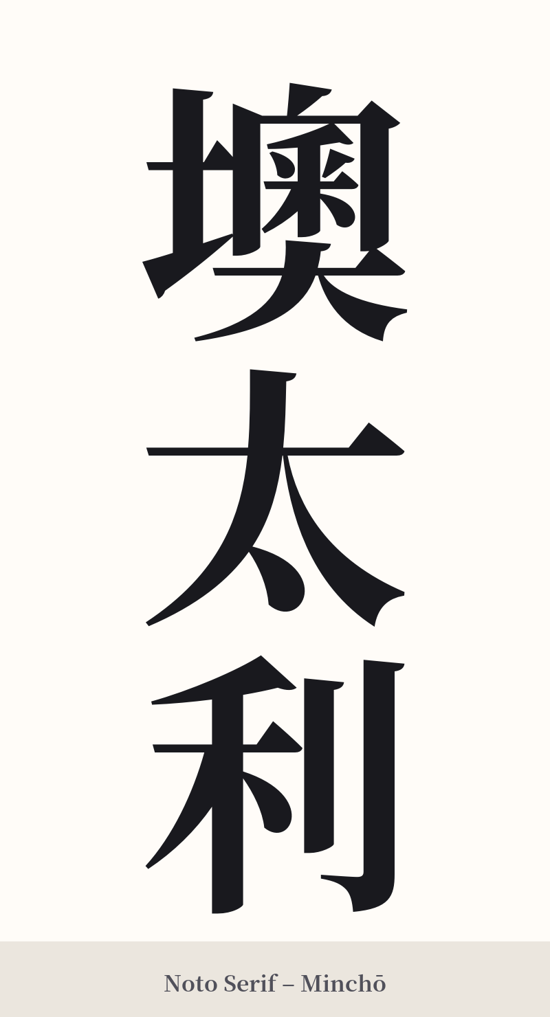
🖌️ Estilos de fuente para 墺太利
Los mismos caracteres kanji pueden verse muy diferentes según el estilo de caligrafía. Elige una fuente que se ajuste al ambiente que deseas para tu tatuaje o diseño.
🎨 Idoneidad para tatuajes
📐 Guía de diseño de tatuajes
Si estás decidido a tatuarte este término histórico, es fundamental considerar cuidadosamente su diseño para honrar su carácter único.
– Colocación: Se recomienda encarecidamente la orientación vertical. Esta es la forma tradicional de escribir japonés y permite que los tres caracteres se apilen elegantemente, generalmente en el antebrazo, la pantorrilla o a lo largo de la columna vertebral. Una disposición horizontal puede resultar incómoda y menos equilibrada debido a la complejidad variable de los caracteres.
– Estilo de fuente: Opte por una escritura tradicional y formal. Un estilo Kaisho (楷書) nítido y robusto resaltará su carácter histórico, casi documental. Para una apariencia más fluida, una escritura Gyosho (行書) o semicursiva podría funcionar, pero evite cualquier estilo demasiado moderno o estilizado, ya que desentonaría con la naturaleza arcaica de la palabra.
Consejos visuales: El primer carácter, 墺, es muy complejo, con 16 trazos. Es fundamental trabajar con un tatuador experto en caligrafía japonesa. El diseño debe ser lo suficientemente grande para evitar que las líneas finas se difuminen con el tiempo, un fenómeno conocido como "corrosión de la tinta". El contraste entre el complejo 墺 y el sencillo 太 (4 trazos) es clave, y un buen artista sabrá cómo equilibrarlos visualmente.
Comentarios