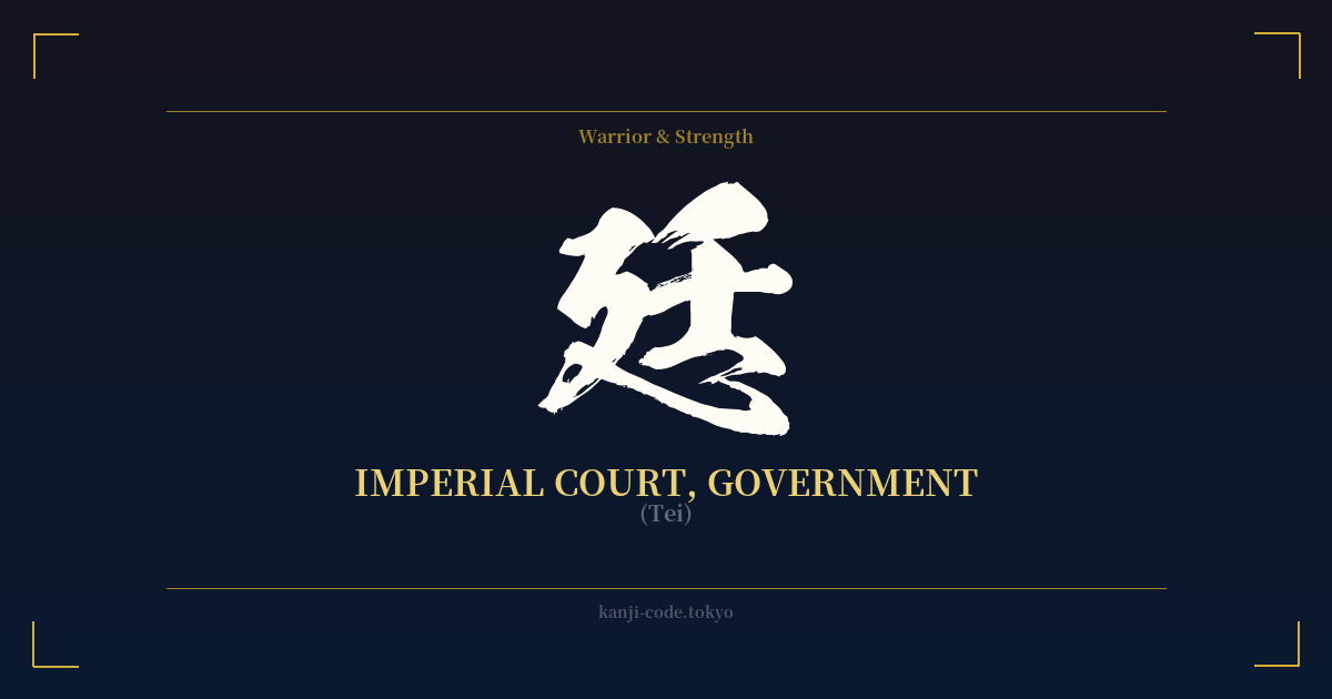
✍️ 廷 (Tei) — Contexto cultural
El kanji 廷 (Tei) conlleva un gran peso histórico, legal y de autoridad imperial en Japón. Su significado principal es 'corte', pero este abarca más allá de una simple sala de audiencias, incluyendo la corte imperial, las oficinas gubernamentales y los salones públicos donde se decidían los asuntos de Estado. Es un carácter cargado de formalidad y estructura.
Históricamente, el concepto de 'corte' constituyó el núcleo de la civilización japonesa. Durante el período Heian (794-1185), la Corte Imperial (宮廷, kyūtei) en Heian-kyō (actual Kioto) fue el centro de la política, el arte y la cultura. Este era el mundo retratado en 'La historia de Genji', un lugar de intrincada etiqueta, intrigas políticas y estética refinada. El carácter 廷 es un vínculo directo con esta época, evocando imágenes de grandes salones, funcionarios con túnicas y los solemnes procedimientos que forjaron la nación.
Los elementos visuales del carácter sugieren su significado. Está compuesto por el radical 廴 (in), que significa 'caminar' o 'avanzar', y el componente fonético 壬 (jin). Juntos, pueden interpretarse como un lugar donde la gente se mueve y se reúne de forma ordenada, a menudo ante una figura de autoridad.
En el Japón moderno, 廷 casi nunca se usa como palabra independiente. Su significado se revela al combinarse con otros kanji. Por ejemplo, 法廷 (hōtei) significa específicamente "tribunal" o "sala de audiencias", el lugar donde se administra justicia. 朝廷 (chōtei) se refiere a la "Corte Imperial" como órgano de gobierno, un término con una fuerte resonancia histórica. Por sí solo, 廷 se percibe simplemente como un componente básico, una pieza de una idea más amplia y completa.
Por eso, a pesar de su significado solemne, no es una opción común para la expresión personal. Representa el sistema, la institución y el lugar físico del poder, más que una virtud personal como el coraje (勇) o un concepto filosófico como el vacío (空). Es formal, impersonal y está profundamente ligado a la maquinaria del gobierno y la ley, tanto antigua como moderna.
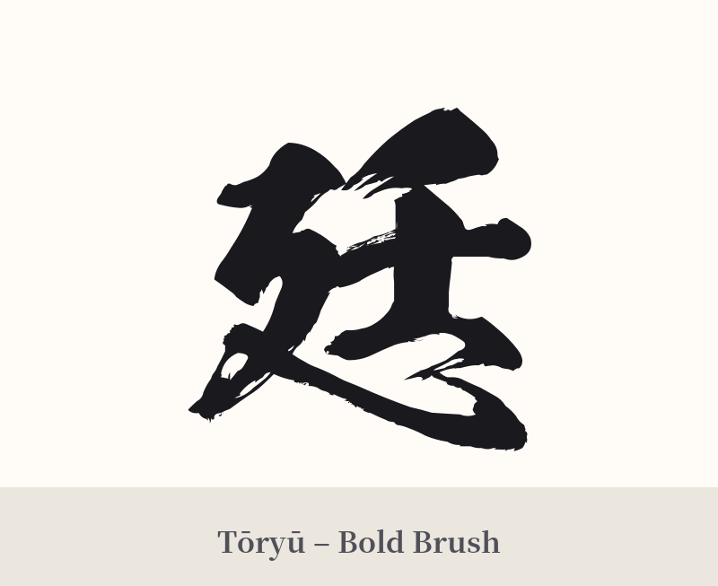
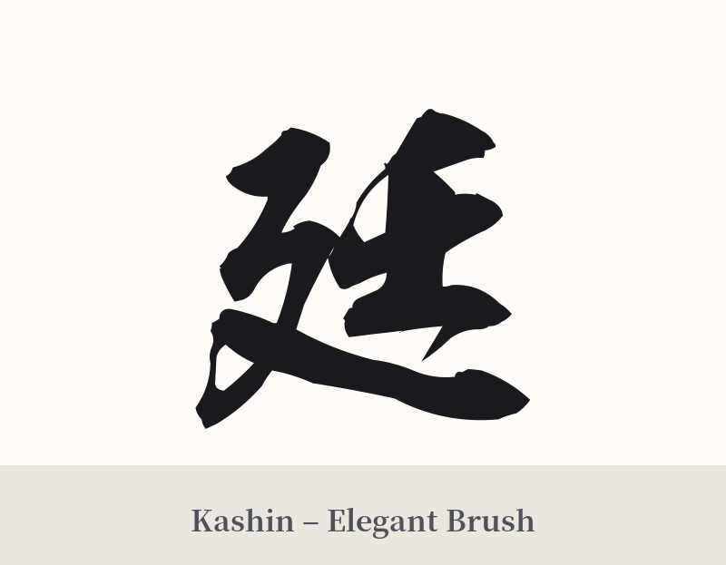
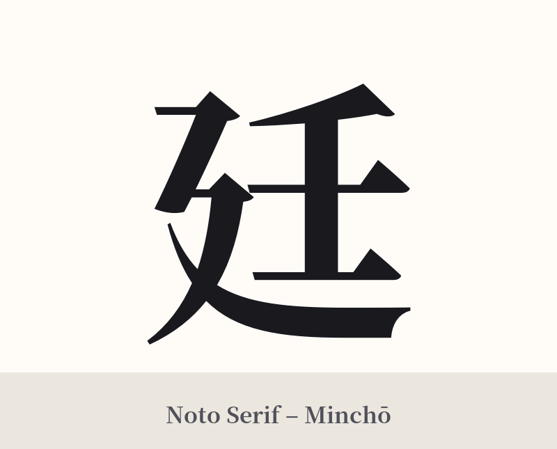
🖌️ Estilos de fuente para 廷
Los mismos caracteres kanji pueden verse muy diferentes según el estilo de caligrafía. Elige una fuente que se ajuste al ambiente que deseas para tu tatuaje o diseño.
🎨 Idoneidad para tatuajes
📐 Guía de diseño de tatuajes
Si está decidido a utilizar 廷, un diseño bien pensado es crucial para transmitir el significado que se pretende y superar su debilidad como símbolo independiente.
– Ubicación: Su naturaleza formal y estructural combina bien con colocaciones lineales. La parte interna del antebrazo, a lo largo de la columna vertebral o en la parte posterior de la pantorrilla pueden proporcionar una base sólida y vertical. Evite las partes más fluidas u orgánicas del cuerpo.
– Estilo de fuente: Una escritura Kaisho (楷書) clásica y robusta enfatizará su asociación con la ley y el gobierno. Para una sensación más histórica y singular, una escritura Tensho (篆書) o de sello puede evocar las antiguas cortes imperiales de Japón. Los estilos cursivos o informales chocarían con el significado formal del kanji.
– Consejos visuales: Dado que se ve incompleto por sí solo, considere incorporarlo a un diseño más amplio. Podría colocarse en un pergamino, enmarcado por elementos arquitectónicos de un palacio japonés o combinado con un símbolo de justicia como una balanza (aunque la balanza es un símbolo occidental). Esto proporciona el contexto que le falta al carácter individual.
Comentarios