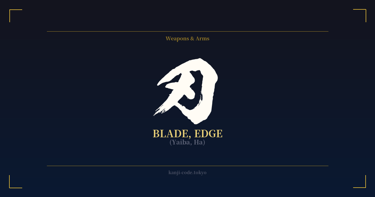
✍️ 刃 (Yaiba, Ha) — Contexto cultural
El kanji 刃, que se lee como 'yaiba' o 'ha', es un carácter de una belleza y una sencillez brutales. Significa 'hoja' o 'filo', la parte de una herramienta o arma que corta. Su origen es un ejemplo perfecto de la lógica ideográfica japonesa. El carácter deriva de 刀 (katana), el kanji de 'espada' o 'cuchillo'. Al añadir un solo trazo o punto a 刀, se creó el nuevo carácter 刃 para señalar específicamente el filo afilado, la parte más vital de la hoja.
Este rasgo es inseparable de la imagen del samurái y su icónica espada, la katana. El filo de una katana no era solo un trozo de metal afilado; era la culminación de un proceso de forja casi espiritual. Los herreros doblaban y martillaban el acero miles de veces, creando una hoja increíblemente dura y flexible. La línea de temple visible en la hoja, conocida como hamon, es la manifestación física del filo endurecido, el ha. Para un samurái, la integridad del filo de su espada era una cuestión de vida o muerte y honor.
Más allá de su significado literal, el kanji 刃 se ha arraigado en el idioma japonés con potentes significados figurados. La frase 諸刃の剣 (moroha no tsurugi), que significa literalmente 'espada de doble filo', utiliza este kanji para describir algo que puede ser tanto beneficioso como perjudicial, un concepto universalmente comprendido. También puede referirse a la agudeza intelectual o al carácter hiriente de las palabras. Estar a la vanguardia en un campo transmite una sensación similar de estar al frente, ser perspicaz y avanzado.
Es importante distinguir 刃 de otros kanji similares. Mientras que 刀 (katana) se refiere a la espada de un solo filo completa y 剣 (ken/tsurugi) a la espada de doble filo, 刃 (yaiba/ha) se centra exclusivamente en la esencia de su función: el filo. Esto lo convierte en un concepto más abstracto y fundamental. No representa el objeto en sí, sino el potencial de acción, el punto de impacto y la idea misma de agudeza. Es el alma del corte.
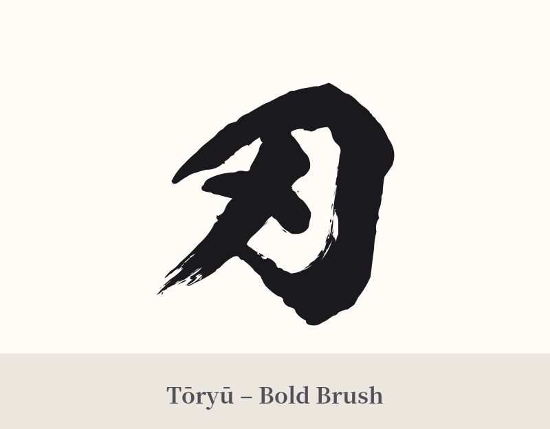
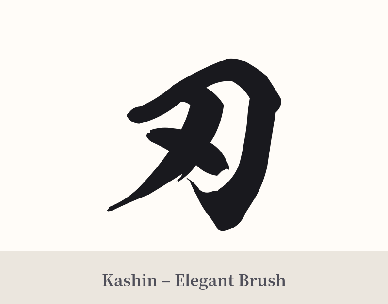
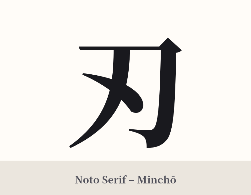
🖌️ Estilos de fuente para 刃
Los mismos caracteres kanji pueden verse muy diferentes según el estilo de caligrafía. Elige una fuente que se ajuste al ambiente que deseas para tu tatuaje o diseño.
🎨 Idoneidad para tatuajes
📐 Guía de diseño de tatuajes
Para un tatuaje, 刃 ofrece un atractivo sobrio y minimalista. Sus líneas limpias y ángulos agresivos transmiten un mensaje poderoso a pesar de su simplicidad.
– Ubicación: Considere zonas que resalten su naturaleza lineal y definida. El antebrazo, la parte posterior de la pantorrilla, a lo largo de las costillas o verticalmente a lo largo de la columna vertebral son excelentes opciones. Para un diseño más pequeño y sutil, la muñeca o detrás de la oreja también pueden funcionar bien.
– Estilo de fuente: Una fuente Kaisho (de imprenta) nítida y angular resaltará su naturaleza precisa y definida. Para un estilo más dinámico, un trazo de pincel Gyosho (semicursivo) o Sosho (cursivo) puede evocar el movimiento fluido de un espadazo.
Consejos visuales: Si bien el símbolo 刃 tiene un gran impacto por sí solo, puede combinarse con otros elementos. Una pincelada de tinta roja, como si fuera un corte, puede añadir un efecto dramático. También puede integrarse en una pieza más grande, quizás sostenida por un guerrero o junto a un dragón, para definir el tema general del diseño.
Comentarios